Comment on my work with another designer (Rationalism and romanticism)
1.1 Introduction
This blog analyzed my work about another designer, which are all graphic design. Rationalism and romanticism as the main aspects are discussed in this blog and refer to the reading Design thinking between rationalism and romanticism written by Ida Engholm & Karen Lisa Salamon.
1.2 The relationship between Rationalism and Romanticism
After the Crafts and Arts Movement, which was initiated by William Morris, two primary schools of the Western design field emerged in the 20th century: modernism and postmodernism. The basis of modernist design is rationalism and functionalism, claiming Forms Follow Function. Postmodernism first appeared in the field of architecture, and it was a counteraction that originated within modernism, especially the rebellion of modernist rationality. Its design style emphasizes that it should have historical continuity, but it is not limited to traditional logical thinking. At the same time, it should explore innovative styling techniques, pay attention to human touch, and pursue individuality. In the design, exaggerated and deformed, or classical elements and modern symbols are often combined in a new way. Romanticism is a decorative development of rationalism and internationalism.
1.3 Combination with Rationalism and Romanticism
Ida Engholm and Karen Lisa Salamon (2017) represent that for today’s design, letting go of romanticism, so ingrained in the deep of design thinking, can be the most challenging thing. It is free-expressed about itself and has a significant impact on the public understanding of design. The graphic composition is an optical element which according to the aesthetic visual effect and the principle of mechanics to arrange and combined. It is a way of creating characters and studying the arrangement between different images by rational and logical reasoning. It is the product of the combination of reason and sensibility.
The logo design (2019, Figure 1) is from this semester’s workshop of identity. The logo was designed for an education camping which was inspirited by my food memory about dragon fruit. Geometric figures were primary parts of my logo design, at the same time, it arranged with different colors, typography, and location and represented the form of dragon fruit and my memory so that it combined with rationalism and romanticism.
There is a Blog from Nazareno Scibilia (2017, para.8) said: “Romanticism always shows this story even if there is no humanly figure or animal in the image it can show some movement especially when the color and the light are both going in the same direction with the same brush stroke.” For identity, the logo of every branding is the first thing that is showing the background story of a brand. The significant point of designing identity is letting the works communicate with audiences.
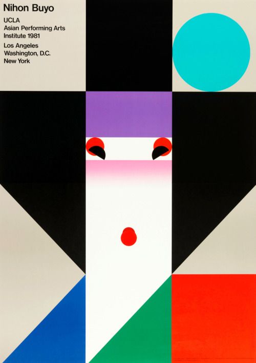
Japanese designers Ikko Tanaka pays attention to the ideographic function of visual elements. The poster of ” Nihon Buyo “(1981, Figure 2 ) with the face as the expression object. The work is consisting of squares and other geometrically equal shapes which is logically mechanical and rational. Tanaka tilted the two semicircles representing the eyes inboard. The processing produces an expression and forms a moving figure with a smile on his face. Looking through Tanaka’s work, the strongest feeling is his bold imagination and performance by vivid colors and images and some exaggerated expression to represent his strong emotion directly.
1.4 Conclusion
For the understanding of romanticism, we should profoundly understand and grasp their spiritual essence and cultural connotation, rather than blind worship and external use. The coexistence of rationalism and romanticism has its rationality. While criticizing the inheritance of history, we should combine it with the characteristics of the modern era. Any design style and genre should be good at “taking the essence and going to the dross” to achieve the best of the world and keep pace with the times.
A Forgotten designer (Hannah Höch)
1.1 Introduction
This blog is to analyze the work designed by Hannah Höch who was a “forgotten” Dada designers refers to reading Plotting the Historical Pipeline of Women in Graphic Design written by Jane Connory.
1.2 Dada with Gender
Dadaism has profoundly influenced the society of the early 20th century. This wave of power from the imaginary is as a way of thinking art rather than an art form. It eases the split human soul in the context of World War I by all things with “anti-,” even the art itself and deconstructing everything.
Dada has played an important role in history from the perspective of art, politics, and society. However, what was ignored by the public is it is a force consolidating by the white male system, while the contemporary female artists, who had same ideological form and creative context, was seen by the public in the first decade of their death, and regained the right to speak at the end of the 20th century.
1.3 Hannah Höch as an originator of photomontage
National Gallery of Art (2006) concludes that during the Weimar period, Hannah is best known for her work. When she was one of the originators of photomontage. It is a type of collage in which the pasted items are actual photographs or photographic reproductions pulled from the press and other widely produced media.
She chose this form to express some split in mind, including the presentation of women, gay images and ridicule of the beauty industry, and the issue of racial discrimination. Hannah Hoch, born in Germany, is not easy to create and design. Jane (2017) represented that “While they all start from an assumption of gender equality; their voices reveal that a woman’s freedom to pursue a graphic design career has been a struggle against the established social order and its gendered expectations.” Because of Hannah’s creative theme and the time, she was not only suppressed by the Weimar regime but also called “degenerates” by the art circles at that time. However, Hannah Hooch’s later works broke away from the veins of Berlin’s Dadaism and moved to a graphic design that only used different elements to create collages, until the work on the afternoon of her life continued to pay attention to social issues.
Cut with the Kitchen Knife Dada through the Last Weimar Beer-Belly Cultural Epoch in Germany (1919, Figure 3) is one of her essential pieces. Hawke’s photo collages intelligently reflect Weimar’s diverse social cross-section in Germany by splitting and disintegrating to show her face as a feminist Dada pioneer.
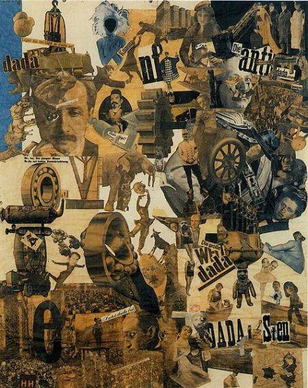
The genre of Dadaism likes its name ( a group of people casually flipped the word out in the dictionary), pursues accidental and meaningless. Collage is a manifestation of Dadaism. Collages are often fragments of magazine photos, often deliberately combined into anti-logic works. One of the Berlin Dadaists who made this integrated photo technique perfect was Hannah Hoch (1889-1978), and Hawke’s combined photo was extremely sensitive because her work brought together many of the things that were discussed at the time. The topic, through the manifestation of hasty chaos, contradictions, and irony, her work not only promotes Dada’s absurdity and illogical, but also redefines the two most exciting developments in the German Weimar Republic, namely the role of women’s society. The explosive growth of the mass media has made a sharp and insightful comment.
1.4 Conclusion
In Hannah Hoch’s work, she showed an integrated theme and mixed the selective cut photos in a seemingly accidental way. Hannah showed her picture in the lower right corner together with a European map pie showing the progress of women’s liberation. She realized that both women and Dada must incite the society that was she created a powerful visual manifesto of this belief.
As the most outstanding female artist in the Dada art circle of male hegemony, there are countless reasons for Hooch to fight for women’s rights, but he has never preached in his works. Even with a clear political theme, Hoch can introduce the subject without hurting its sharpness. She widely accepts various forms of aesthetics. Whether it is an absurd parody of social issues, almost abstract graphics experiments, or bizarre dreams, she is treated with equal calmness.
Reference List
Hannah, H 1919, Cut with the Kitchen Knife Dada through the Last Weimar Beer-Belly Cultural Epoch in Germany, New York, viewed 8 April 2019.
Ida Engholm & Karen Lisa Salamon 2017, ‘ Design thinking between rationalism and romanticism,’ Artifact, vol.5, issue 1, pp. E1.16, viewed 8 April 2019,
https://lms.monash.edu/pluginfile.php/8323636/mod_resource/content/1/12.%20Design%20Thinking%20Between%20Rationalism%20.pdf
Ikko, T 1981, Nihon Buyo, graphic design, Japan, viewed 8 April 2019.
Jane, C 2017 ‘ Plotting the Historical Pipeline of Women in Graphic Design,’ DHARN, viewed 8 April 2019,
http://dharn.org.au/plotting-the-historical-pipeline-of-women-in-graphic-design/
Nazareno, S 2017, ‘Romanticism,’ Nazareno Scibilia Blogs weblog post, 27 January, viewed 8 April 2019,
http://blogs.plos.org/plos/2011/06/open-access-megajournals-%e2%80%93-find-out-more-in-estonia/
National Gallery of Art 2006, Hannah Höch, viewed 8 April 2019,
http://www.understandingwar.org/sites/default/files/SectarianandRegionalConflictintheMiddleEast_3JUL.pdf
Ruihan, L 2019, the Logo of See You Tomorrow, viewed 8 April 2019.
