Huijun Huang
In today’s society, sometimes women are still living in the shadow of men. This phenomenon could be discovered from many parts of the community, such as the Australia graphic design field.
In reviewing Jane Connory’s article, “Women in Graphic Design”, she pulls out the fact that “despite women comprising more than 50% of GD graduates since the 1970s, only one woman, Dahl Collings, was included in the AGDA Hall of Fame.”[1]The statistic is showing how women designers are lack of getting recognition when comparing with male designers. The result from this is that many female designers have been forgotten or invisible by the community.
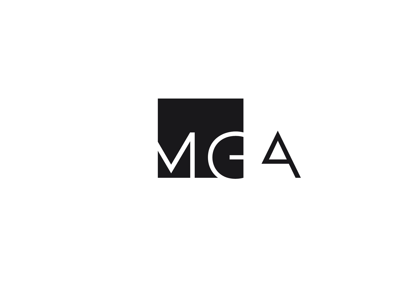
Figure 1.Lynda Warner, MGArchitecture.Interiors identity design, n.d, accessed on 10th, April 2019, https://www.warnerdesign.com.au
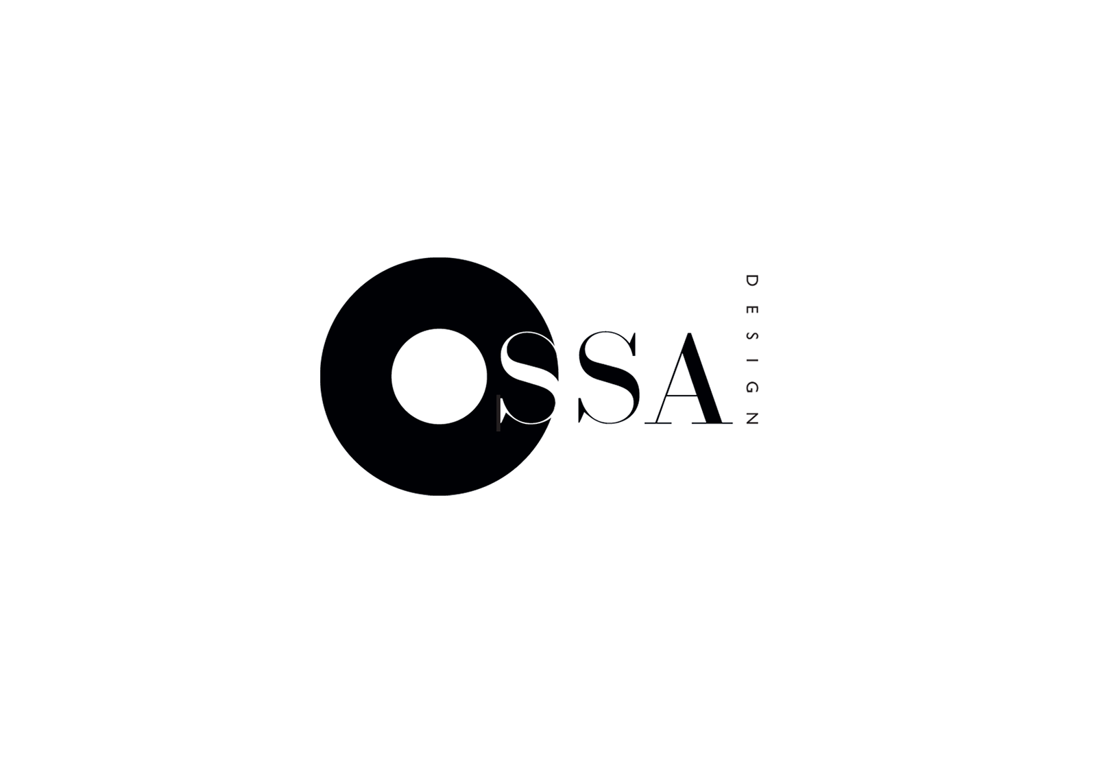
Within the field, people have discussed the different design choices made between male and female while they were doing design individually. People say, generally, women like “bright colours, surfaces replete with detail, curvy as opposed to straight lines.”Whereas men like “darker colours, surfaces devoid of detail and so on.”[2] However, I view that as a gender stereotype. Because of this kind of opinion with female designer, women’s ability could not be seen fully by people. My argument to that could be proved from looking at Lynda Warner’s works. Lynda Warner was one of the female designers who has experienced inequality during her career. Warner has been a significant graphic designer in Australia. Warner was one of eight designers invited to contribute a poster design for the 2000 Sydney Olympics. The other seven were men. Warner particularly has a love of typography. One of the identity design she designed for MGArchitecture.Interiors(figure 1) is solely type based. The design of the logo is simple, with only black and white colour used. These two colours give audience a feel of stability. In addition, the square shape under the letters gives the same impression, match with the colours. The font she created was in semibold with sharp edges. The logo could be view in two parts; the first part is the square at the left side, the second part is the “A” on it own at the right side. As the letter “A” has one stroke missing which makes it almost looks like an image of a roof or another thing. At most of the time, “such designs reference traditional sex roles rooted in sex-trait stereotypes, such as masculine strength and feminine gentleness.”[3] From my point of view, those design could be graphic or product design. However, logos like MGA is a successful gender-neutral design, which designed by female. The reason Warner has chosen to use those design elements(bold font and darker colour) in some of her works is to show the ability as a female designer. Not only male designer can call as profession, but female has also tried to be flexibility of using different colours and forms in their works to prove that they are profession as well. Other logos designed by Warner such as the logo for Tasmania floriculture association(figure 2) and Ossa design(figure 3) has shown the ability to include feminine gentleness in her design.

As mentioned in the article “women designers-is there a gender trap?”, In order becoming success in design field, except showing ability from designing works, gaining awards is also important. However, as “the majority of firms are established by men, the majority of awards are presented to male designers, and the majority of senior positions are held by men.”[4] Therefore, it is hard to reach gender equality, unless, people make changes from “established social order” and “gendered expectations.”[5]
References:
- Jane Connory, “Plotting the Historical Pipeline of Women in Graphic Design”, accessed 10 April, 2019, http://dharn.org.au/dharn2017/plotting-the-historical-pipeline-of-women-in-graphic-design/ ,1
- Gloria Moss, “The Implications of the Male and Female Design Aesthetic for Public Services”, The Innovation Journal: The Public Sector Innovation Journal, Volume 8(4), 2003: 2
- Drake, Carly K., and Scott K. Radford. “[Softly Assembled] Gender Performance through Products: Four Practices Responding to Masculine and Feminine Codes in Product Design.” Research in Consumer Behavior 19 (2018): 125
- Margaret Bruce & Jenny Lewis, “women designers-is there a gender trap”, Butterworth&Co(Publishers)Ltd, 1990: 119
- Jane Connory, “Plotting the Historical Pipeline of Women in Graphic Design”, accessed 10 April, 2019, http://dharn.org.au/dharn2017/plotting-the-historical-pipeline-of-women-in-graphic-design/ ,2