Forgotten Heroes – Margaret Calvert

By Leah Choo

When studying the history of design, the contributions and accomplishments of male designers are usually discussed. We learn of designers like Le Corbusier and Mies van der Rohe and their contributions to the Modernism movement. Even the artists and designers most commonly associated with the Bauhaus movement are men. According to the reading Women designers – is there a gender trap? Bruce and Lewis stated that “the majority of firms are established by men, the majority of awards are presented to male designers and the majority of senior positions are held by men. So the higher up the scale one goes, the less visible are women designers.” [1] Design has long been a male-dominated industry, resulting in women designers being marginalized and their contributions to design undervalued or forgotten.

Figure 1.

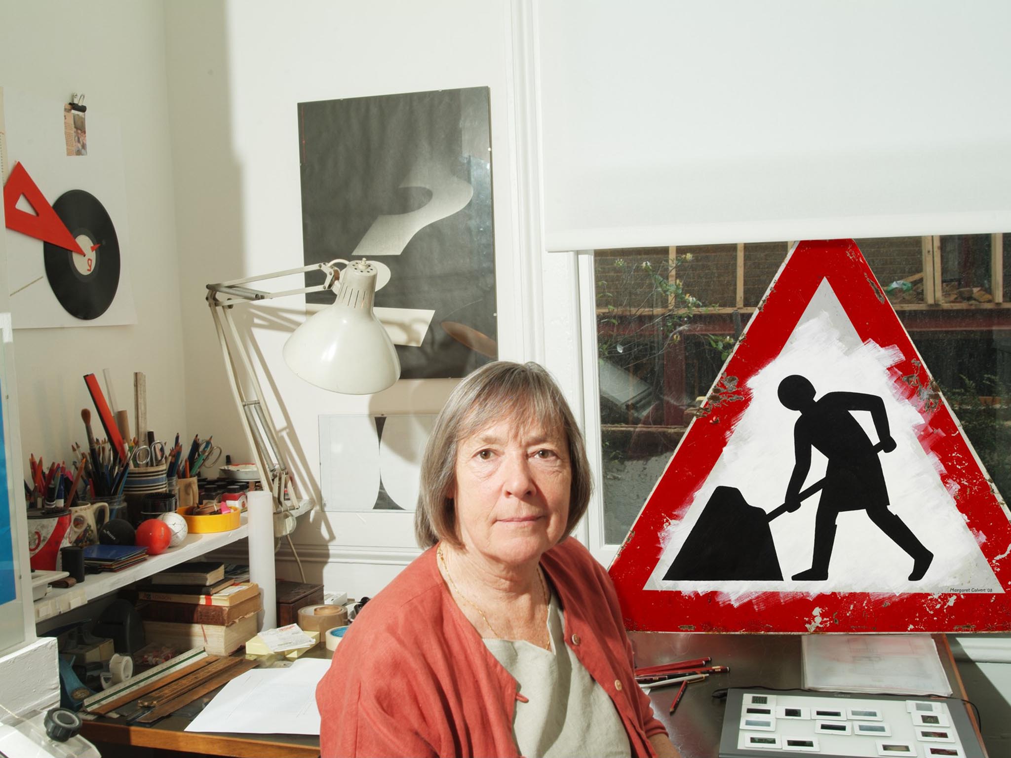
One of these ‘forgotten heroes’ is Margaret Calvert (Figure 1). Often called the ‘Mother of modern-day information design’ [2], Calvert played an important role in shaping the British landscape with her designs. Born in 1936, Calvert spent her earlier years in South Africa before moving to England with her family at aged 14 [3]. She attended Chelsea College of Art during the 1950s, where she did a four-year course in Illustration [4]. It was at Chelsea where she met graphic designer Jock Kinneir, who took her under his wing and asked her to assist him in designing the new wayfinding signage at Gatwick Airport [5].

Figure 2.

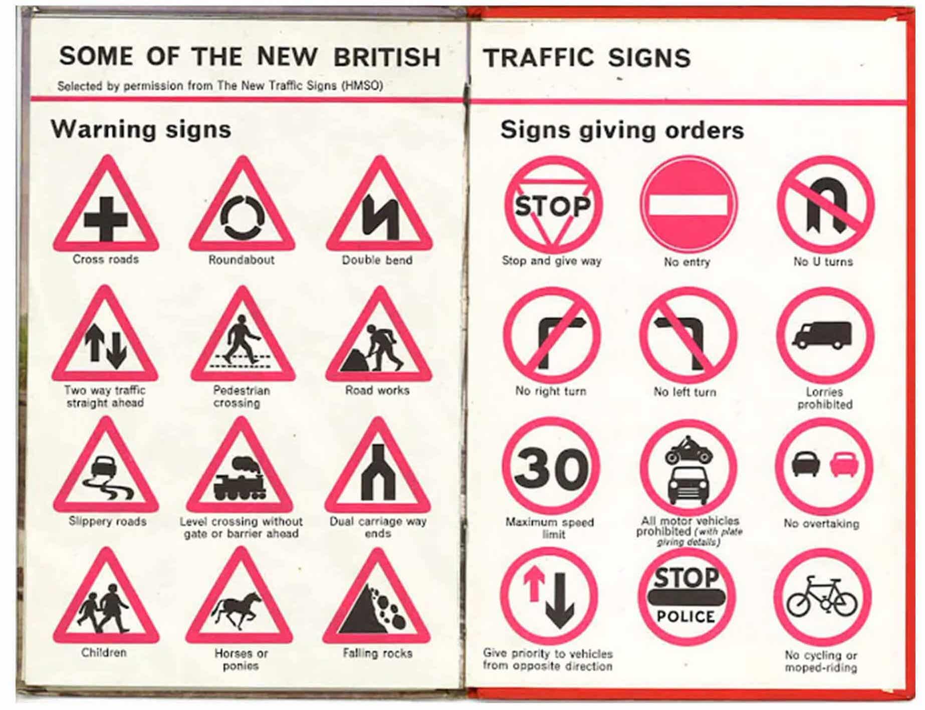
Under Kinneir’s tutelage, Calvert developed a considerable interest in lettering [6]. In 1957, Kinneir and Calvert were commissioned to design a road system for the new motorways [7].

Figure 3.
Figure 4. Rail Alphabet

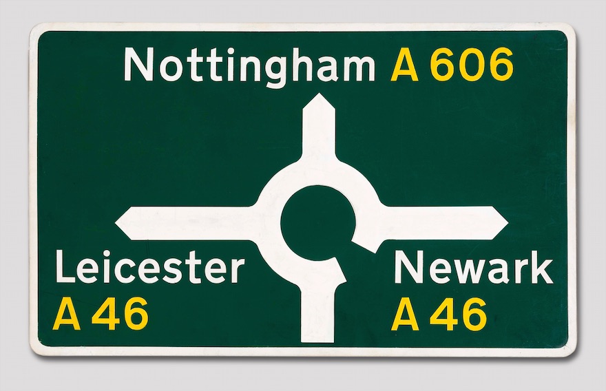
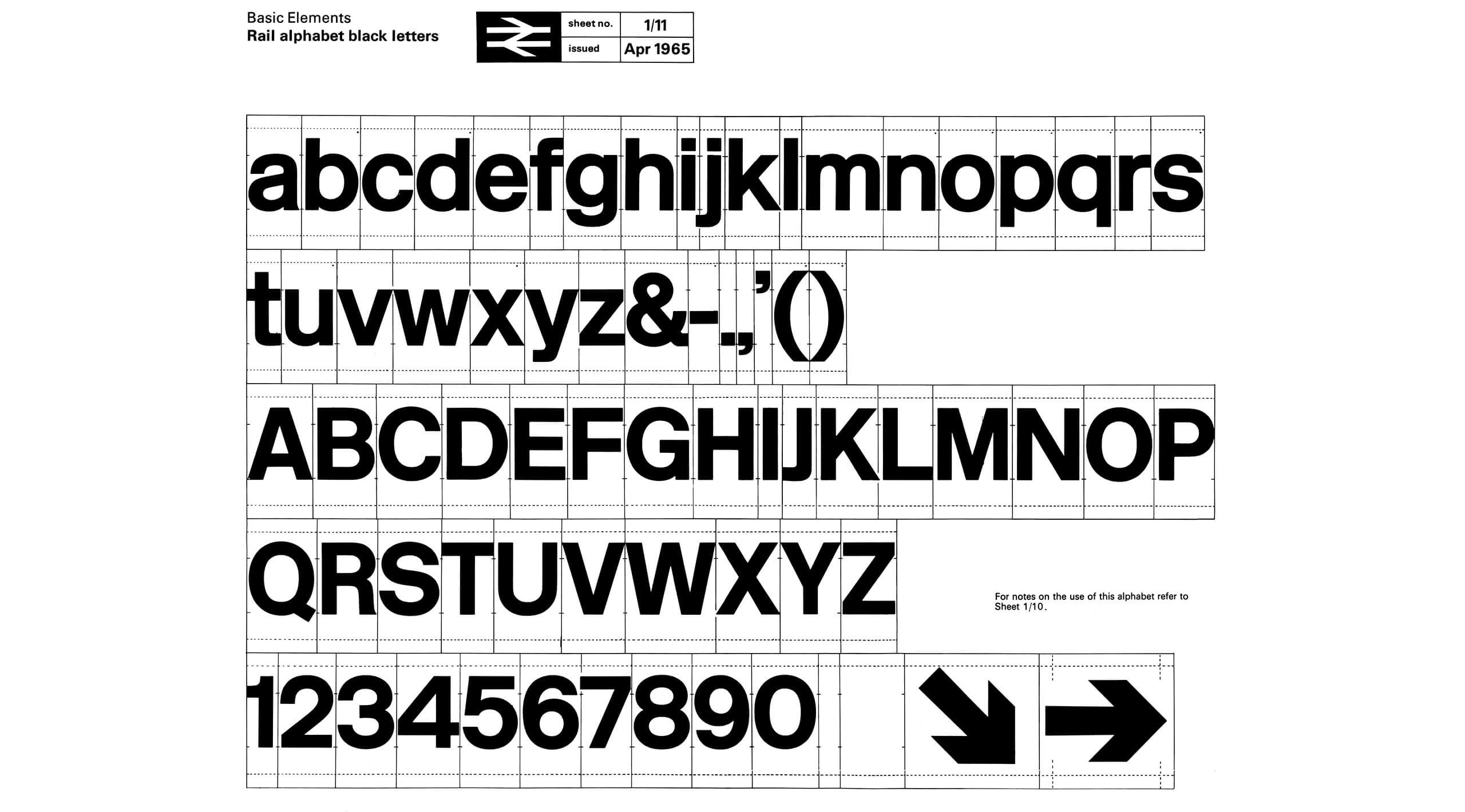
Together, they developed an “easy to understand graphic language that lives on every signpost and roadside sign” throughout the country (Figure 2), along with two sans-serif typefaces – Transport (Figure 3), which was used for road signs and Rail Alphabet (Figure 4), which was used for the British Railway System [8].

Another one of Calvert’s iconic designs is the pictogram on the ‘children crossing’ sign. The original sign was a boy wearing a cap and carrying a satchel, however Calvert decided to change it to a girl leading a boy by hand. “There was a different attitude to schooling coming in and I thought, wouldn’t it be nice to turn it around and have a girl leading a small boy.” [9]

50 years later, we’ve become so accustomed to seeing these signs that we often take them for granted, forgetting about the heroes and their efforts in creating them. It is interesting to note that when we learned about British designers, only the work of Edward Johnston for the London Underground was discussed, despite Calvert’s work having a bigger impact on the design of Britain’s landscape. The fact that the contributions of Calvert has gone unnoticed, despite the influence her work has had in shaping design history, confirms the gender-equality that still exists in the design world today.

References

[1] Margaret Bruce and Jenny Lewis, “Women Designers — Is There a Gender Trap?” Design Studies 11, no. 2 (1990): 119

[2] “Margaret Calvert – the mother of modern-day information design” Hatched London. February 6, 2018. Accessed 12 April 2019, https://hatchedlondon.com/margaret-calvert-the-mother-of-modern-day-information-design/

[3] “Margaret Calvert” Famous Graphic Designers. Accessed 12 April 2019, https://www.famousgraphicdesigners.org/margaret-calvert

[4] Ibid.

[5] Jen Dennis, “Quick Design History: Margaret Calvert #ThrowbackThursday” Shillington Education. June 25, 2015. https://www.shillingtoneducation.com/blog/margaret-calvert-tbt/

[6] Ibid.

[7] Ibid.

[8] Ibid.

[9] Caroline McClatchey, “The road sign as design classic” BBC News Magazine. December 9, 2011. https://www.bbc.com/news/magazine-15990443

Between Two Worlds

by Leah Choo

From the 2nd of December 2018 to the 7th of April 2019, the National Gallery of Victoria held an exhibition that featured the works of renowned Dutch artist M. C. Esher in collaboration with acclaimed design studio nendo [1]. Titled Between Two Worlds, the exhibition featured an expansive collection of Escher’s work made over the course of his career and were presented within multiple exhibition spaces designed by nendo.

The works of Escher were divided into 6 different themes, with nendo designing a space for each theme. Drawing on Escher’s fascination with space, geometry and optical illusions, nendo created each exhibition space as a response to the artist’s work and ideas. The simplified form of a house – the exhibition’s signature motif – is a recurring theme throughout the exhibition. Varying forms and interpretations of the house motif can be seen in the design of each different space, resulting in a playful and immersive experience in which viewers can interact with their environments while also exploring Escher’s artistic vision. By turning the artist’s two-dimensional work into an intriguing three-dimensional space, viewers were drawn into the fantastic imagination of Escher and were able to experience his art in a more physical way.

Figure 1. House in Perspective, Photograph: Sean Fennessy 

In one space, titled ‘House in Perspective’ (Figure 1), black metal rods were installed within an all-white gallery to present Escher’s works exploring extreme perspectives and optical illusions [2]. The rods enabled the works to be displayed in a new spatial arrangement and were arranged in a rhombus-shaped layout around a centrally placed mirror structure. At first glance, the metal rods appear to be placed in a clutter, but the shape of a house is revealed – as seen in Figure 2 – as the viewer walks around the gallery and views them from different perspectives.

Figure 3. Transforming House, Photograph: Sean Fennessy 

In another, Escher’s lifelong research into the ‘regular division of the plane’ were presented in a split-level, 60-metre-long and 6-metre-high gallery that provided two different viewing experiences. The upper floor acted as a display space for Escher’s works and a viewing gallery that overlooked a house installation that occupied the lower floor. ‘Transforming House’ (Figure 3) appeared as a three-dimensional tessellation in which a row of four black houses gradually become a row of five white houses at the back of the room [3]. Viewers were encouraged to walk around and explore the space, discovering more of Escher’s works as they immerse themselves in the installation.

Looking at the exhibition from a design perspective, Between Two Worlds can be considered as ‘good design’ – in fulfilling its function of transcending the traditional gallery viewing experience, and also in its modernist aesthetics. When looking at it from a broader, sociological perspective, however, the notions of luxury and ‘good taste’ came to mind. Unlike the other exhibitions held at the National Gallery of Victoria, which are free for the public, the Escher x nendo exhibition seemed quite exclusive. From the $30 entrance fee to the compulsory booking of viewing timeslots, the ‘experience’ was only available to those with the economic means to enjoy it.

According to the reading A Conscious Luxury Experience in the Transformation Economy, the writer states that “with the democratization of traditional luxury value, high cultural capital and status is expressed through subtle behaviors and products that might not be necessarily expensive but signal social class and informed knowledge.” [4] Although the reading was referring to the practice of yoga as a luxury experience, the same ideas can be applied on this exhibition. During my visit to the exhibition, I couldn’t help but notice the few viewers who seemed to only care about getting their pictures taken with the installations, which got me thinking about how people consume luxury in order to appear to have ‘good taste’. As Pierre Bourdieu stated in his 1984 book Distinctions, museums are a place for the elite to flaunt their ‘cultural capital’ and ‘good taste’ [5].

References

[1] “Escher x Nendo | Between Two Worlds, National Gallery of Victoria (NGV), accessed April 12, 2019, https://www.ngv.vic.gov.au/exhibition/escher-x-nendo-between-two-worlds/

[2] Ibid.

[3] Ibid.

[4] Mora, Juliana L., The Yoga Industry: A Conscious Luxury Experience in the Transformation Economy, 2018, 13

[5] Bourdieu, Pierre, Nice, Richard, ed, Distinction : A Social Critique of the Judgement of Taste. (Cambridge, Mass.: Harvard University Press, 1984)