A Forgotten Movement – Redback Graphix and the Forgotten Art of Screen Printing

By Maksis Darzins

Australian design history is regularly omitted from formal design theory classes around the world but, more alarmingly, within Australia itself. After two years of formal design theory classes I have only just been exposed to the rich subculture of print making in Australia between the 1970’s and 1980’s.

This period was filled with underground poster collectives working to support minority political movements and marginalised societies through low cost printing methods, such as stencilling, lino cutting and, most importantly, screen printing.

Screen printing provided the production process for a raft of poster collectives that, because of this process, where able to produce vast quantities of brightly coloured and easily duplicated poster designs.

One of the most influential poster collectives was Redback Graphix, a poster company founded by Michael Callaghan in Sydney’s Griffith University in 1979.

Gregor Cullen became a key member of Redback Graphix when it moved from Sydney to Wollongong in 1980. Throughout Cullen’s time at Redback Graphix he used his talent to create posters about a range of serious social issues, which have almost all since been forgotten.

In 1983, Cullen designed a poster titled “Keep State Schools Great School” (Figure 1). This poster addressed the cost cuts that where being made by the Fraser Government to state schools at the time. The poster uses the typical bright colours and screen-printing techniques characterised by Redback Graphix to depict a group of students enjoying their state school education. The poster gets its message across using dark humour in the caption where Cullen has written “The rich get educated and the poor get unemployed”. This caption is designed to resonate with the audience, to alarm them about the seriousness of the cost cuts. This illustrates the positive impact Cullen has had on our society through the creation of his posters, and why we should remember him and his designs in contemporary visual culture.

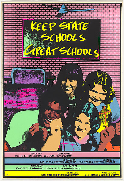
Figure 1: Keep State Schools Great Schools, by Gregor Cullen, 1983

Cullen also used his posters to address other serious issues such as racism in the work place (Figure 2) as well as to support local art shows and similar exhibitions (Figure 3). These posters were created in a familiar Redback Graphix style, while communicating completely different messages.

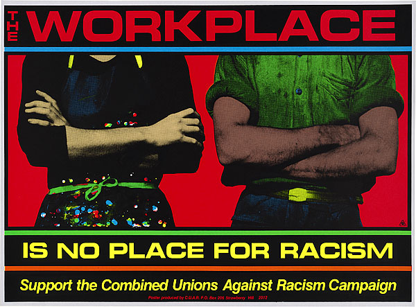
Figure 2: The Workplace Is No Place for Racism, by Gregor Cullen, 1985

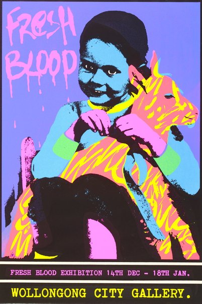
Figure 3: Fresh Blood, by Gregor Cullen, 1983

As digital technologies advanced, the artistry in poster making and silk screen printing was forgotten. The digital age lead to easy mass production of posters through new printing technologies. We see this nowadays as it is possible for anyone to print an infinite amount of full colour posters at the press of a button with minimal effort. This ease of manufacturing leads to an over-saturation of posters that pushes traditional poster designers out of their field.

The digital age has also allowed the greater population the ability to become poster designers. This means that anyone can jump on their computers, open a Microsoft Word document or an Adobe Illustrator artboard, and create a poster to push their message.

This is in stark contrast to the Redback Graphix process where the skills must be learned before a poster can be produced. To create a screen-printed poster the designer would have been taught in a more formal “master to student” way how to create designs, cut out stencils, lay ink and all of the tips and tricks in between. So, not just anyone could walk off the street, operate a screen printer and start creating posters. This extra element of artistry in poster making, supported by Redback Graphix, has since been forgotten and hidden from the wider population.

It is important that we understand and remember the art of print making that was so rich in Australia in the 1970’s and 1980’s, as promoted by artists such as Gregor Cullen at Redback Graphix, especially for its role in the formation of the current political and social construction of Australia.

References

Redback Graphix 1989, Redback Graphix: Now We Are 10 A Retrospective 1979 – 1989, The Impressionists, Camperdown NSW

Gregor Cullen, Gregor Cullen: About, viewed 11 April 2019 http://www.gregorcullen.com/gregor

National Gallery of Australia (NGA), Keep State Schools Great Schools, viewed 11 April 2019 https://artsearch.nga.gov.au/detail.cfm?irn=162786

National Gallery of Australia (NGA), The Workplace Is No Place for Racism, viewed 11 April 2019 https://artsearch.nga.gov.au/detail.cfm?irn=70772

Art Gallery NSW, Fresh Blood, viewed 11 April 2019 https://www.artgallery.nsw.gov.au/collection/works/103.1983/

Welcome to Wasteland: The Future of Design

By Maksis Darzins

As sustainability becomes more of a concern in our day to day lives, designers will be responsible for creating change that pushes away from the ideas of consumerism and mass production. Designers will have to use their skills to develop creative solutions for everyday activities with an ever-larger emphasis on sustainable and ethical design practices.

The Welcome to Wasteland exhibition shows positive steps to a cleaner future. The exhibition highlights the positive change being made by many architects, industrial designers, furniture designers and design researchers across Australia to achieve a cleaner future through transforming waste to functional products.

The Welcome to Wasteland exhibition was displayed at Compound Interest, which is a single room gallery hidden between Collingwood’s heritage town houses and ever-changing vibrant graffiti.

This single room was presented with all the exhibits positioned around the outer wall with a pile of materials used by the selected designers arranged in the centre. This material pile looked like a hard waste collection at first glace due to its porcelain shards, metallic tubes and industrial plastic off-cuts arranged in a haphazard construction.

After looking around the exhibition the first time it became clear that this collection of waste was a selection of materials that the designers had repurposed and reimagined into one of a kind products and furniture pieces.

One example of this is TeMo (Figure 1),a tensegrity table designed by Mark Richardson out of aluminium tubing with a plate glass top. The materials could have all been bought brand new from the local hardware store but instead Richardson repurposed the handles from old whipper-snippers that he found in hard rubbish collections or at waste transfer centres. These tubes where then held together with simple 3D printed brackets which could be made in house without any outsourcing which adds to the philosophy of sustainable design practices.

Figure 1: TeMo by Mark Richardson

This ingenuity was seen throughout the whole exhibition as these talented, progressive designers had turned materials such as marine plastic debris and spent coffee grounds into door knobs and functional stools.

From the whole exhibition the product that interested me the most was a cutlery set titled Grip (Figure 2). This product caught my eye through its use of organic curves and unusual shapes. Grip was designed by Sarah Ceravolo who is a Melbourne based designer who works mainly with the development of dynamic forms and generative technologies.

Ceravolo designed this cutlery set with the dynamic forms in mind as well as the overarching theme, from Welcome to Wasteland, of sustainability. This cutlery set was made out of HDPE plastic syringes that would have normally been thrown out as hospital waste. Ceravolo states on her Instagram that “Australian hospitals produce 260 million kilograms of solid waste each year”. This waste is currently disposed of after its short usage life, ending up in landfill across the country. Ceravolo’s work shows clearly that this hospital waste could easily be melted down and recycled into a vast variety of useful products, giving this saved landfill a second life.

Grip has an extra level of positive impact as the items have been designed specifically in their interesting forms to help individuals who have difficulty gripping traditional cutlery due to a lack of fine motor skills. This is what has dictated the thicker handle and unconventional geometry. This can be seen particularly well with the knife where the blade is located directly below the handle rather than, conventionally, at the end of a thin lever. The blade location means that the cutting force is not applied directly from the wrist but from further up the users arm, making it easier to apply the required force.

Figure 2: Grip by Sarah Ceravolo

The idea of designing for a specific purpose also resonated with the Welcome to Wasteland exhibition, as it means the product will have a longer life. The Grip, for example, will always serve their stated purpose and will not simply be disposed of after one use like plastic cutlery would, or be replaced once they go out of fashion, as homeware and fast fashion items tend to do.

This exhibition has made me think more about how I work in my own design process. I have started to think twice before buying new materials, seeing if I can possibly use recycled materials, upcycling waste, or whether the product is even worth making, that is, will the product’s positive impact out weigh its negative environmental impact.

This was a great exhibition for any design student to see as it promoted cleaner design practices and stimulated design ideas through the adaption of unusual materials, while clearly showing the direction in which design is heading today.

Written by Maksis Darzins

References

Pieces of Eight, Sarah Ceravolo, viewed 7 April 2019, https://www.piecesofeight.com.au/collections/sarah-ceravolo

Convolo Design, About Concolo Design, viewed 7 April 2019, https://www.convolodesign.com/studio/

Ceravolo, S 2019, Instagram update, 25 March, viewed 7 April 2019, https://www.instagram.com/convolo_design/?hl=en

National Gallery of Victoria (NGV), Welcome to Wasteland, viewed 17 March 2019, https://www.ngv.vic.gov.au/program/welcome-to-wasteland/

Friends and Associates, Mark Richardson: TeMo, viewed 10 April 2019, http://solar.friendsand.associates/glass-aluminium-plastic-stainless-steel

Friends and Associates, Sarah Ceravolo: Grip, viewed 10 April 2019, http://solar.friendsand.associates/hdpe-polyethelene-stainless-steel