By Rochelle Oh
In November of last year I was lucky enough to find myself in London, sequentially visiting the never-ending string of extremely large, excellently curated, free exhibition rooms of the Tate Modern. Nearing the end of my journey and already thoroughly visually stimulated, a small blinking ticker filled with orange LEDs caught me off guard. “GOOD AND EVIL”, “NOTHING TO LOSE”, “SIGN OF MATURITY” declared the ticker. It was spouting Truisms, excerpts of a famous 1984 work by contemporary American artist Jenny Holzer [1]. These short, cryptic, subtly contradictory statements perfectly set the tone for ARTIST ROOMS: Jenny Holzer, the exhibition I was about to enter, which is full of iterations of the artist’s blunt, didactic phrases that engage, provoke, and confront.
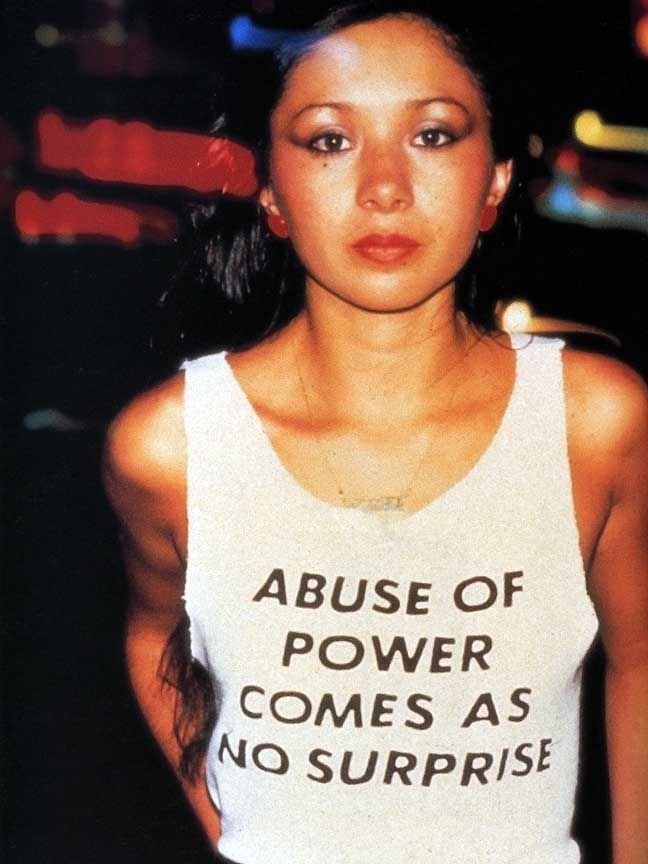
Jenny Holzer, Abuse of Power Comes As No Surprise from the series Truisms T-shirts,1980-, worn by Lady Pink. Photo: 1983 Lisa Kahane, NYC 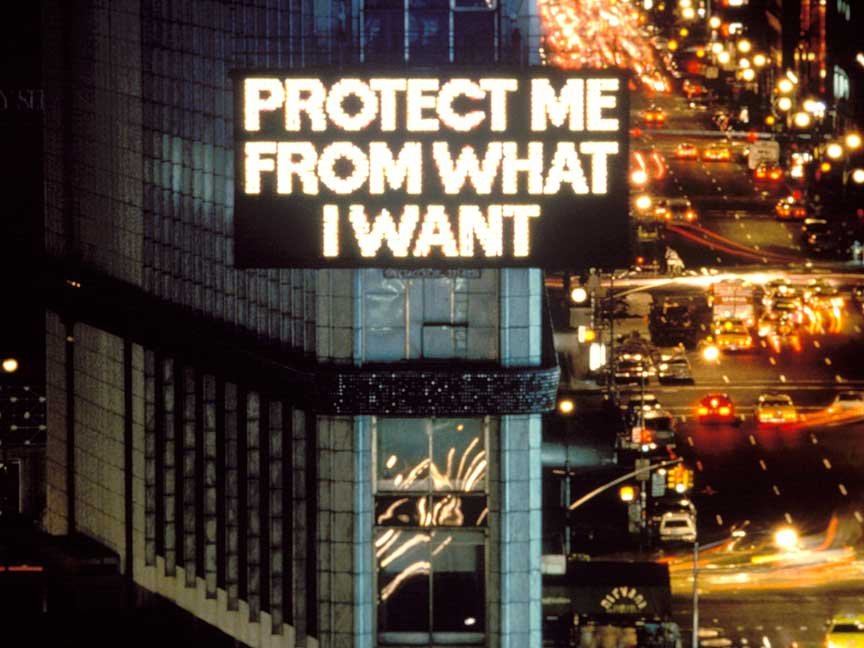
Protect Me From What I Want as part of Survival (1983–85), 1985, Jenny Holzer. Photo: John Marchael
Words are the basis of Holzer’s work. While ARTIST ROOMS: Jenny Holzer shows these words on tickers, stone benches, plaques, maps, and condoms surrounded by clean white gallery walls, these same words we surrounded by 70’s New York air, eyes and bodies first [2]. Holzer’s work has been pasted and illuminated on buildings and worn on t-shirts [3]. By infiltrating the so-called ‘public arena’, Holzer invaded advertising’s domain while advertising was still figuring out how to exploit every square metre of a city [4]. Through the display of a diverse range of perspectives as in Truisms and Inflammatory Essays (1979-82), some of which can be confronting, truth-baring and uncensored, Holzer challenges and disempowers the manipulative jargon advertising employs when dominating urban scapes [5]. Holzer’s work, as often the case with street art, encourages you to react and think critically, rather than blindly agree as advertising would have you, reclaiming space and filling it with minority voices.
Jenny Holzer’s Truisms (1977–79) and Inflammatory Essays (1979–82) as offset posters installed in, Seattle, Washington, USA, in 1984.
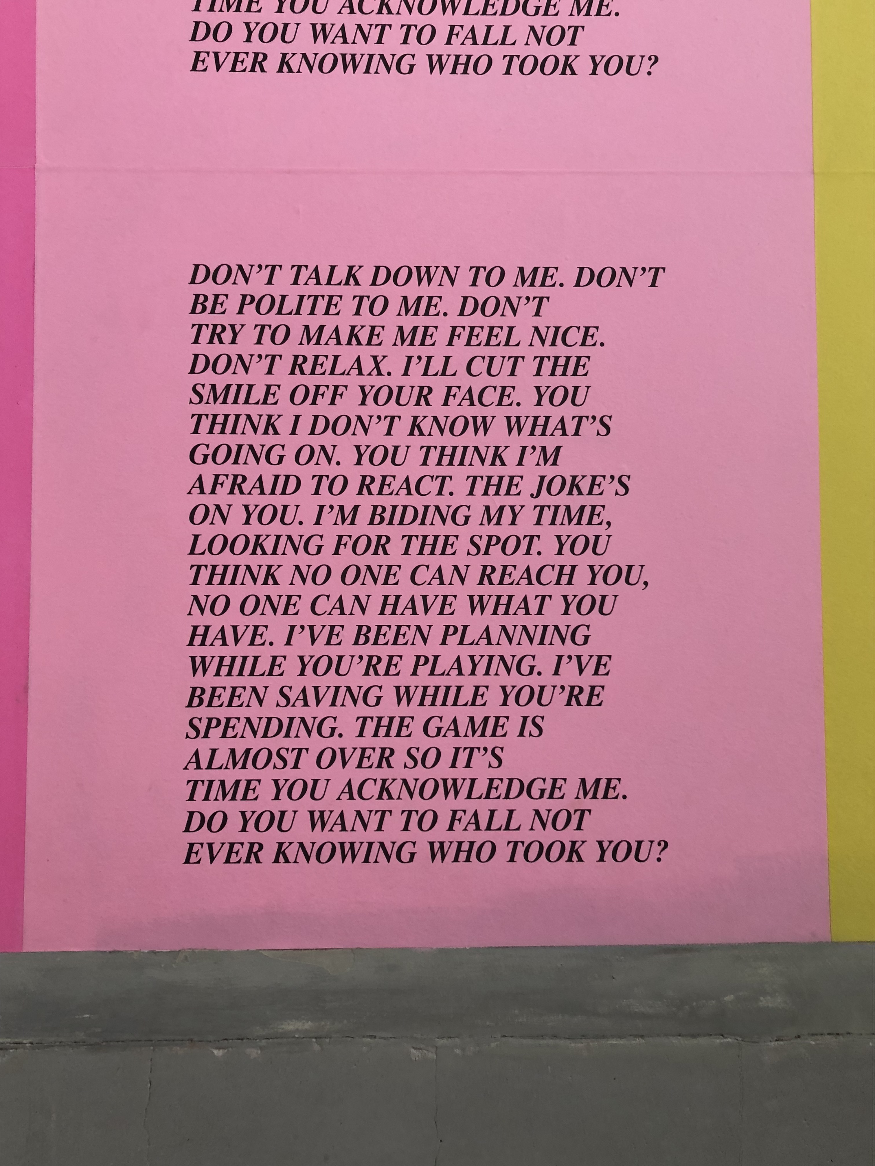
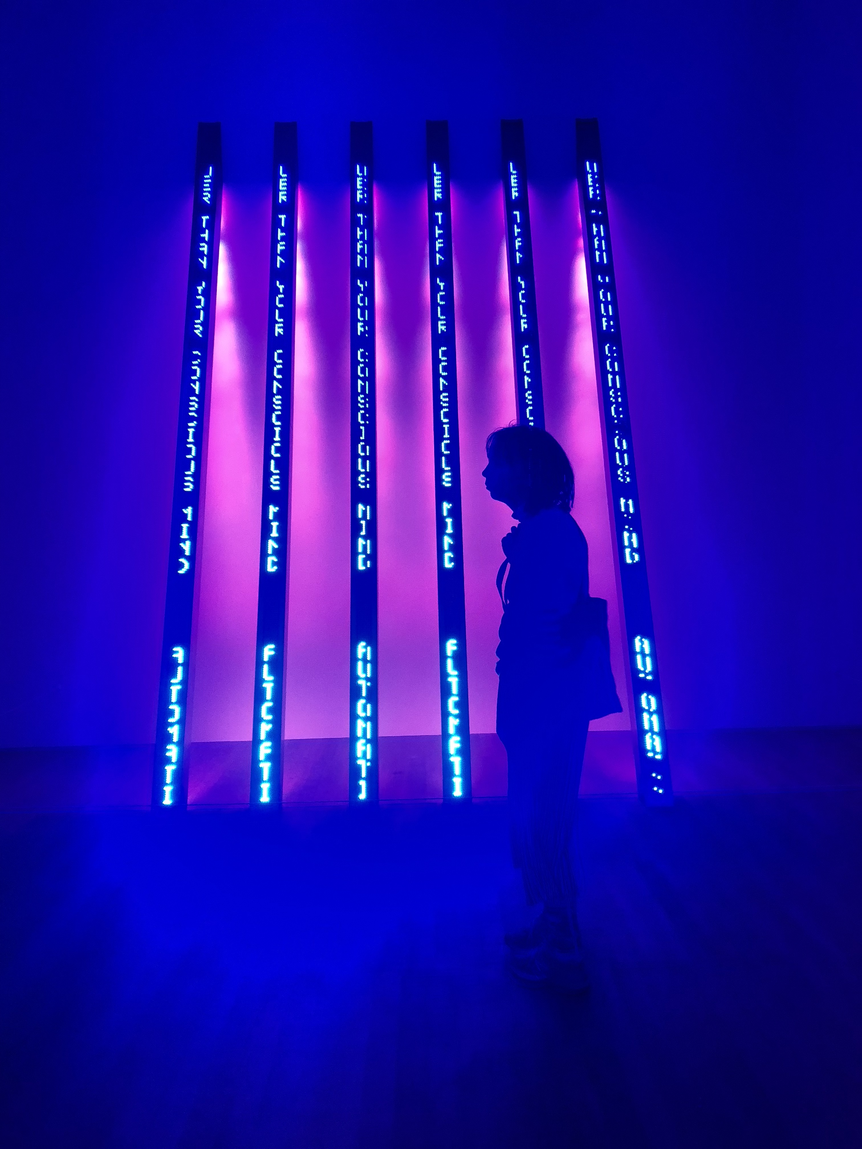
An Inflammatory Essay by Jenny Holzer (1979–82) at Tate Modern (2018). These were written by Holzer, but do not necessarily reflect her opinions. They are instead inspired by the opinions of others, from political theorists to religious fanatics. Photo: Rochelle Oh. 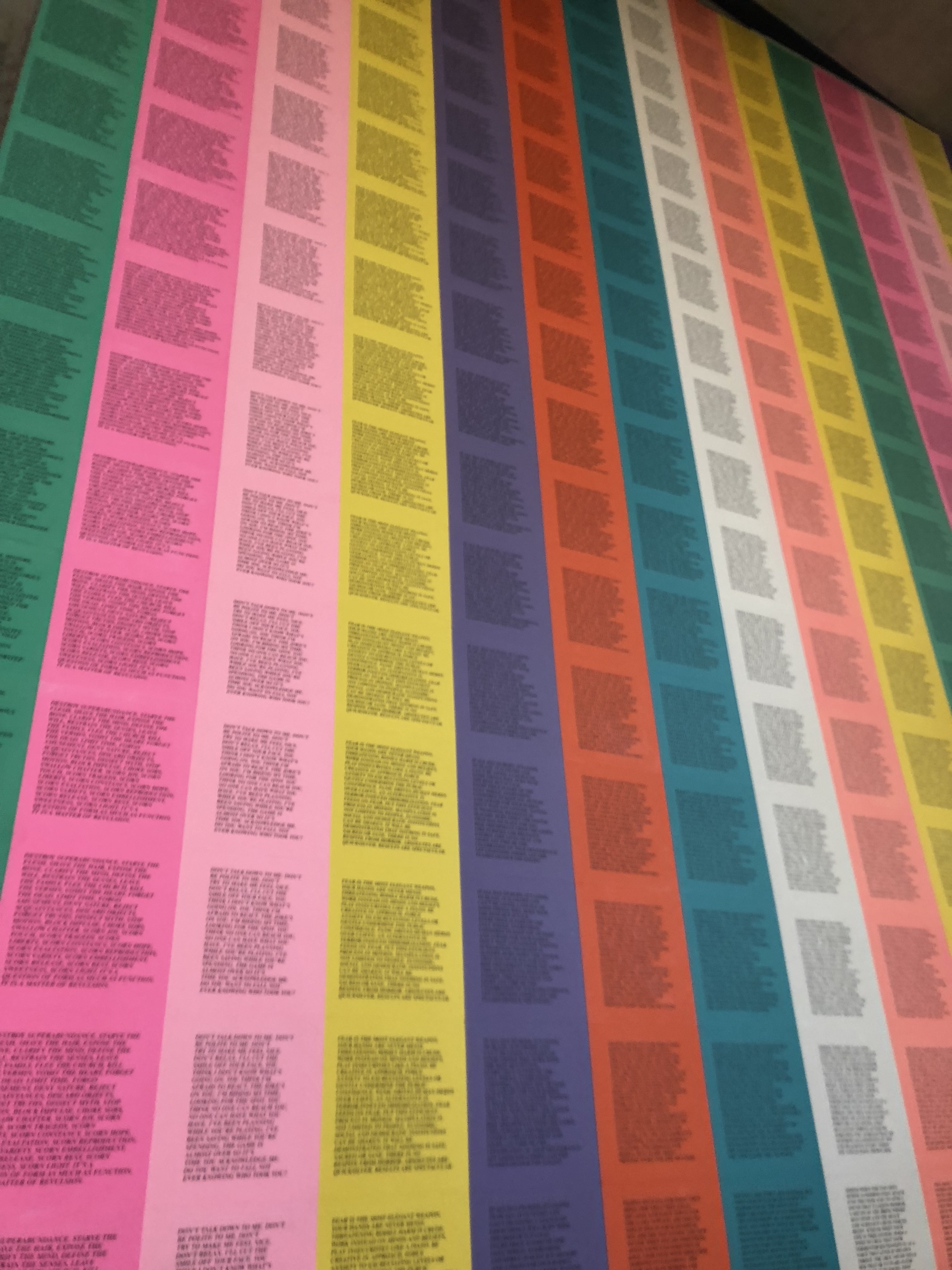
Jenny Holzer’s Truisms (1977–79) and Inflammatory Essays (1979–82) installed in Tate Modern. Photo: Rochelle Oh 2018. 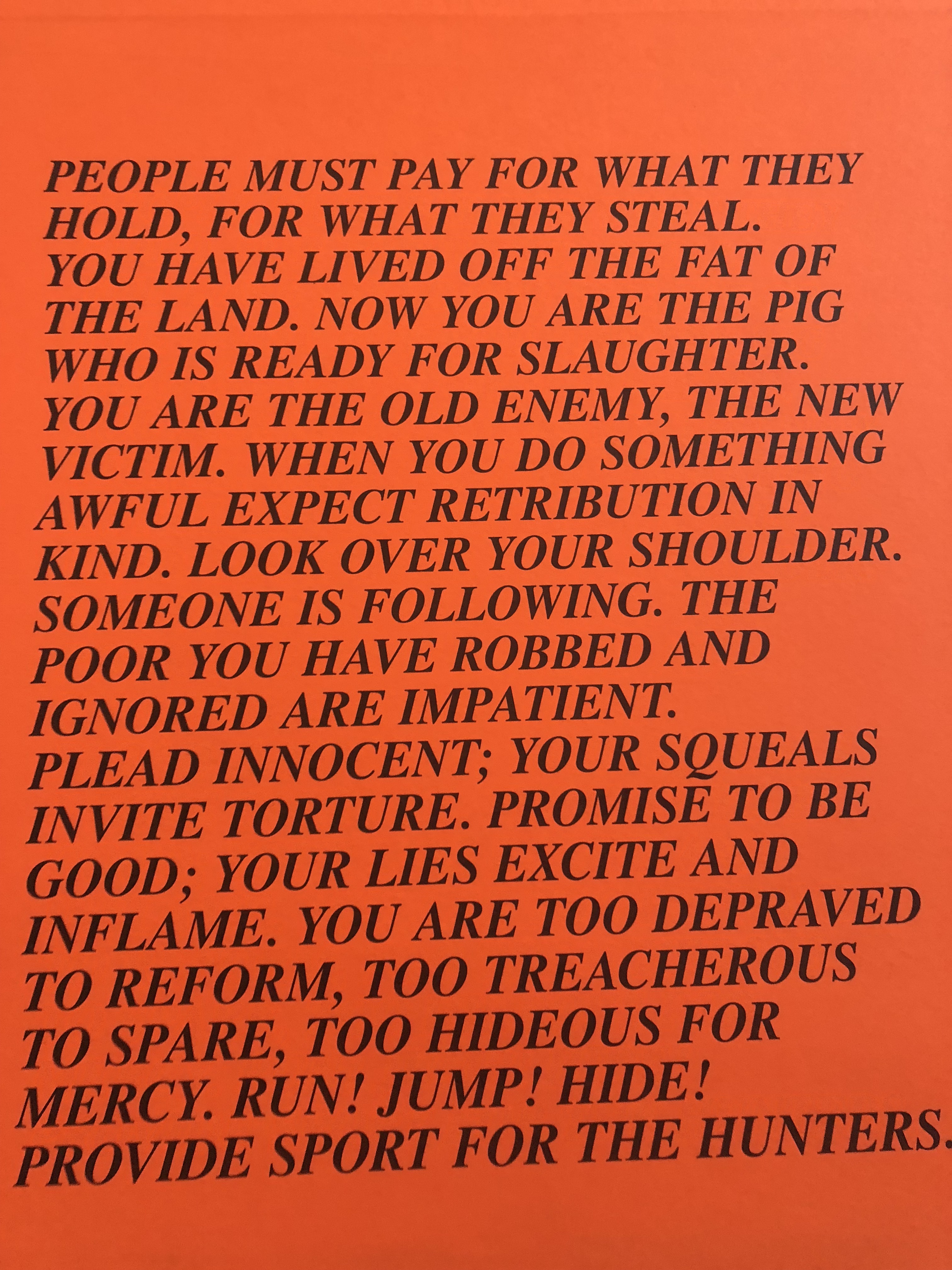
An Inflammatory Essay by Jenny Holzer (1979–82) at Tate Modern (2018). The bold, capitalised serifed text gives a sense of urgency and didacticism, the words demand to be read. Photo: Rochelle Oh.
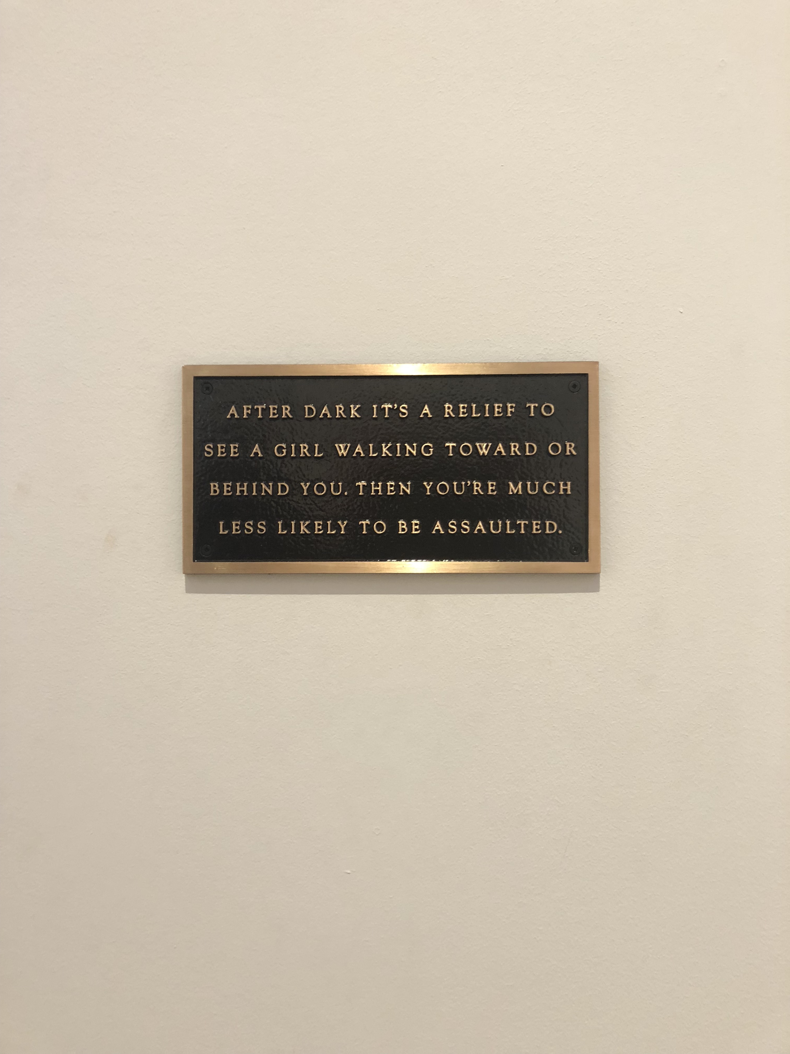
Roaming a city is a lovely everyday reminder of a the soft-porn placement of femme bodies [6] in our social and cultural narrative. The most I see myself in inescapable urban advertising is as a thin white orgasmic woman, the painted picture of patriarchal perfection [7]. Holzer protests this by replacing such imagery with words spawning from the oppressed mind, texts pertaining to the female experience, among other harsh truths. One such work is a bronze plaque reading: “After dark it’s a relief to see a girl walking toward or behind you. Then you’re much less likely to be assaulted.” This piece is a part of Holzer’s Living (1980-82) series. For some reason this plaque is bronze rather than aluminium like the others, and the letters are a thinner serifed font, but this is not why it stood out to me. While I couldn’t understand or appreciate the context and nuances many of Holzer’s other statements referenced, the only context necessary to deeply connect to this piece is an existence as a non-cis-male. It physically manifests a deep-rooted, unspoken feeling I have every time I’m alone at night, even in my own home. It confirms the existence of a sad truth and empowers in its exposition of the female experience.
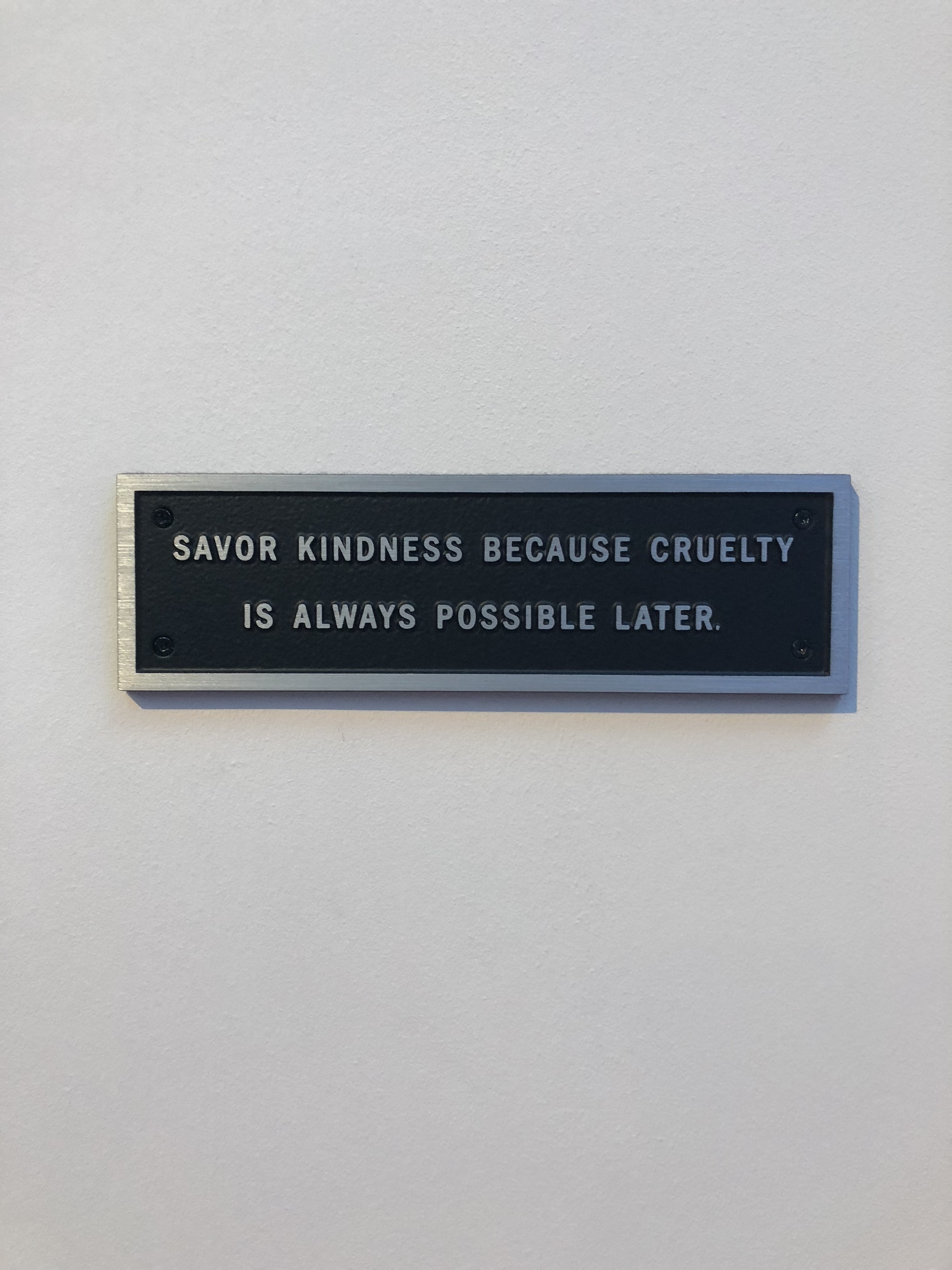
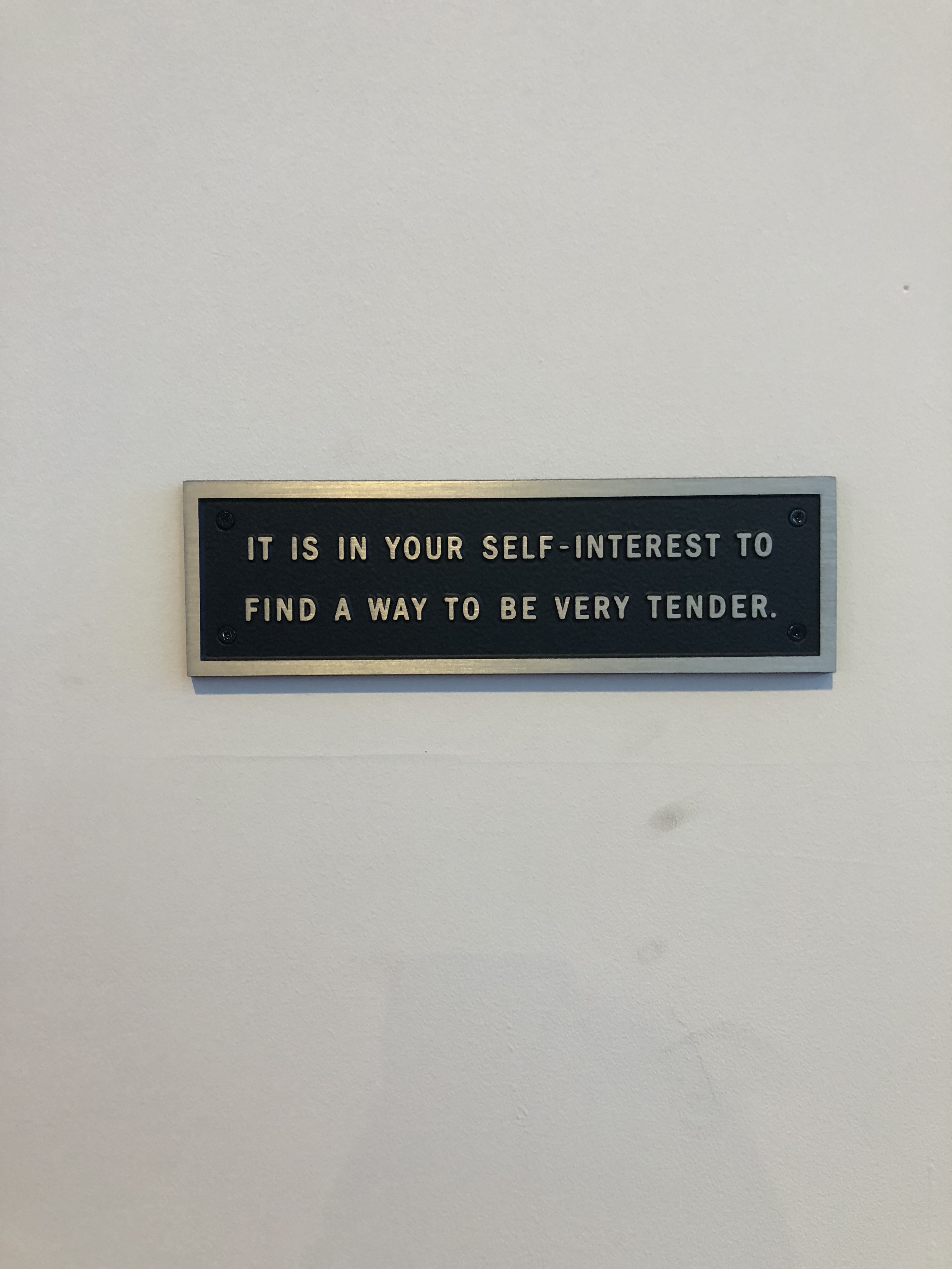
Various plaques included as part of Jenny Holzer’s Living series (1980-82) for ARTIST ROOMS: Jenny Holzer at Tate Modern. These plaques in particular seem to speak to the femme experience. Photos: Rochelle Oh 2018.
Much of the success of Holzer’s work probably (and I could be very wrong, but hear me out,) is due to its presentation as factual and informative. Although the content is frequently feminist, she does not use ‘feminine’ design codes to execute this. Form and colour palette is appropriate to its medium, making it’s feminist/social justice content more subtle and perhaps surprising. She avoids the immediate dismissal minority work subconsciously receives by using clinical, informative and rational codes – all of which are associated with masculinity. In the case of After Dark it’s a Relief to See a Girl.., the bronze capitalised letter forms present a solidity and actuality to the female experience, which is often dismissed as fiction or too-overwhelmed-with-emotion-to-be-taken-seriously. As said by the Tate themselves, “In contrast to fast-moving LED signs and posters that can be torn down, bronze makes passing thoughts permanent” [8].
Overall, I found Holzer’s exhibition at the Tate highly enjoyable. I was educated on an influential artist, amazed by the modern history she has created, had the pleasure of being immersed in it, and let it shape my own work. And if that isn’t the perfect gallery experience, I don’t know what is.
ARTIST ROOMS: Jenny Holzer is on at Tate Modern until 31 July 2019.
1. Tate, “ARTIST ROOMS: Jenny Holzer”, accessed March 29 2019, http://www.tate.org.uk /art/research-publications/the-sublime/ philip-shaw-modernism-and-the-sublime-r1109219.
2. Ewens, Hannah, “Jenny Holzer’s Art Is Powerful on and off the Screen” VICE, Oct 10 2017, accessed March 29 2019, https://www.vice.com/en_us/article/8x8bd5/jenny-holzers-art-is-powerful-on-and-off-screen
3. Tate, “5 ways Jenny Holzer brought art to the streets”, accessed March 29 2019, https://www.tate.org.uk/art/artists/jenny-holzer-1307/5-ways-jenny-holzer-brought-art-streets
4. Kalms, Nicole, “Hypersexualized media in urban space” Hypersexual City : The Provocation of Soft-Core Urbanism, Taylor and Francis, 2017. Accessed March 29 2019, https://lms.monash.edu/pluginfile.php/8323626/mod_resource/content/1/wk%206%20Kalms%20Hypersexual_City_The_Provocation_of_Soft-Core_Urba…_—-_%28Pg_64–84%29.pdf
5. Ibid.
6. Ibid.
7. Ibid.
8. Tate, “ARTIST ROOMS: Jenny Holzer”, accessed March 29 2019, http://www.tate.org.uk /art/research-publications/the-sublime/ philip-shaw-modernism-and-the-sublime-r1109219.