From July 21st to October 21st Xu Bing has held his solo summation exhibition ” Thought and Method” at Beijing Center for Contemporary Art[1]. This exhibition includes more than sixty highlight artworks over Xu Bing’s forty years of his artistic career. It presents a wide range of drawings, prints, painting, film documentary as well as mixed media installation art. The exhibition mainly focuses on Xu Bing’s thinking of methodology and motivation in his Chinese contemporary art. His works have responded to social contexts and the surroundings he lives by which have been divided into three sections in this exhibition. So that allows visitors an insight into Xu Bing’s three main turning points of his design thinking over forty decades.
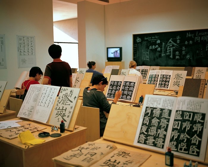
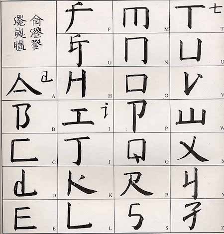
One of the highlight installation pieces is a mixed media installation called “Square Word Calligraphy Classroom.”[2] Its intention is to set up a classroom-like experimental workshop in a gallery space. The installation featured the basic principles of Xu Bing’s “New English Calligraphy” via instructional video, blackboard, and textbooks. Visitors were all invited to participate in the classroom and experience the new characters with ink and brushes.
In this artwork, Xu Bing has developed his lettering system using the English alphabet to resemble Chinese words. It’s a fusion of two different language system. From the textbook can find out that each English alphabet has slightly altered its form and shaped into a square-like structure, therefore the character takes on the ostensible form of a Chinese Character but remains legible to the English reader.
After emigrated to New York, Xu Bing engaged with Western norms as well as challenged at the narrow confines between Western and Chinese contemporary art. He commented on “Square Word Calligraphy Classroom” on his book that “original idea of this work is caused by the conflict between language and culture,[3] but in fact, this work shows how the cultural shift from one and other, how they communicate, and the convergence of things between the two countries. This classroom allows viewers to have an immersive experience in a new cultural environment which create by my lettering system. I want to give people a new perspective of the world through the artworks; let people realize that the basic way of thinking can be broken and changed.” Just as the visitors may first think about it was a classroom that teaches Chinese character, but when they participated in writing, they then found out they were actually writing English.
According to the paper “transformation of the Aesthetic: Art as Participatory Design” Participatory Design is the imposition of the already designed upon a situation, it is a way of making an argument for reversing the flow of information.[4]
In Xu Bing’s work, it not only emphasized how different languages can obtain in a new system. But also challenge the basic epistemic assumption. The work attacked viewer’s habitual thinking patterns that have been ingrained since they learned how to read.
“Square Word Calligraphy Classroom” also well established the notion of Environment Design, it has been introduced into two parts: an increased awareness of audience participation, and the realization that exhibition is not just overview but an exercise of interaction. More importantly, exhibition design is now shifting from displaying knowledge about a subject to the subject representing itself.
In conclusion, Xu Bing has engaged directly with Participatory design through his new letting system work. His real goal is to generate the logical transposition of two cultural conflicts, by engaging viewers participate in experimental work of learning new letters. The work remains viewers that the basic way of thinking can be broken and changed.
[1] Art, C. f. (2018, seven 21st). Xu Bing: Thought and Method. Retrieved from Center for Contemporary Arts
http://ucca.org.cn/en/exhibition/xu-bing-thought-and-method/
[2] Square Word Calligraphy. (n.d.). Retrieved from XU BING
http://www.xubing.com
[3] BingXu. (2015). 我的真文字. China: China CITIC Press Corporation.
[4] MathewHolt, “Transformation of the Aesthetic: Art as Participatory Design. “
Design and Culture, Vol. 7 No.2. 144.