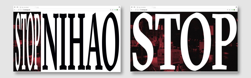
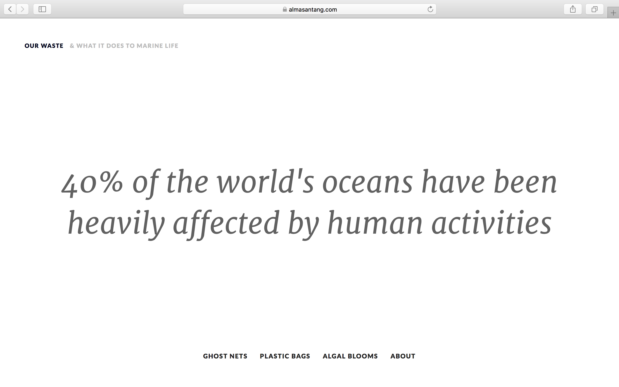
Written by Gokcan Selem
In the article of Good Taste vs. Good Design: A Tug of War in the Light of Bling, authors investigates the relationship between good design and good taste. According to Rampell, the basis of good design was formed by modernist values.1 In terms of graphic design, modernism developed visual design by centralising a function of form in order to minimise ornamentation and communicate with viewers for a commerce purpose.2 Ahl and Olsson mentions ‘form’ rather than ‘taste’. Good taste is similar with good form language, and Crozier adds that “an understanding of good form is based on subjective values.”3
I examine two similar design understandings which are based on modernism, and explore how individual taste in aesthetic is utilised to shape their visual communication.
International typography Style and my design understanding is based on the functionality of form so “form follows function” principle altered 20th century modernist ideology, and that shapes form according to function. In terms of graphic design, the ideology assimilated with the Bauhaus. The principle creates direct and simplistic communication between viewers and work to convey visual and textual information.4
Josef Muller Brockmann established the pioneer practitioner and theorist international typography style. He advanced using grid structure based on the golden ration, and created harmony and hierarchy between geometrical shapes, typography and images.5
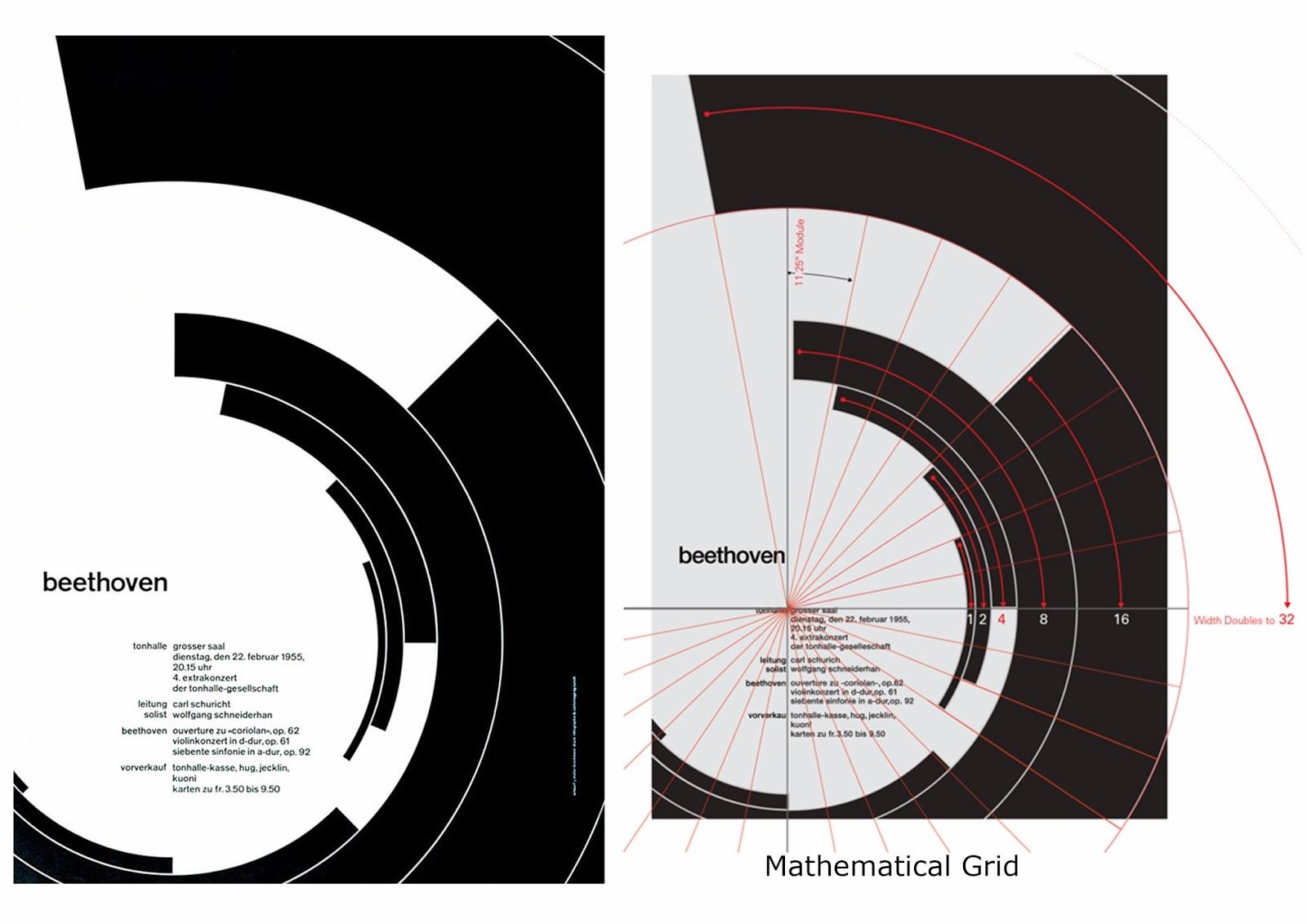
On the Concert Posters: II, Muller-Brockmann created a rich sense of harmony and melodic rhythm through the diameter of arc (see figure 1). The poster shows the visual reflection of Josef Muller’s understanding of design which is based on mathematical grid structure. The posters were designed to infer the visual representation of modern music. As the chosen colours are black and white, the poster represents a note on a manuscript paper. Also, the placement of typographic and geometric shapes creates unified form, and the shapes drive viewers’ eyes on to the text.7
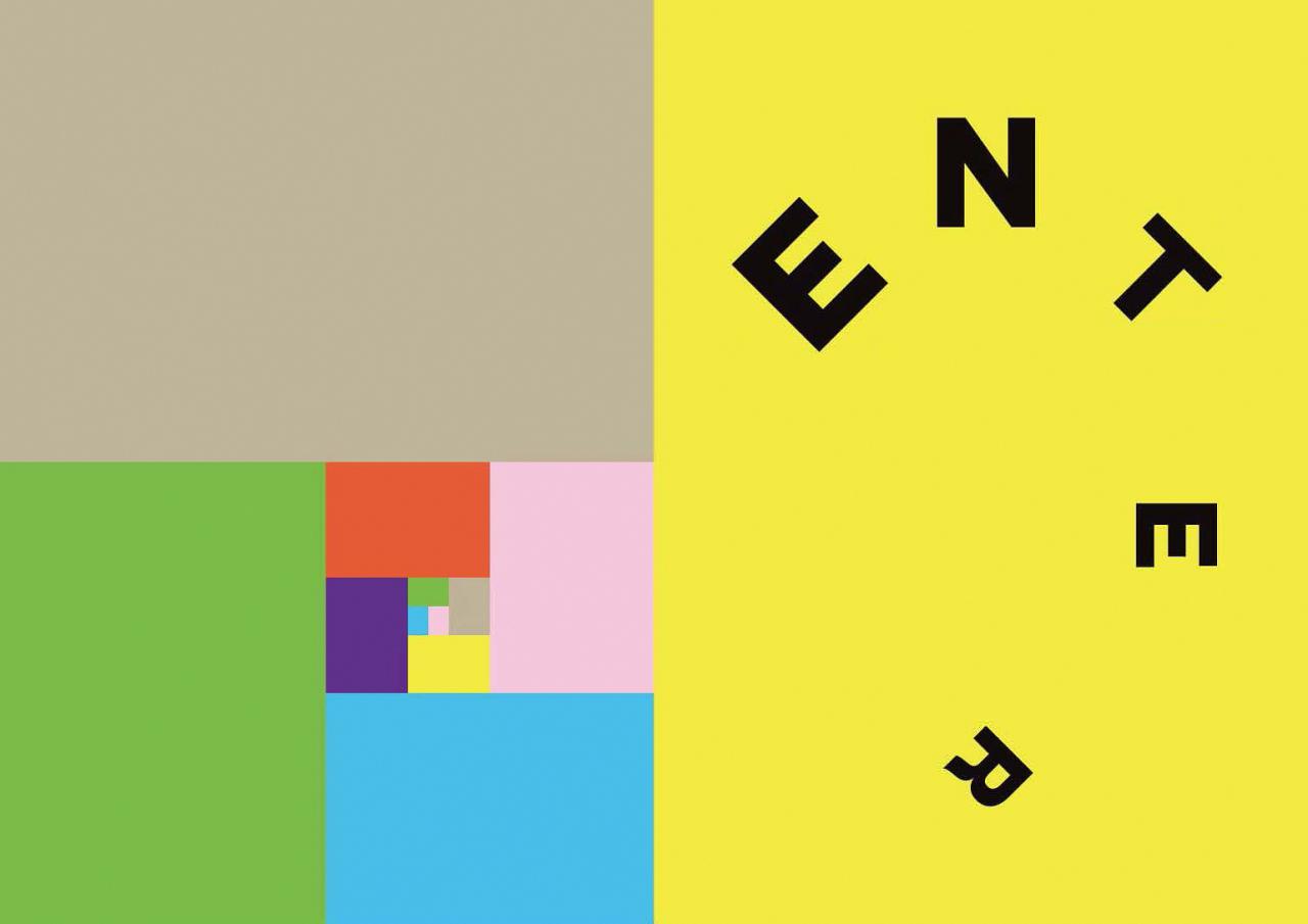
Figure 2. MDW by Gokcan Selem.
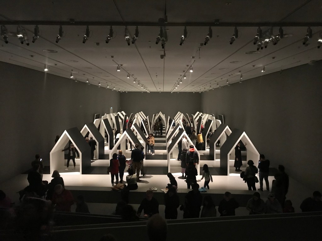
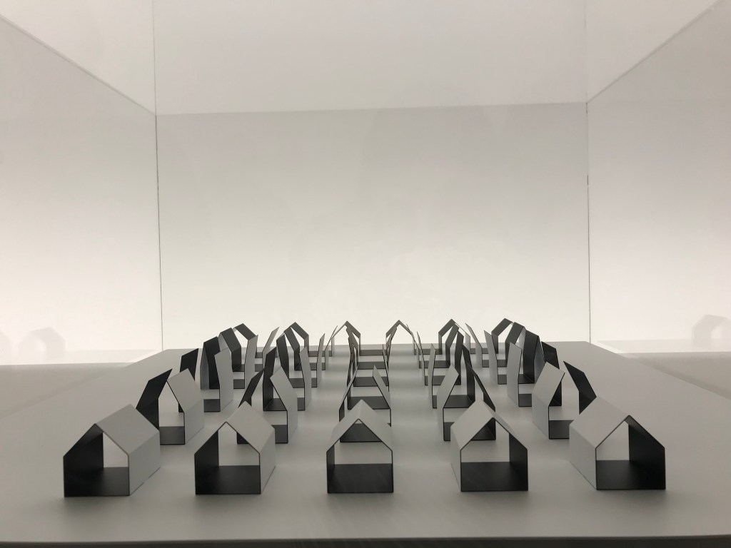
The project of Melbourne Design Week is designed for Branding for Design unit in second semester 2018 (see figure 2). The purpose of project is to design an identity and campaign, including online, internal applications, and public space which improve a brand perception in order to reach more audiences. Targeted audiences are those who are professionally in the industry, artists, students and people generally interested in design fields. The function of the annual event internally and nationally is to present the up to date direction of the design world, prepare audiences for the future, and debate current drawbacks and outcomes in the society.
So, I decided to utilise the vocabulary of movement because the lexicon meaning is similar to the functionality of Design weeks “a group of people working together to advance their shared political, social, or artistic ideas” The theme was visually applied on graphic elements throughout the project to create united textual and visual communication in order to convey the brand purpose.
The composition of poster is minimalistic, and has the letter M representing movement, which is placed at the focal point of the poster to highlight the theme of the event and which includes a gradient effect between background and font colours to visualise physical movement effect. At the bottom of the poster, the name of event and theme and date are placed according to hierarchy principles.
In conclusion, In terms of the Functionality of form differently formalised in two projects. Muller-Brockmann prioritises the placement of elements by his personal grid structure which provides the connection of text and shapes each other. The composition represents a sound wave including asymmetric but rhythmic forms of music. On the other hand, in my project, my major focus is the connection between textual meaning and shape in order to convey a direct message, and my design understanding is shaped based on design principles, and my personal aesthetic taste is seen as the selection, size and placement of design elements. As a result, good design and good taste integrates each other. A designing good design needs the judgment of good taste (form) which is shaped by modernism and subjective values. However, professional development and skill are one of the most effective element to create a well designed visual system, if who wants to provide creative visual communication instead of only utilising standardised design principles.
____________________________________________________________
1. Despina Christoforidou, Elin Olander, Anders Warell & Lisbeth Svengren Holm, “Good Taste vs. Good Design: A Tug of War in the Light of Bling.” The Design Journal 15, no. 2 (2012): 185-202.
2. Juliette Cezzar, “What is Graphic Design?,” AIGA, accessed April 26, 2019, https://www.aiga.org/guide-whatisgraphicdesign.
3. Despina Christoforidou, Elin Olander, Anders Warell & Lisbeth Svengren Holm, “Good Taste vs. Good Design: A Tug of War in the Light of Bling.” The Design Journal 15, no. 2 (2012): 185-202.
4. Philip B. Meggs and Alston W. Purvis, Meggs’ History of Graphic Design, 6th ed. (New York: John Wiley & Sons, Incorporated, 2016), 345-351.
5. Ibid., 405-407.
6. Josef Muller Brockmann, Zurich Tonhalle, 1955, offset, 127.5 x 90 cm, acceseed 26 May, 2019, https://www.behance.net/gallery/9862277/Mueller-Brockmanns-Beethoven-Poster-Geometric-Analysis.
7. Kerry W. Purcell, “Josef Muller Brockmann,” 1st ed. (New York: Phaidon Press, 2006), 161.