The More Of Less

By Yingge chen, from the series ‘more of less’ 2019

“the more of less” is a publication featuring a series of landscapes of Pyongyang the capital city of North Korea and Melbourne. Both Pyongyang and Melbourne are the most bustling city in their country. This photobook draws inspiration from the book ” [1]. The book conveys the message that there is more to be had in owning less. Joshua Becker also establishes his own “simplify life” rules through sharing different people’s life experiences and stories. To further develop the idea “the more of less” from the book. I transformed the text into a visual art form which offers more direct experience to people, allowing them to gain quick ideas of minimalism. This photobook is not just a book with splendid imagery but a simplify easy-read version of the textbook.

For a long period of time, North Korea has been described as weird, a dictatorship of the most extreme kind[2], however, I would like to provide a different perspective of North Korea in a design aesthetic way. Rather than its underdeveloped and closed-off, I found this place somehow matches the idea of minimalism. 1. Simple and minimal design elements: a lot of white space on the wall due to no advertisement.  2. The use of restraint: restrict color palette of all buildings as well as limiting content on everything. 3. One single standout element: all propaganda that you can see is mainly focused on the leaders and their greatness.

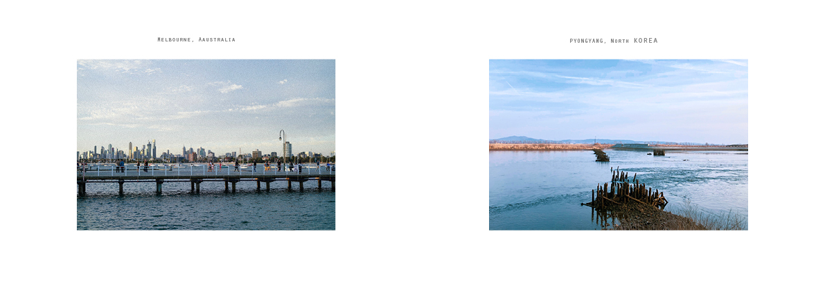
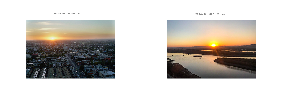
In order to better emphasize Pyongyang city’s minimalism, I have a look into Dianna Wells photograph work “On Edge” [3] which explores the transition and tension between the old pastoral and the new expanding urban landscape in Melbourne City. In her pictures shows the “tension point” between a suburb and nature view, which to tell people how a city has lost contact with nature gradually, she strongly features out the future of Melbourne’s fringe that is just about to happen.

by Dianna Wells, from the series ‘On Edge’ 2012

Like Dianna Wells’, I have involved critical design thinking throughout my work according to the article “Critical design as approach to next thinking.” [4]I used Melbourne urban footages as a comparison group to stand out Pyongyang’s natural environment. The emphasize focus on a future living situation: from Pyongyang city to Melbourne indicated the evolution of a suburbs development with future. My photographic works have expanded the social meaning of a clash between an urban living city and an underdeveloped but yet have a more natural environment country. which makes people consider their future and their own impacts on the environment as potential decision makers, questioning themselves what will be like in the future for a city that its natural landscapes are rapidly turning into urban development?

In conclusion, “the more of less” is trying to make people concerns about future space and living through critical thinking, by comparing Pyongyang’s natural landscapes and Melbourne city urban life. The work also drops a hint that Pyongyang would likely develop into Melbourne which lets people realize how our choices in the present could influence the future. Therefore I have urges that minimalism lifestyle would bring a more environmentally friendly future rather than excess production and consumption.


[1] Becker, Joshua. More Of Less Finding the Life you Want. America: Waterbrook Pr, 2018.

[2] Jakobsone, Liene. “Critical design as approach to next thinking.” The Design Journal, 2017: 20.

[3] Jordan, Caroline. DIANNA WELLS. 8 September 2012.

https://www.diannawells.com.au/new-blog/2019/3/25/on-edge-caroline-jordan.

[4] North Korea country profile. June 13, 2018.

https://www.bbc.com/news/world-asia-pacific-15256929.

Forgotten Heroes – Margaret Calvert

By Leah Choo

When studying the history of design, the contributions and accomplishments of male designers are usually discussed. We learn of designers like Le Corbusier and Mies van der Rohe and their contributions to the Modernism movement. Even the artists and designers most commonly associated with the Bauhaus movement are men. According to the reading Women designers – is there a gender trap? Bruce and Lewis stated that “the majority of firms are established by men, the majority of awards are presented to male designers and the majority of senior positions are held by men. So the higher up the scale one goes, the less visible are women designers.” [1] Design has long been a male-dominated industry, resulting in women designers being marginalized and their contributions to design undervalued or forgotten.

Figure 1.

One of these ‘forgotten heroes’ is Margaret Calvert (Figure 1). Often called the ‘Mother of modern-day information design’ [2], Calvert played an important role in shaping the British landscape with her designs. Born in 1936, Calvert spent her earlier years in South Africa before moving to England with her family at aged 14 [3]. She attended Chelsea College of Art during the 1950s, where she did a four-year course in Illustration [4]. It was at Chelsea where she met graphic designer Jock Kinneir, who took her under his wing and asked her to assist him in designing the new wayfinding signage at Gatwick Airport [5].

Figure 2.

Under Kinneir’s tutelage, Calvert developed a considerable interest in lettering [6]. In 1957, Kinneir and Calvert were commissioned to design a road system for the new motorways [7].

Figure 3.
Figure 4. Rail Alphabet

Together, they developed an “easy to understand graphic language that lives on every signpost and roadside sign” throughout the country (Figure 2), along with two sans-serif typefaces – Transport (Figure 3), which was used for road signs and Rail Alphabet (Figure 4), which was used for the British Railway System [8].

Another one of Calvert’s iconic designs is the pictogram on the ‘children crossing’ sign. The original sign was a boy wearing a cap and carrying a satchel, however Calvert decided to change it to a girl leading a boy by hand. “There was a different attitude to schooling coming in and I thought, wouldn’t it be nice to turn it around and have a girl leading a small boy.” [9]

50 years later, we’ve become so accustomed to seeing these signs that we often take them for granted, forgetting about the heroes and their efforts in creating them. It is interesting to note that when we learned about British designers, only the work of Edward Johnston for the London Underground was discussed, despite Calvert’s work having a bigger impact on the design of Britain’s landscape. The fact that the contributions of Calvert has gone unnoticed, despite the influence her work has had in shaping design history, confirms the gender-equality that still exists in the design world today.

References

[1] Margaret Bruce and Jenny Lewis, “Women Designers — Is There a Gender Trap?” Design Studies 11, no. 2 (1990): 119

[2] “Margaret Calvert – the mother of modern-day information design” Hatched London. February 6, 2018. Accessed 12 April 2019, https://hatchedlondon.com/margaret-calvert-the-mother-of-modern-day-information-design/

[3] “Margaret Calvert” Famous Graphic Designers. Accessed 12 April 2019, https://www.famousgraphicdesigners.org/margaret-calvert

[4] Ibid.

[5] Jen Dennis, “Quick Design History: Margaret Calvert #ThrowbackThursday” Shillington Education. June 25, 2015. https://www.shillingtoneducation.com/blog/margaret-calvert-tbt/

[6] Ibid.

[7] Ibid.

[8] Ibid.

[9] Caroline McClatchey, “The road sign as design classic” BBC News Magazine. December 9, 2011. https://www.bbc.com/news/magazine-15990443

The forgotten designer

Huijun Huang

In today’s society, sometimes women are still living in the shadow of men. This phenomenon could be discovered from many parts of the community, such as the Australia graphic design field. 

In reviewing Jane Connory’s article, “Women in Graphic Design”, she pulls out the fact that “despite women comprising more than 50% of GD graduates since the 1970s, only one woman, Dahl Collings, was included in the AGDA Hall of Fame.”[1]The statistic is showing how women designers are lack of getting recognition when comparing with male designers. The result from this is that many female designers have been forgotten or invisible by the community.


Figure 1.Lynda Warner, MGArchitecture.Interiors identity design, n.d, accessed on 10th, April 2019, https://www.warnerdesign.com.au

Within the field, people have discussed the different design choices made between male and female while they were doing design individually. People say, generally, women like “bright colours, surfaces replete with detail, curvy as opposed to straight lines.”Whereas men like “darker colours, surfaces devoid of detail and so on.”[2] However, I view that as a gender stereotype. Because of this kind of opinion with female designer, women’s ability could not be seen fully by people. My argument to that could be proved from looking at Lynda Warner’s works. Lynda Warner was one of the female designers who has experienced inequality during her career. Warner has been a significant graphic designer in Australia. Warner was one of eight designers invited to contribute a poster design for the 2000 Sydney Olympics. The other seven were men. Warner particularly has a love of typography. One of the identity design she designed for MGArchitecture.Interiors(figure 1) is solely type based. The design of the logo is simple, with only black and white colour used. These two colours give audience a feel of stability. In addition, the square shape under the letters gives the same impression, match with the colours. The font she created was in semibold with sharp edges.  The logo could be view in two parts; the first part is the square at the left side, the second part is the “A” on it own at the right side. As the letter “A” has one stroke missing which makes it almost looks like an image of a roof or another thing. At most of the time, “such designs reference traditional sex roles rooted in sex-trait stereotypes, such as masculine strength and feminine gentleness.”[3] From my point of view, those design could be graphic or product design. However, logos like MGA is a successful gender-neutral design, which designed by female. The reason Warner has chosen to use those design elements(bold font and darker colour) in some of her works is to show the ability as a female designer. Not only male designer can call as profession, but female has also tried to be  flexibility of using different colours and forms in their works to prove that they are profession as well. Other logos designed by Warner such as the logo for Tasmania floriculture association(figure 2) and Ossa design(figure 3) has shown the ability to include feminine gentleness in her design.

Figure 2. Lynda Warner, Tasmania floriculture association identity design, 1980s, accessed on 10th, April 2019, https://www.warnerdesign.com.au
Figure 3. Lynda Warner, Ossa design identity design, n.d, accessed on 10th, April 2019, https://www.warnerdesign.com.au

As mentioned in the article “women designers-is there a gender trap?”, In order becoming success in design field, except showing ability from designing works, gaining awards is also important. However, as “the majority of firms are established by men, the majority of awards are presented to male designers, and the majority of senior positions are held by men.”[4] Therefore, it is hard to reach gender equality, unless, people make changes from “established social order” and “gendered expectations.”[5]

References:

  1.  Jane Connory, “Plotting the Historical Pipeline of Women in Graphic Design”, accessed 10 April, 2019, http://dharn.org.au/dharn2017/plotting-the-historical-pipeline-of-women-in-graphic-design/ ,1
  2. Gloria Moss, “The Implications of the Male and Female Design Aesthetic for Public Services”, The Innovation Journal: The Public Sector Innovation Journal, Volume 8(4), 2003: 2
  3. Drake, Carly K., and Scott K. Radford. “[Softly Assembled] Gender Performance through Products: Four Practices Responding to Masculine and Feminine Codes in Product Design.” Research in Consumer Behavior 19 (2018): 125
  4. Margaret Bruce & Jenny Lewis, “women designers-is there a gender trap”, Butterworth&Co(Publishers)Ltd, 1990: 119
  5. Jane Connory, “Plotting the Historical Pipeline of Women in Graphic Design”, accessed 10 April, 2019, http://dharn.org.au/dharn2017/plotting-the-historical-pipeline-of-women-in-graphic-design/ ,2

Between Two Worlds

by Leah Choo

From the 2nd of December 2018 to the 7th of April 2019, the National Gallery of Victoria held an exhibition that featured the works of renowned Dutch artist M. C. Esher in collaboration with acclaimed design studio nendo [1]. Titled Between Two Worlds, the exhibition featured an expansive collection of Escher’s work made over the course of his career and were presented within multiple exhibition spaces designed by nendo.

The works of Escher were divided into 6 different themes, with nendo designing a space for each theme. Drawing on Escher’s fascination with space, geometry and optical illusions, nendo created each exhibition space as a response to the artist’s work and ideas. The simplified form of a house – the exhibition’s signature motif – is a recurring theme throughout the exhibition. Varying forms and interpretations of the house motif can be seen in the design of each different space, resulting in a playful and immersive experience in which viewers can interact with their environments while also exploring Escher’s artistic vision. By turning the artist’s two-dimensional work into an intriguing three-dimensional space, viewers were drawn into the fantastic imagination of Escher and were able to experience his art in a more physical way.

Figure 1. House in Perspective, Photograph: Sean Fennessy 

In one space, titled ‘House in Perspective’ (Figure 1), black metal rods were installed within an all-white gallery to present Escher’s works exploring extreme perspectives and optical illusions [2]. The rods enabled the works to be displayed in a new spatial arrangement and were arranged in a rhombus-shaped layout around a centrally placed mirror structure. At first glance, the metal rods appear to be placed in a clutter, but the shape of a house is revealed – as seen in Figure 2 – as the viewer walks around the gallery and views them from different perspectives.

Figure 3. Transforming House, Photograph: Sean Fennessy 

In another, Escher’s lifelong research into the ‘regular division of the plane’ were presented in a split-level, 60-metre-long and 6-metre-high gallery that provided two different viewing experiences. The upper floor acted as a display space for Escher’s works and a viewing gallery that overlooked a house installation that occupied the lower floor. ‘Transforming House’ (Figure 3) appeared as a three-dimensional tessellation in which a row of four black houses gradually become a row of five white houses at the back of the room [3]. Viewers were encouraged to walk around and explore the space, discovering more of Escher’s works as they immerse themselves in the installation.

Looking at the exhibition from a design perspective, Between Two Worlds can be considered as ‘good design’ – in fulfilling its function of transcending the traditional gallery viewing experience, and also in its modernist aesthetics. When looking at it from a broader, sociological perspective, however, the notions of luxury and ‘good taste’ came to mind. Unlike the other exhibitions held at the National Gallery of Victoria, which are free for the public, the Escher x nendo exhibition seemed quite exclusive. From the $30 entrance fee to the compulsory booking of viewing timeslots, the ‘experience’ was only available to those with the economic means to enjoy it.

According to the reading A Conscious Luxury Experience in the Transformation Economy, the writer states that “with the democratization of traditional luxury value, high cultural capital and status is expressed through subtle behaviors and products that might not be necessarily expensive but signal social class and informed knowledge.” [4] Although the reading was referring to the practice of yoga as a luxury experience, the same ideas can be applied on this exhibition. During my visit to the exhibition, I couldn’t help but notice the few viewers who seemed to only care about getting their pictures taken with the installations, which got me thinking about how people consume luxury in order to appear to have ‘good taste’. As Pierre Bourdieu stated in his 1984 book Distinctions, museums are a place for the elite to flaunt their ‘cultural capital’ and ‘good taste’ [5].

References

[1] “Escher x Nendo | Between Two Worlds, National Gallery of Victoria (NGV), accessed April 12, 2019, https://www.ngv.vic.gov.au/exhibition/escher-x-nendo-between-two-worlds/

[2] Ibid.

[3] Ibid.

[4] Mora, Juliana L., The Yoga Industry: A Conscious Luxury Experience in the Transformation Economy, 2018, 13

[5] Bourdieu, Pierre, Nice, Richard, ed, Distinction : A Social Critique of the Judgement of Taste. (Cambridge, Mass.: Harvard University Press, 1984)

Invading Urban Space: Jenny Holzer at Tate Modern

By Rochelle Oh

Friend Joëlle in front of Blue Purple Tilt (2007) by Jenny Holzer. Photo by Rochelle Oh.

In November of last year I was lucky enough to find myself in London, sequentially visiting the never-ending string of extremely large, excellently curated, free exhibition rooms of the Tate Modern. Nearing the end of my journey and already thoroughly visually stimulated, a small blinking ticker filled with orange LEDs caught me off guard. “GOOD AND EVIL”, “NOTHING TO LOSE”, “SIGN OF MATURITY” declared the ticker. It was spouting Truisms, excerpts of a famous 1984 work by contemporary American artist Jenny Holzer [1]. These short, cryptic, subtly contradictory statements perfectly set the tone for ARTIST ROOMS: Jenny Holzer, the exhibition I was about to enter, which is full of iterations of the artist’s blunt, didactic phrases that engage, provoke, and confront.

Words are the basis of Holzer’s work. While ARTIST ROOMS: Jenny Holzer shows these words on tickers, stone benches, plaques, maps, and condoms surrounded by clean white gallery walls, these same words we surrounded by 70’s New York air, eyes and bodies first [2]. Holzer’s work has been pasted and illuminated on buildings and worn on t-shirts [3]. By infiltrating the so-called ‘public arena’, Holzer invaded advertising’s domain while advertising was still figuring out how to exploit every square metre of a city [4]. Through the display of a diverse range of perspectives as in Truisms and Inflammatory Essays (1979-82), some of which can be confronting, truth-baring and uncensored, Holzer challenges and disempowers the manipulative jargon advertising employs when dominating urban scapes [5]. Holzer’s work, as often the case with street art, encourages you to react and think critically, rather than blindly agree as advertising would have you, reclaiming space and filling it with minority voices.

Roaming a city is a lovely everyday reminder of a the soft-porn placement of femme bodies [6] in our social and cultural narrative. The most I see myself in inescapable urban advertising is as a thin white orgasmic woman, the painted picture of patriarchal perfection [7]. Holzer protests this by replacing such imagery with words spawning from the oppressed mind, texts pertaining to the female experience, among other harsh truths. One such work is a bronze plaque reading: “After dark it’s a relief to see a girl walking toward or behind you. Then you’re much less likely to be assaulted.” This piece is a part of Holzer’s Living (1980-82) series. For some reason this plaque is bronze rather than aluminium like the others, and the letters are a thinner serifed font, but this is not why it stood out to me. While I couldn’t understand or appreciate the context and nuances many of Holzer’s other statements referenced, the only context necessary to deeply connect to this piece is an existence as a non-cis-male. It physically manifests a deep-rooted, unspoken feeling I have every time I’m alone at night, even in my own home. It confirms the existence of a sad truth and empowers in its exposition of the female experience.

Various plaques included as part of Jenny Holzer’s Living series (1980-82) for ARTIST ROOMS: Jenny Holzer at Tate Modern. These plaques in particular seem to speak to the femme experience. Photos: Rochelle Oh 2018.

Much of the success of Holzer’s work probably (and I could be very wrong, but hear me out,) is due to its presentation as factual and informative. Although the content is frequently feminist, she does not use ‘feminine’ design codes to execute this. Form and colour palette is appropriate to its medium, making it’s feminist/social justice content more subtle and perhaps surprising. She avoids the immediate dismissal minority work subconsciously receives by using clinical, informative and rational codes – all of which are associated with masculinity. In the case of After Dark it’s a Relief to See a Girl.., the bronze capitalised letter forms present a solidity and actuality to the female experience, which is often dismissed as fiction or too-overwhelmed-with-emotion-to-be-taken-seriously. As said by the Tate themselves, “In contrast to fast-moving LED signs and posters that can be torn down, bronze makes passing thoughts permanent” [8].

Overall, I found Holzer’s exhibition at the Tate highly enjoyable. I was educated on an influential artist, amazed by the modern history she has created, had the pleasure of being immersed in it, and let it shape my own work. And if that isn’t the perfect gallery experience, I don’t know what is.

ARTIST ROOMS: Jenny Holzer is on at Tate Modern until 31 July 2019.

1. Tate, “ARTIST ROOMS: Jenny Holzer”, accessed March 29 2019, http://www.tate.org.uk /art/research-publications/the-sublime/ philip-shaw-modernism-and-the-sublime-r1109219.

2. Ewens, Hannah, “Jenny Holzer’s Art Is Powerful on and off the Screen” VICE, Oct 10 2017, accessed March 29 2019, https://www.vice.com/en_us/article/8x8bd5/jenny-holzers-art-is-powerful-on-and-off-screen

3. Tate, “5 ways Jenny Holzer brought art to the streets”, accessed March 29 2019, https://www.tate.org.uk/art/artists/jenny-holzer-1307/5-ways-jenny-holzer-brought-art-streets

4. Kalms, Nicole, “Hypersexualized media in urban space” Hypersexual City : The Provocation of Soft-Core Urbanism, Taylor and Francis, 2017. Accessed March 29 2019, https://lms.monash.edu/pluginfile.php/8323626/mod_resource/content/1/wk%206%20Kalms%20Hypersexual_City_The_Provocation_of_Soft-Core_Urba…_—-_%28Pg_64–84%29.pdf

5. Ibid.

6. Ibid.

7. Ibid.

8. Tate, “ARTIST ROOMS: Jenny Holzer”, accessed March 29 2019, http://www.tate.org.uk /art/research-publications/the-sublime/ philip-shaw-modernism-and-the-sublime-r1109219.

Transformed into something new: How Dale Hardiman has inspired my Design Practice

By Pin Chen Chen

“Another limiting factor in establishing a design world is that most people understand in terms of what it has been rather than what it might be”[1] stated by Victor Margolin in the design journal. However, Dale Hardiman perfectly did the job by transforming something into a brand new form. He is a Melbourne based designer who focuses on more conceptual ideas. In contrast to mass production, which is an efficient and repeatable manufacturing process, his experimental design practice refuses to be universal and instead, he extends his research on organic materials to re-create unique forms of design objects. He challenges the principle of the industrial economy and notices the waste of consumer culture. In the interview, Hardiman talked about his true interest in the idea of DIY making and thought about “why couldn’t we reproduce things in our home, we have so many intelligent materials, why couldn’t we?”[2]

Figure 1, Screenshot of the interview with Dale Hardiman, uploaded by Amateur Hour,2015

I was inspired by this interview and his belief in using ready-made materials and turning them into something completely new. Therefore, I designed a little giveaway DIY set(figure2&3) for the people who visit the exhibitions. Inside of this set contains bits and pieces of shapes that you can slot together to create your own little version of furniture or maybe other kinds of forms. All of these shapes are created from reusable bags and boxes which I collected from different stores and markets, I used the laser cut to cut off each pieces and paste the bags and boxes together to create the thickness.

In relation to Hardiman’s work, the Best of the Best Polly chair was exhibited at the NGV. It is a “simple plastic chair from Ikea covered entirely in colourful globules of biodegradable polyester plastic”, the plastic transforms into a “soft transparent blob when immersed in water 60 degrees Celsius and above.”[3] It will then turn into a unique handmade formed chair which sarcastically emphasises and contrasts how a mass produced company can be transformed into a self-produced piece of decorative art.

Despite the concept of this work, do you consider this as good taste or good design?

Bourdieu stated “social subjects classified by their classifications, distinguish themselves by the distinction they make, between the beautiful and the ugly.”[4] People might immediately assume this chair is a cheap Ikea product with some crafts on that would make them question why this work is displayed in the exhibition without reading the description. However, the world has changed and people nowadays are more aestheticized, where their taste has become more individual due to the technology arising. Dale Hardiman’s work is trying to advocate for the concept of having the choice of reusing or recreating recyclable materials for a better cause by experimenting new forms of objects and to continue the essence of life cycle. The effort that he puts into his work is extraordinary, which I would go with good design but also good taste because his ideas and concepts reflect in our daily lives and what he created was more of a sculpture instead of a functional chair.

References

[1] Margolin, Victor. “Design Studies: Tasks and Challenges.” The Design Journal16, no. 4 (2013): 403.

[2] Amateur Hour, “Amateur Hour Spotlight: Dale Hardiman (designer)” (online video), published October 13, 2015, accessed April 8, 2019, https://www.youtube.com/watch?v=GlH2SgfbL98

[3] National Gallery of Victoria, Best of the Best Polly Chair 2016. Didactic panel to accompany the furniture “Best of the best Polly Chair 2016 shown at Contemporary Design and Architecture: NGV International, 7 July – 8 November 2018. Visited on 5 August 2018.

[4] Bourdieu, Pierre, Nice, Richard, ed, Distinction : A Social Critique of the Judgement of Taste. (Cambridge, Mass.: Harvard University Press, 1984), 6.


Designing Women at NGV

Huijun Huang

On the 21st of March 2019, I went to visit an exhibition held in National Gallery of Victoria, which called “Designing Women”. It displayed roughly 30 pieces of work, all created by female designer. The exhibition was located on level 3 of the gallery. 

Figure 1. Paulina Olowska, The painter, 2016, Oil on acrylic on canvas, National Gallery of Victoria, Melbourne

The painting “The painter”(figure 1) was the first work I saw before I entered the main area of the exhibition. It was created by Paulina Olowska, who is a painter, photographer and filmmaker. Olowska used to “give back a voice to those who have been excluded or forgotten, in particular women of the socialist era in Poland”[1] in her works. This information makes me think that the female in this painting might also be considered as “forgotten” one. So that is the reason Olowska has drawn her. As an audience, I do not know who the lady is in the painting and the story behind her. However, in the painting, the way of lady sits on the chair with legs apart and no emotion on her face, makes her look powerful and independent. It could be designer’s decision which has made us view in her designed way of seeing. Just as what John Berger has written in his book, “The painter’s way of seeing is reconstituted by the marks he makes on the canvas or paper”[2]. In addition, the placement of the artwork may also influence the way we view this artwork or the role of female in the painting. In my opinion, the way lady sits has already differed her from those ladies on usual traditional female portraits. The lady is looking straight at the audience which generates pressure on the viewer. Olowska has chosen to mainly use grey colours on this work, both at the foreground and background. 

Olowska’s painting was the only graphics work which has displayed on exhibition. Other works are mostly either industrial or fashion design. It was surprising to see much successful industrial designs created by women at present. As according to a previous statistic, “ The Design Innovation Group’s… between 1982 and 1984 showed that in a typical sector, office furniture, 72% of firms employed in-house industrial designers but only one company employed a woman in this capacity.”[3] So where were all the female designer in the past decade? I found the answer after I read a wall text at the exhibition. This was shown under the section of “Teamwork”, which listed out a few designers’ names “who all experienced relative anonymity when co-designing with their better-known husbands.”[4] We all have to know the fact that we are still live in a patriarchy society since six thousand years ago, which means in some cases, men are still think as better than women. In my opinion, this exhibition was a successful one. Especially, the way they have displayed the works which have lead audience to view the exhibition in their designed order that they want viewer to perceive. The result from doing this gives audience a better experience. Designer has put those selected interesting design everywhere around the room, so audience would not get bored even it takes a while for every one of them to finish seeing all the works. I wished to see more great female designed work in other exhibitions. This kind of exhibition has empowered me, to feel more confident to work as a female designer both now and in the future.

Figure 2. Tom Ross, Designing women exhibition in NGV, accessed 07 April, 2019, https://www.ngv.vic.gov.au/exhibition/designing-women/

References:

  1. Culture.pl, Paulina Ołowska, accessed 25th, March 2019, https://culture.pl/en/artist/paulina-olowska
  2. John Berger, Ways of seeing, London: British Broadcasting Corporation and Penguin Books, 1972, 7
  3. Margaret Bruce & Jenny Lewis, women designers-is there a gender trap, Butterworth&Co(Publishers)Ltd, 1990, 114-115
  4. National Gallery of Victoria, Teamwork shown at Designing women Exhibition, Contemporary Art & Design: NGV Australia, 28 Sep 2018 – 29 Sep 2019. Visited on 21st, March 2019.

Welcome to Wasteland : A Designer’s Responsibility

By Pin Chen Chen

Welcome to Wasteland exhibition,2019

Melbourne design week 2019 has released with the theme called Design Experiments which has been curated under five thematic pillar. The one that I went to visit was called Welcome to Wasteland, it is under the category of The War on Waste, emphasises the problems within this world such as waste and pollution, which define the “moral issues of our time” from “ecosystems to individual consumer choices.”[1] Complicated situations need the designers to be innovative and considerate in order to transform our world.

The exhibition was located in Collingwood with 31 experiments presented by more than thirty designers, not just industrial designers but also including architects, communication designers and more. This exhibition wants us to imagine all of the items that have been generated in our daily lives but where did they go? Exploring the use of waste materials where designers have transformed the waste into a new form. All of the details within this space have been well considered by the curators Dale Hardiman and Tom Skeehan, such as the labels that were used by the industrial handheld inkjet guns instead of typical industrial tools. Likewise, the website is run by a solar panel to generate less energy, which it also counts as waste. The designs were well displayed for visitors to feel the textures, the majority of them can be touched except for the centre piece(figure 1-3).

The centre piece got me thinking the most. It has all the waste that came from all the projects in this show to put on display and ideally, the designers will come, pick it up and transform to something new in the future. This got me thinking of what should be considered within design, Clarke said “design without both material and social impact in the world would not be design.”[2] I can feel the intention within Hunt’s quote that we, as a designer, must act in a sense because for what we create, the outcomes reflect not just our society but also the world as a whole.

At the end of this visit, the staff and I were discussing about designer’s responsibility which she briefly said “I definitely think it is the designer’s responsibility to make sure they consider waste materials and take into account the end of the life cycle of these variety of designs.” Just like what the curators said “waste is just resources with a bad name” and proposing designers should have a sensibility to “discern good and bad forms”[3] of waste in order to repair, reuse or recycle. Also, the reading of critical design talks about the concept of future cones which suggested that “including the principle of speculative design thinking [would] raise awareness of design potential to influence the future towards the preferable.”[4]

This world is becoming a wasteland, and we, as designers or as a whole should raise awareness on how we perceive and create design in a more attentive way to protect this world for a better future.

References

[1] National Gallery of Victoria, “The War on Waste,” National Gallery of Victoria, local government, Melbourne Design Week, accessed April 8, 2019, https://www.ngv.vic.gov.au/melbourne-design-week/highlights/the-war-on-waste/

[2] Clarke, Alison J. Design Anthropology : Object Culture in the 21st Century. Edition Die Angewandte, University Press.(Wien ; New York: Springer, 2011), 36.

[3] Guy Keulemans, ”Welcome to Wasteland Exhibition, Catalogue Essay (Notes on the idea of a wasteland), Friends and Associates, manifesto, accessed April 8,2019, http://solar.friendsand.associates/manifesto

[4] Jakobsone, Liene. “Critical Design as Approach to next Thinking.” The Design Journal20, no. Sup1 (2017): S4259

Tommy Mcrae – An Exploration into Forgotten Australian Designers

By Sarah Toal

Figure 2. “Squatters” from Notebook, Tommy McRae, 1875. National Gallery Of Victoria, Purchased 2001.

What does it mean to be a forgotten ‘superhero’ of design? Could it refer to someone who has fallen through the cracks of the design world? Or could it be a reference to Fry’s theory of marginality, that being, those ‘rendered silent’ by the ‘Eurocentric’, ‘dominant’ voices throughout history [1]? The piece presented here to explore this statement is by Tommy McRae, an Aboriginal artist from the nineteenth century [2]. He was presumed to be a Kwat Kwat man who drew his observations, outlining his perspectives of the events happening around him throughout the time he lived [3][4]. The piece in reference is titled “Squatters”, created using black ink on paper and is part of the extremely difficult to obtain, ‘Notebook’, 1875 [5]. This piece was acquired by the NGV, having been originally owned by McRae’s supporter Canadian Roderick Killborn, who commissioned drawings from McRae throughout the time he lived. ‘Squatters’ represents a ‘kind of narrative’ that only someone outside of Western culture can tell [6]. The figures represented in McRae’s designs can be a reference to the European settlers of the time, drawn hollow and less expressive in contrast to the other highly rendered figures featured within his work [7]. This use of storytelling through imagery provides an intimate and subjective view of Australia’s past, one that contrasts from Australia’s previously ‘eurocentrically grounded’ history [8].

Figure 1. Tommy McRae Portrait

It is important to consider Fry’s theory of marginality to analyse McRae as a designer and his work’s place within Australian history. According to Fry, artists like McRae fall under the marginal category of designers because they don’t fit in with Western ideologies or ideas of modernity. However, it is increasingly apparent that work like “Squatters” are important within the understanding of Australia’s history, and what forms Australia’s design history. Fry states that design history in Australia is made from ‘forces of import’, meaning we have had no individualised design history [9]. McRay is an example of how Australia has often forgotten the works of Aboriginal artists as part of design history. Australia’s design history lies within the voices of those who have been rendered silent, those who have fallen victim to ‘ethnocide’, that being ‘destruction of the culture of the “other”’, culture that doesn’t reside within ideals of western culture [10]. However, in recent times Australia has been more open in the exploration of indigenous culture, with artists such as Tommy McRae being increasingly celebrated. This is evident through more information being provided on indigenous artists, pieces such as “Squatters” being presented and charters such as the Indigenous Design Charter being created to allow for appropriate representation of Aboriginal culture [11]. Acknowledgement of Indigenous culture has allowed Australia to take a step forward in preventing the ‘covert, or even unconscious’ acts of segregation within design practice [12]. This begs the question, is Tommy McRae still a ‘forgotten superhero’ within the design world? Or is Australia on the right path towards more representation that will allow artists like McRae to be celebrated?

References:

[1] Tony Fry, “A Geography of Power: Design History and Marginality,” Design Issues 6, No. 1 (Autumn, 1989): 17.

[2] Nerissa Broben, “Tommy McRae,” Culture Victoria, accessed April 11 2019, https://cv.vic.gov.au/stories/aboriginal-culture/the-koorie-heritage-trust-collections-and-history/tommy-mcrae/

[3] Ibid.

[4] Jryan, “Tommy McRae’s Sketchbooks,” National Gallery of Victoria, accessed 11.04.2019. https://www.ngv.vic.gov.au/essay/tommy-mcraes-sketchbooks-2/

[5] Ibid.

[6] Fry, 17.

[7] Jryan.

[8] Fry, 22.

[9] Ibid, 20.

[10] Ibid, 18.

[11] Russell Kennedy et. al. Australian Indigenous Design Charter – Communication Design (Australia: 2016), 1.

[12] Dimeji Onafuwa, “Allies and Coloniality: A Review of the Intersectional Perspectives on Design, Politics, and Power Symposium,” Design and Culture 10, no.1 (2018): 9.

Designing Women // NGV International

Throughout history, women have suffered inequality and gender prejudice within the field of design, which is why it is so important to showcase the works of talented and driven women who may otherwise have not received the recognition they deserved. Designing women is an exhibition held at the National Gallery of Victoria from the 28th of September 2018 until 27th of September 2019 and highlights the ongoing role of female designers in shaping contemporary design [1].

Walking into the National Gallery of Victoria on a busy Monday morning during school holidays created a scene of frenzy around me. However, when I reached the third floor where the Designing Women exhibition was being held, there is a respectful silence. I believe this is because the dark room and brightly exhibition pieces make people stop and take in the works of art around them. From fashion to product design, to architectural and digital design, this exhibition really highlighted all the different types of contributions women have made to the practice and profession of design over the last 40 years [2].

It is argued that women throughout the past couple of decades have many more barriers imposed on them to be successful designers, barriers that an equally talented man may not face [3]. These barriers, or hurdles, according to Margaret Bruce and Jenny Lewis in ‘Women Designers – is there a gender trap?’, include completing a degree, attaining a job and becoming successful in that job [4]. Although in today’s society this may be easier to do, women in the past had a harder time of getting their design works recognised. This is why an exhibition like NGV’s Designing Women is important for all of us to appreciate.

It also is important when focusing on women’s work throughout history that we also look at the women from different cultures and races, which this exhibition has perfectly included. From works from Indigenous Australians, to women from countries such as Japan and the Netherlands, the NGV has showcased the ideas, beliefs and values of many creative and inspiring women. One of the exhibition pieces that encompasses the teamwork and community of women is ‘Bush Couture’ by Linda Jackson (Figure 1 & 2). ‘Bush Couture’ has a whole range of pieces and all of them defy the limits of western fashion by focusing on influences from around the world [5]. However, the one showcased in the Designing Women exhibition is called Tiwi Outfit and is one of many collaborations with Indigenous artists and art centres.

Tiwi outfit was made in 1992 in Wurrumiyanga on Bathurst Island, and is a collaboration with Josette Orsto, a Tiwi born batik artist. The piece comprises Orsto’s silk batiks and twenty disparate indigenous necklaces collected by Jackson on visits to numerous indigenous communities. The layering of the batiks dyed with Tiwi jilamara (designs) references Tiwi island performers adorned for Pukumani (mourning) and Kulama (coming of age) ceremonies [6].

This outfit is beautiful and the different patterns and colours link significantly with the theme of ‘bush couture’. However, an important feature of this outfit is that Jackson has incorporated ‘Respectful Design’ into it. Respectful Design implies “forgoing vast emotional experiences that validate privilege, and instead amplifying the voices of the oppressed” [7]. Jackson had sought for different pieces of jewellery from Indigenous people, which makes the purpose of the outfit more genuine, and she also discussed with a collaborated with Indigenous people, which is seen to be respectful to their cultures and values.

In conclusion, the Designing Women exhibition celebrates the work by female artists and designers from all cultures and backgrounds, such as Linda Jackson and Josette Orsto. It highlights the ability of women to challenge gender prejudice and allows talented female designers to be acknowledged for their professional contributions separatately from their gender identity, while also inspiring all those who view their work.

References:

[1] “Designing Women”, Ngv.Vic.Gov.Au, accessed April 9th, 2019, https://www.ngv.vic.gov.au/exhibition/designing-women/

[2] Ibid

[3] Bruce, and Lewis. “Women Designers — Is There a Gender Trap?” Design Studies 11, no. 2 (1990): 117

[4] Ibid, 117

[5] “Linda Jackson Bush Couture”, Ngv.Vic.Gov.Au, accessed April 9th, 2019, https://www.ngv.vic.gov.au/exhibition/linda-jackson-bush-couture/

[6] Ibid

[7] Onafuwa, Dimeji. “Allies and Decoloniality: A Review of the Intersectional Perspectives on Design, Politics, and Power Symposium.” Design and Culture 10, no. 1 (2018): 11