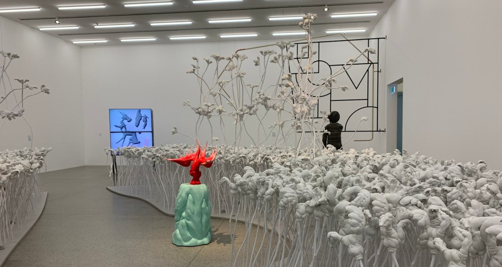
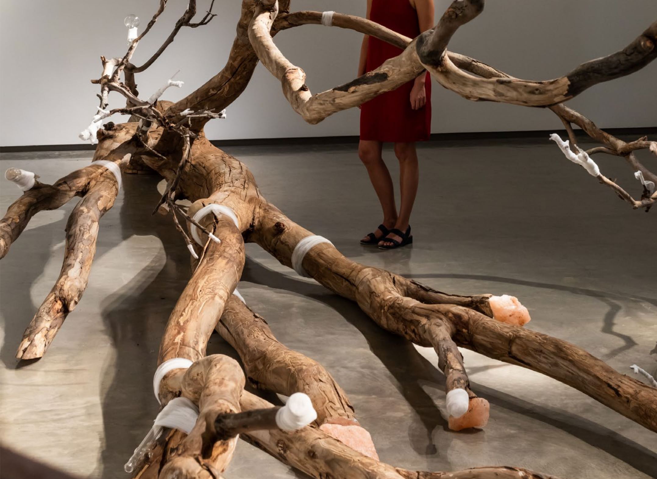
Figure 1. The Clearing, Patricia Piccinini, Lyon Housemuseum, Melbourne, Australia Personal image.
Eerie yet
beautiful. These were the first notes I wrote upon entering the “ENTER”
exhibition in Kew, newly curated by the Lyon Housemuseum. As I walked through one
of the major rooms of the small exhibition I couldn’t help but notice a violin
playing faintly in the background, which was surprisingly not intended to be
part of the piece that struck my interest the most. It was hard to miss the
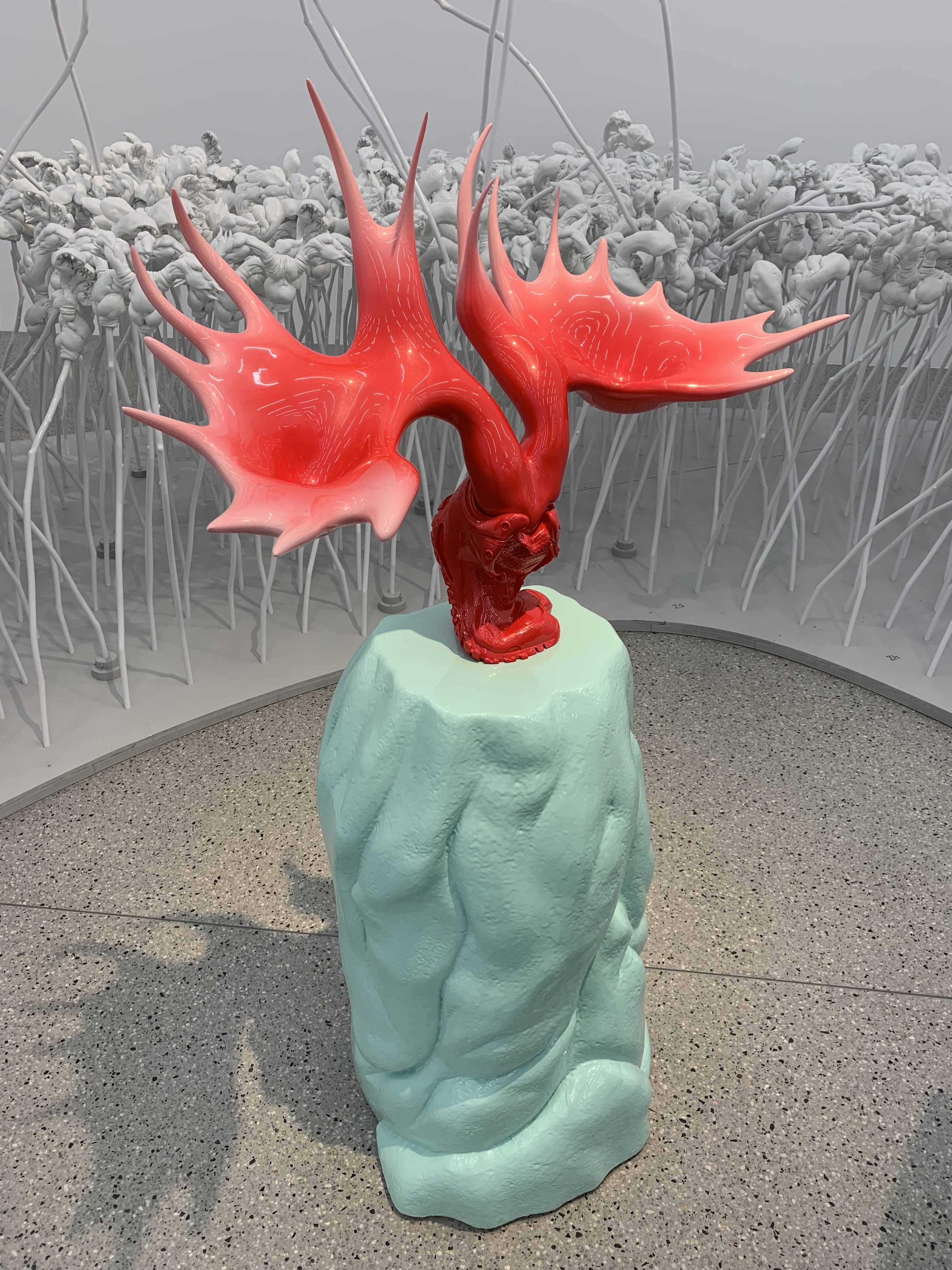
sculpture that took up a large portion of the space in the room. The piece in question had a boldly coloured
pair of red antler-like structures emerging from a red boot, sitting upon a
turquoise rock. However, this was only one part of the piece as it sat within a
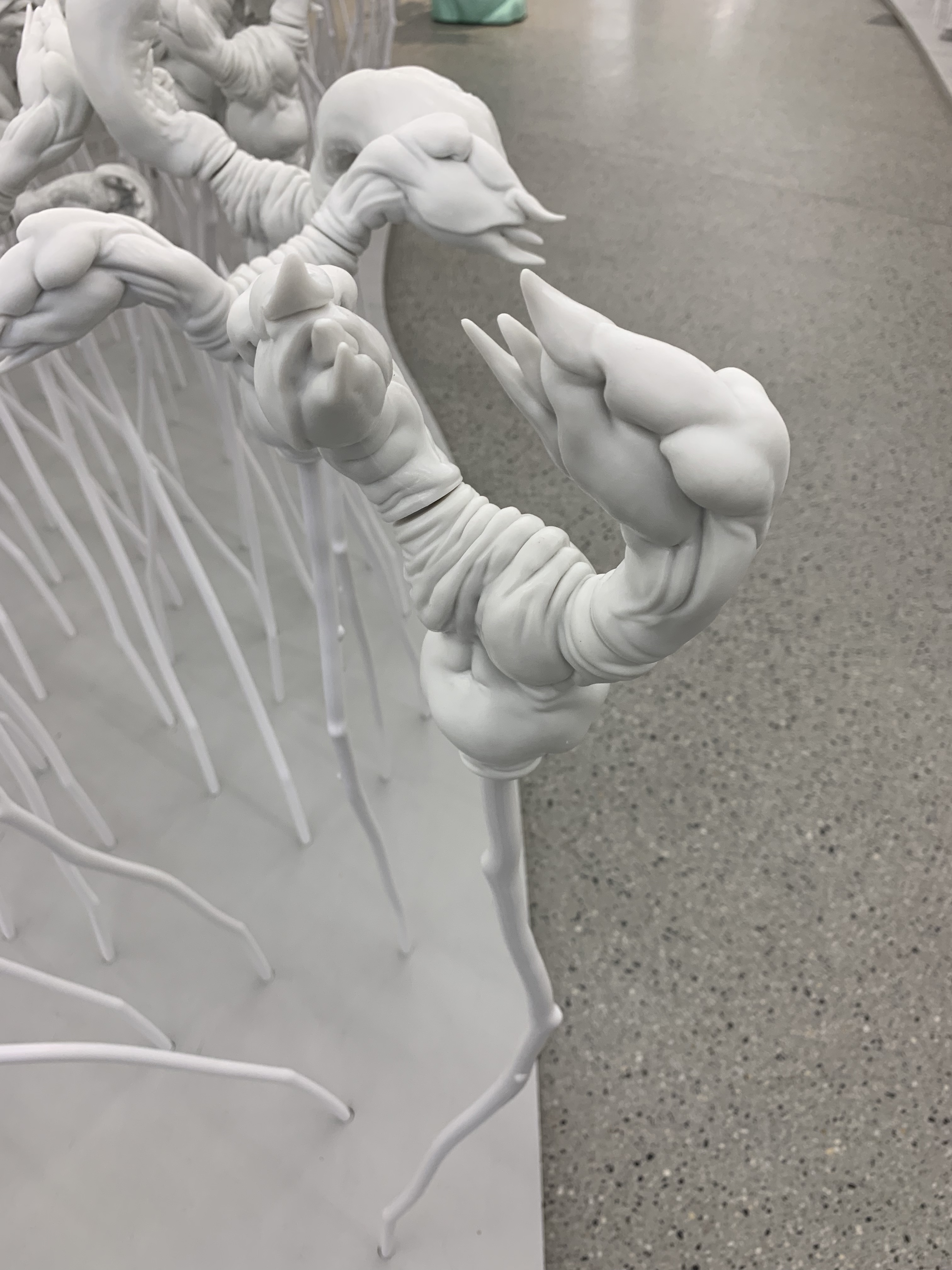
moderately sized walkway in a large, white, field-like environment. However, I
couldn’t quite figure out what the field consisted of despite the sculptured
figures being incredibly detailed. My initial reaction to this piece was that
although it was grand and aesthetically pleasing, I couldn’t identify the underlying
meaning. However, upon reading the guide I received on entry the messages
became clear.
Figure 2. The Clearing, Patricia Piccinini, Lyon Housemuseum. Personal image.
Figure 3. The Clearing, Patricia Piccinini, Lyon Housemuseum. Personal image.
This piece is titled “The Clearing” by Patricia Piccinini, a contemporary Australian Artist and one of the few selected to take part in the ‘ENTER’ exhibition. Piccinini asks her viewers to question the idea of nature within our contemporary world. Her proposition is that we need to have a better understanding of our constantly moving modern world and change the way we think about nature to protect what’s left of it [1]. Piccinini also proposes that the field consists of flowers, all the same yet positioned differently to appear as though they are all different, an attempt to embody how nature is complex despite being represented in a simple environment [2]. These statements allowed me to further my understanding of the underlying connotation, as I initially didn’t have, as Bourdieu states, the ‘cultural competence’ or the ‘code’ to which was required in deciphering the underlying meaning of this piece [3]. What she has stated refers directly to aesthetics, we are focussed on how the piece looks and fail to consider what is being symbolised, to which I am guilty of. An art principle used within “the Clearing” is contrast, commonly represented by using a coloured object within a white space, as it has been used here. In my case, I focussed on the coloured object as it stands out, with the white field being a secondary thought despite it exploiting a large area within the exhibition. This is a metaphor for how we perceive the world, we are so focussed on what is right in front of us, or what is considered materialistic, that we fail to realise what surrounds us, that being nature. ‘Critical designers do not suggest what is the preferable future according to them; they encourage the society to reflect on it’ although Piccinini isn’t suggesting how to effectively improve our focus on nature, she is calling her audience to begin to recognise what is beyond the modernistic world we have become consumed within [4].
References:
[1] Lyon Housemuseum, The Clearing 2019. Didactic booklet to accompany the piece “The Clearing” 2019 presented at the ENTER Conversation exhibition, Housemuseum Galleries: Lyon Housemuseum, 16 March – 21 July 2019. Visited 30 March 2019.
[2] Ibid.
[3] Pierre Bourdieu, Distinction:A social
Critique of the Judgement of taste (France: Harvard University Press, 1984),
2.
[4] Liene Jakobsone, “Critical Design as Approach to
Next Thinking,” The Design Journal 20,
no:sup1 (2017): S4259.
It is quite disappointing to hear that there are forgotten superheroes of design, as we know that designers put so much effort, hard-work and dedication into their work. However, we know that the field of design is so broad and large, that it is no wonder why not everyone can be remembered for every work of design. This is why it is so important to highlight the forgotten designers who have made an impact on the world, maybe without many people noticing it.
Figure 1. Photograph of Muriel Cooper
In 2007, the New York Times published an article about “the design heroine you’ve probably never heard of”. This article was written about Muriel Cooper (Figure 1.), a graphic designer, book publisher, digital designer, researcher and educator. With this long list of expertise, how is it possible not many people know about her? Cooper was the very first design director at the Massachusetts Institute of Technology Press (otherwise known as the MIT Press), she was the co-founder of the Visible Language Workshop at MIT, and was the first woman to be granted tenure at the MIT’s Media Lab, where she was able to develop software interfaces [1]. On top of this, she was also given the opportunity to teach a new generation of designers.
Figure 2. One of Muriel Cooper’s design pieces for the MIT Press
Muriel Cooper is also known for her concentration on the relationship between graphics and technology. Cooper was seen as a pioneer of the new design domain, as she was one of the first graphic designers to carry out profound explorations of the new possibilities of electronic media, such as 3D text [2]. Muriel also had a love for Bauhaus, and had even designed the classic book Bauhaus, which was published by MIT Press in 1969, the 50th anniversary of the German design school’s founding. This project took Cooper nearly two years to create, as she had to enlarge, revise, and completely redesign an American version of an earlier German edition. She set the book in the newly-available Helvetica typeface and used a grid system page layout, giving the book a strong modernist appearance [3]. This, and her work in digital design, is why she was known by many around her as the woman who designed the bridge between Bauhaus and the digital age.
Again, it’s hard to understand why this remarkable woman has been seen to be “forgotten” in today’s society. This is because women have a harder time being recognised compared to men. In Jane Connory’s paper on women in graphic design, it was shown that despite women comprising more that 50% of graphic design graduates since the 1970’s, only one woman was included in the AGDA Hall of Fame [4]. Although this is an Australian statistic, the same can be said for female designers around the world. Women have been rendered invisible within the graphic design field, and it makes us question why someone like Muriel Cooper, with her depth of experience, is left out of the spotlight today.
Cooper had obtained three degrees throughout her life; a Bachelor of Arts degree in 1944, a Bachelor of Fine Art in Design in 1948 and a Bachelor of Science in Education in 1951 [5]. Despite her degrees and her work at MIT, she was still unable to gain the same recognition as her fellow male designers, including her friend Paul Rand, who was a major influence for her design work and who had even recommended her to be the design director of the MIT Press. She was such a talented woman, and her influence on contemporary media, technology and design can’t be denied.
This is why it is so important to recognise and celebrate women like Muriel Cooper, as their work in design decades ago has a major influence on design today, even if people don’t realise it.
[5] “Muriel Cooper, 68, dies; noted graphic designer”, issue of MIT Tech Talk, Volume 38, Number 35, June 1st 1994, accessed April 9th 2019, http://news.mit.edu/1994/cooper-0601
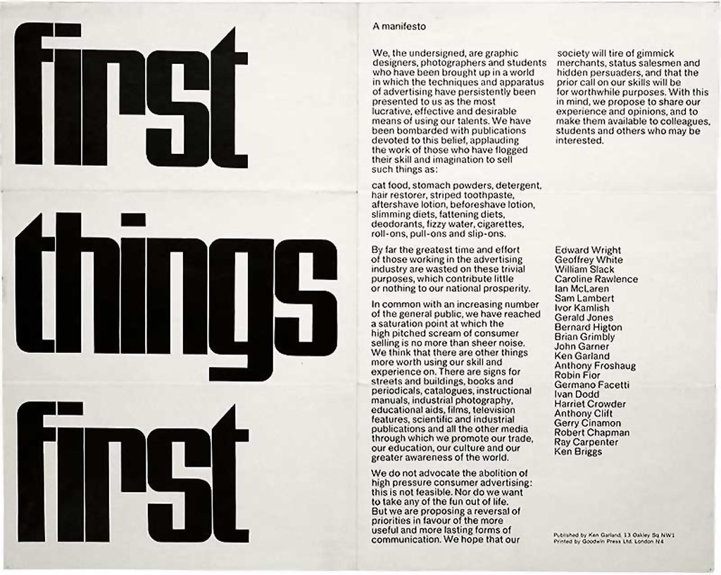
I am currently working on a conceptual project for a studio unit in my third year study of communication design at MADA, under the title Pupils. The project is an instigation of a longing for discussion, questioning, answering and unity; inspired by the work of the designer Ken Garland, specifically his manifesto First Things First.
Garland initially published First Things First in London in 1964 across multiple international design journals – it was later revisited and updated again in 2000. Achieving significant acclaim and sparking controversial reactions from the international design community, Garland’s reflective thoughts on the purpose and practices of a designer called for a reformation. According to Rick Poynor (1999): “It is no exaggeration to say that designers are engaged in nothing less than the manufacture of contemporary reality” [1]. Garland challenged this very statement in his manifesto thirty years prior, and still does to this day; writing a follow-up response to his initial manifesto in 2012 entitled Last Things Last. Garland presents a final critique on his original philosophy with regard to the coming generations of designers and the future; how our relationships with “the ruthless exploiters of our skills”, or ‘clients’, should be viewed as a collaborative partnership with an opportunity to do good things [2].
First Things First, 1964. Ken Garland
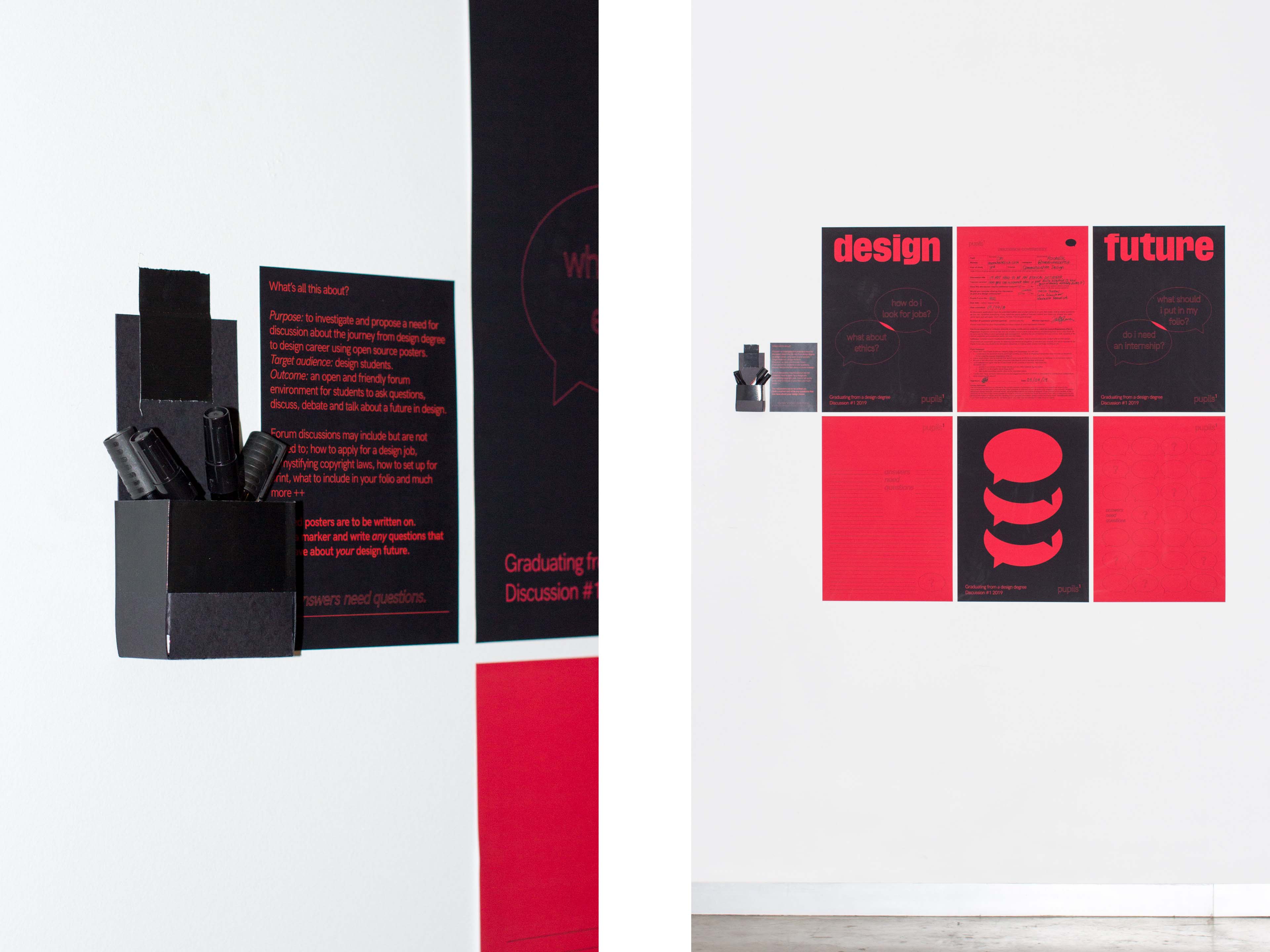
In response to First Things First and Last Things Last, the purpose of my project is to investigate and propose a need for discussion about the journey from design degree to design career and the trials and tribulations faced along the way. Targeting design students within the MADA community and abroad, the outcome of the project sees to create an open and friendly forum environment for students to ask questions, discuss, debate and talk about a future in design; with aid of guest speakers and industry mentors to provide insight and experience. Pupils forum is a solution to a personal and colloquially need for an environment that builds thought, consideration and identification of our responsibilities as designers, and how we may address and better serve the community with our abilities.
Pupils Forum Posters, open source 2019. Photography and design by Alexander Rothmeier
Through an array of ‘open source posters’ I have created a direct link of interaction between the supposed Pupils forum event, specifically it’s discussion content, and the design community within MADA. Black markers are provided beside the posters, to enable and encourage students to write any design related questions or thoughts they have onto the red posters. These questions are to be then transcribed into discussion material to be brought to attention at the proceeding Pupils forum.
Similarly to the concepts of participatory design presented by Matthew Holt in his writing Transformation of the Aesthetic: Art as Participatory Design, the Pupils poster series aims to work as both an ‘incomplete’ participatory design (PD) tool that involves input from a community audience in order to achieve an ‘informed’ outcome: the forum discussion. “The basic definition of PD is that it involves people in the design process who have a stake in the outcome of the design from the very beginning, rather than being an end-user or a temporary source of feedback in the development stage” [3].
According to Jamer Hunt: “Design without both material and social impact in the world would not be design; designers must act in the sense that their outputs change the facts on the ground” [4]. I as a design student benefit from the incite of my colleagues, their questions and answers, and the guidance from my academic superiors – the Pupils project is a vessel to achieve challenges such as those posed by Hunt, and ultimately, that of the philosophies of Garland; it provides an opportunity to learn and to grow.
References
[1] Poynor, Rick. First things first Revisited. Emigre 51. (1999).
[2] Garland, Ken. Last Things Last. Eye: The International Review of Graphic Design. 21, no. 83. (2012): 79.
[3] Holt, Matthew. “Transformation of the Aesthetic: Art as Participatory Design.” Design and Culture 7, no. 2 (2015): 65-143.
[4] Hunt, Jamer. Prototyping the social: temporality and speculative futures at the intersection of design and culture. (2011): 35-36. Cited in Clarke, Alison J. Design Anthropology : Object Culture in the 21st Century. Edition Die Angewandte, University Press. Wien; New York: Springer, 2011.
Also
Jakobsone, Liene. “Critical Design as Approach to next Thinking.” The Design Journal 20, no. Sup1 (2017): 4253-262. Fry, Tony. Design Futuring: Sustainability, Ethics and New Practice. Australian ed. Sydney: University of New South Wales Press, 2009: 2-46.
Fry, Tony. Design Futuring: Sustainability, Ethics and New Practice. Australian ed. Sydney: University of New South Wales Press, 2009: 2-46.
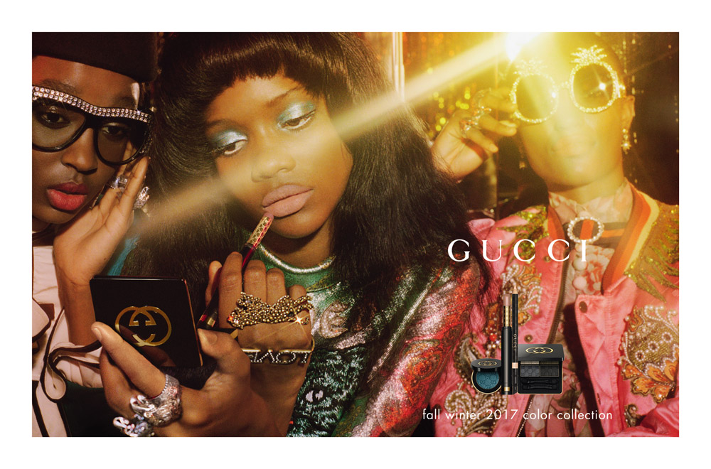
Gucci Color Collection Campaign 2017 , shot by Petra Collins and art directed by Christopher Simmonds
Being part of various minority groups (queer, of colour, a woman), but privileged in so many ways (cis-gendered, able, living in Melbourne, etc.), means empowerment and education has become a core part of my practice, my goals, and my career path, before it’s fully taken form. I want to use my work to bring pressing issues and ignored minority groups to life, however this has to be approached carefully. It’s not enough to just be female, or queer, or of colour to make ‘progressive’ work.
One fantastically female artist I look up to is Petra Collins. Her dreamy, brightly coloured, filmic campaigns has greatly impacted my photographic style. Not to mention her insane career path- at the current age of only 26, Collins is an internationally renowned artist, photographer, art director and model. When coming into prominence, it was her photo series titled The Teenage Gaze that circulated magazine and blog headlines, coupled with words pertaining to “UP AND COMING FEMALE PHOTOGRAPHER” or “FINALLY, A FEMALE GAZE”. For being female, Collins’ work was speaking on behalf of a whole gender, and her work was therefore definitely feminist, right?
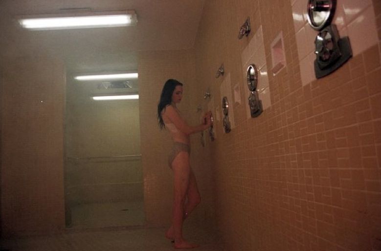
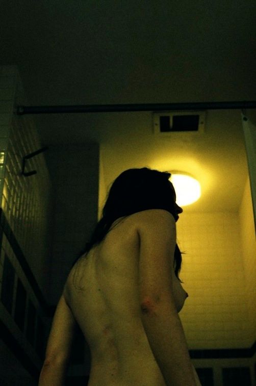
Various photographs from The Teenage Gaze (2010-2015) by Petra Collins
According to Collin’s website, The Teenage Gaze is comprised of “intimate portraits shot from 2010-2015 of teenage life” [1]. The works in this series mostly presents teen girls in stereotypical dress, engaging in the gendered act of grooming [2]. It enters the female dominion of the bathroom and does not challenge any cis-gender expectations [3] that are set in that space: for girls to be pretty, for girls to be born with certain biology, for girls to be waiting, and waiting, but always pretty, because they’re waiting for a man. Collins’ early work, albeit probably unintentionally, has participated in the reduction and commodification of the female experience, just as we’ve seen in the yoga industry [4]. The patriarchally pleasing female has been abstracted from the feminist, just as the slim white privilege body has been pushed to the front of the ancient Indian practice [5]. In The Teenage Gaze, Collins takes an already idealised a version of life, one that repeats patriarchal and white-dominant imagery, romanticises it with a refined colour palette and a 35mm film camera and turns it into an item of luxury. It’s the idea that you can use your money to surround yourself with pretty things and look just as hopelessas they do in it.
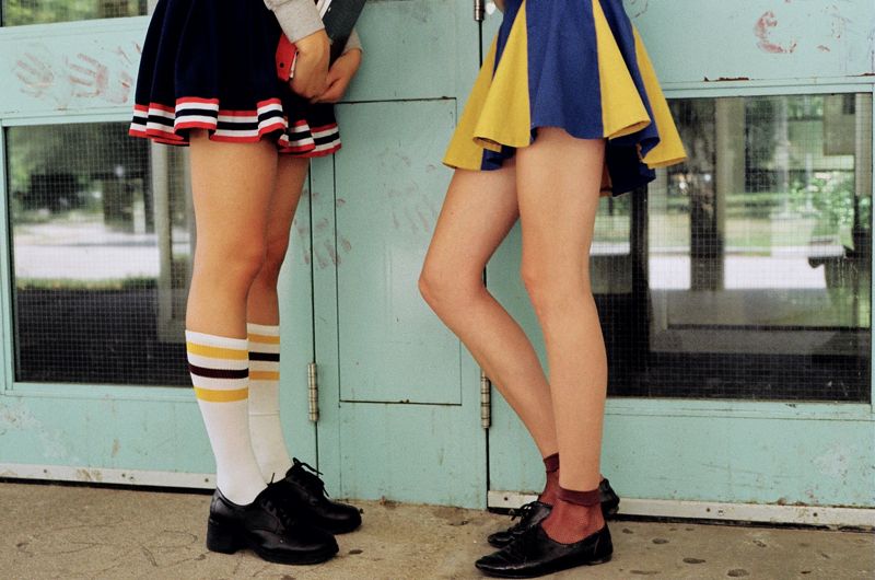
Taking note of this, I have made it my mission to disrupt the gender claim on spaces and portray a more thorough understanding of youthful exploration. The photos below are from a recent photo essay for Esperanto Magazine called My Clothes Aren’t Telling You Who I Want to Fuck. I’ve borrowed Collins’ dreamy style, overlapping bodies and editorial tone, but used it to invade the white cis-female-dominated fashion sphere with queer, non-binary and coloured bodies with the aim to challenge heteronormative and homophobic codes of dress. When approaching this shoot, everything was deliberate: I chose five models instead of four to avoid binary associations (e.g. “those are two boys, so those two must be girls”), I demanded queer representation (the only straight person in the shoot is my boyfriend, who as a straight cis-male is rarely represented participating in the female act of grooming), and although I directed the models to sometimes lie passively, their eyes are armed with power, not hopelessness.
Various photographs from My Clothes Aren’t Telling You Who I Want to Fuck. Shot, art directed and styled by Rochelle Oh with photographic assistance from Joëlle Thomas.
Collins’ work, whether in a good way or bad, highlights the importance of nuanced representation in photography, whether artistic, editorial or commercial. The Teenage Gaze is selectively observative, rather than empowering, and neglects so many already forgotten narratives of teenagehood [6] (e.g. trans experiences, non-white experiences, Muslim experiences, girls doing anything other than getting dressed and undressed…). Four years since The Teenage Gaze and Collins has since reworked images from the series into a book titled Babe, where the images are sandwiched between works from artists of all colours and non-cis-male gender identities, presenting a much more thorough representation of femininity. Bringing her fine arts background to many a high fashion campaign and magazine cover, Collins has shown big names that there is a desire for her unique female eye (and gives me hope that I won’t have to make helvetica posters my whole career). One day, I hope to have the platform and prominence to make space for authentic minority voices as Collins has since done. But for now, I’ll use these lessons on representation and gender commodification for student magazines, and watch from afar as she does it for Gucci.
Frank Ocean for 032c Magazine (Winter 2017/18). Shot by Petra Collins, styled by Mel Ottenberg.
Gucci CNY Capsule Collection (2018), shot by Petra Collins.
Gucci Color Collection Campaign 2017 , shot by Petra Collins and art directed by Christopher Simmonds
4. Juliana Luna Mora, “The yoga industry: a conscious luxury experience in the transformation economy,” (PhD thesis, Monash University, n.d.), 3-5.
5. Ibid.
6. Jane Argodale, “Soft power: Petra Collins and the problem with the female gaze,” The College Hill Independent, accessed 1 April 2019,https://www.theindy.org/1442
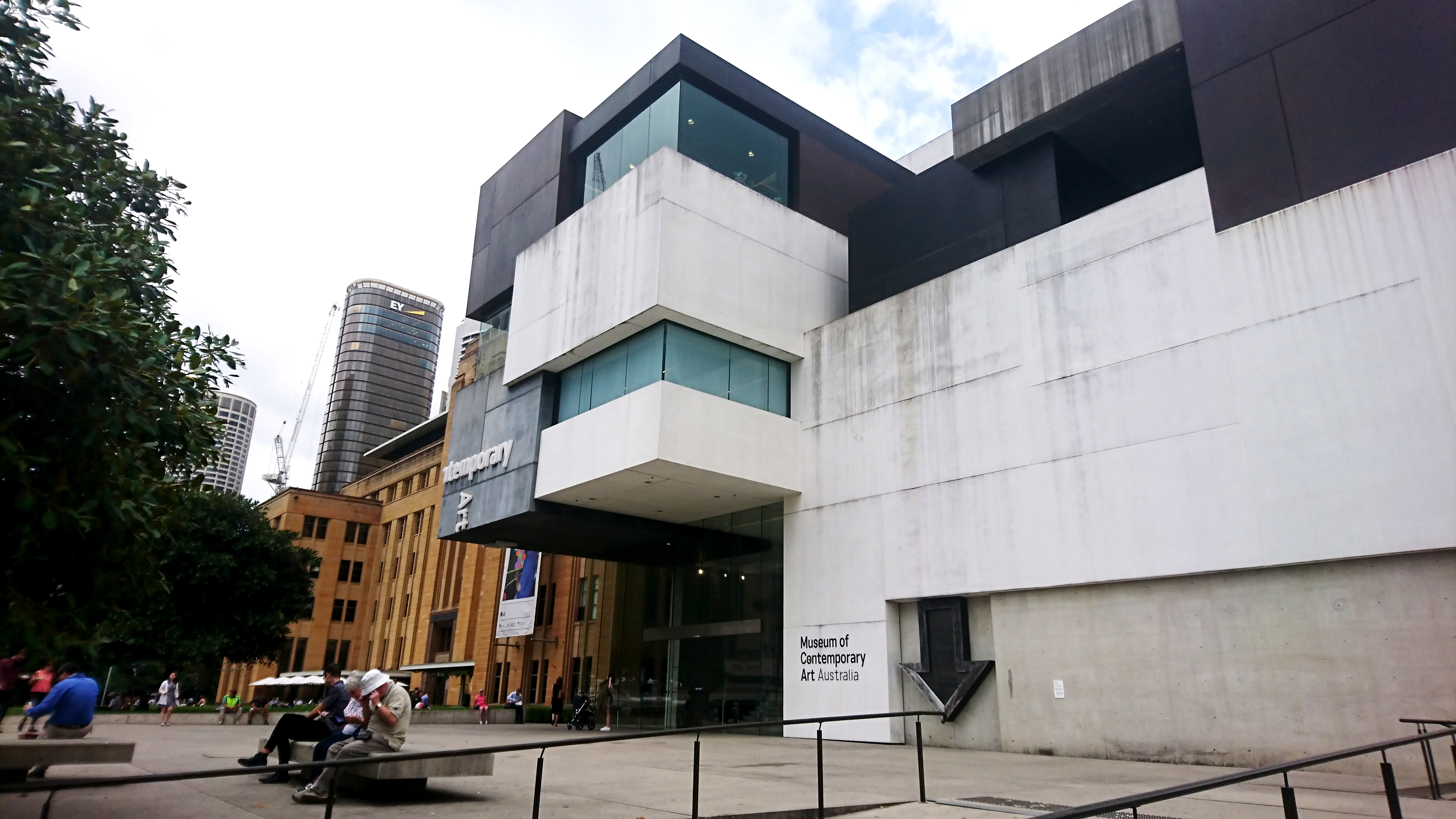
I recently made a trip up to Sydney for a weekend away. It’s a place I don’t often visit so I was excited to check out the art and design scene while I was there. After some internet searching I found myself at the Museum of Contemporary Art (MCA), at an exhibition by Australian artist Janet Laurence. Initially intrigued by the building’s facade, I was sure that whatever was inside the MCA would be something special – I was right.
Figure 1: The Museum of Contemporary Art, Sydney Australia. Personal photograph.
After Nature is a survey exhibition that encompasses Laurence’s expansive career as a multidisciplinary artist, showcasing her works from the early 1990’s up until the present day. Through her paintings, photography, sculpture, installations and videos Laurance encompasses the beauty and fragility of nature, while primarily seeking to provoke the key theme of Anthropocene [1]. A sense of reflection radiates throughout each piece, a call to action in the eyes of Laurence: “We are in a period of the Anthropocene where we are thinking, how do we live on our planet now?” [2]
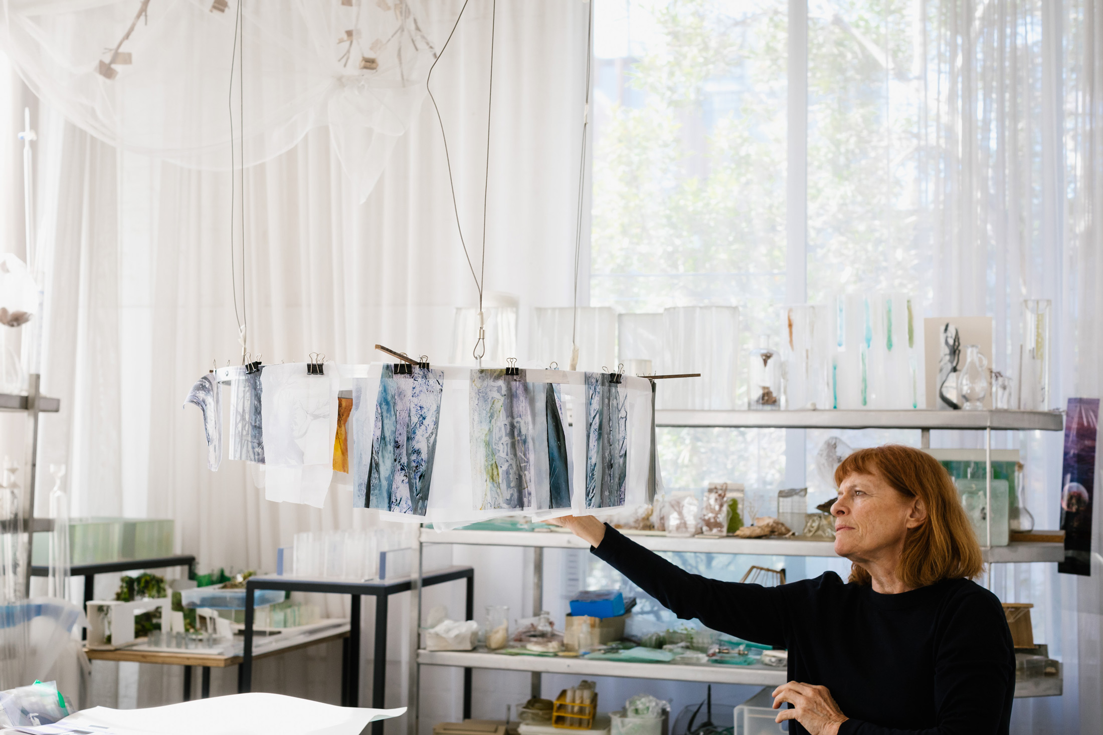
Figure 2: Janet Laurence in her Sydney studio. Photograph: Jacquie Manning
Laurence’s use of raw materials such as minerals, oxides, plant matter and taxidermy in conjunction with medical and scientific instruments and vessels portrayed a wunderkammer experience and a strong sense of intrigue within me. I was set adrift through the gallery space, much like the roots of a tree spreading under the surface; each piece of art a breath of fresh air within an enclosed space. Vertical compositions and natural biological forms drew the organic elements of Laurence’s works back toward the earth and out of the clutches of the stark and sterile white gallery walls.
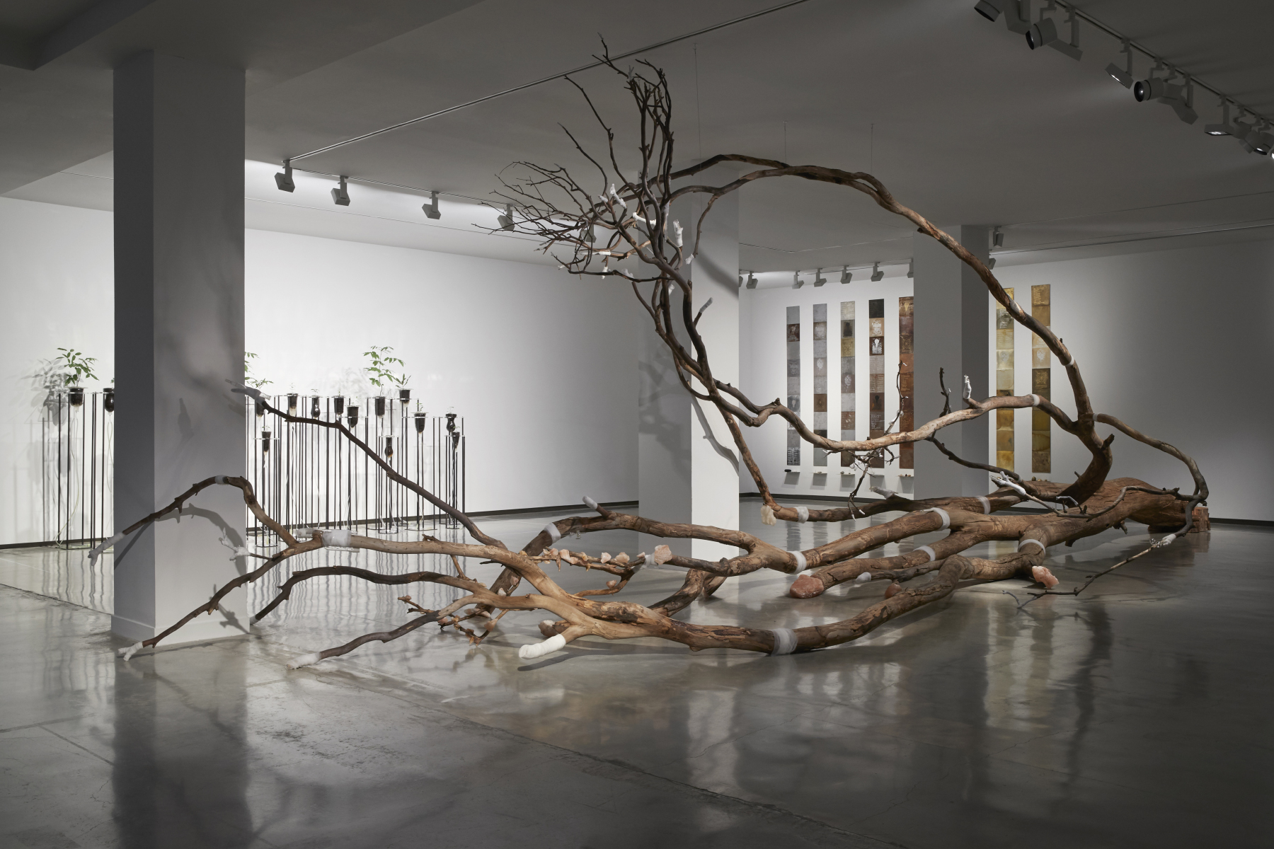
Like a lifeless specimen placed upon a steel operating table, Laurence’s work Heartshock 2008/2019 (figure 3, figure 4) spreads itself over the menacingly cold polished concrete floor in an entanglement of browns and white-pink polka dots. Heartshock consists of a deceased gum tree with a network of slithering branches that are covered in white bandage and rock salt. Some of the branch tips are capped over with bandage; other limbs of the tree are hooped with the soft white material, like a patient with a damaged arm. Chunks of pink Himalayan rock salt teem from the trees pores in many locations.
Without an armour of bark to protect itself the idle tree sits exposed in its most bare form; revealing a sporadic surface inscription of curving impressions, ‘drawings’ describes Laurence, created by burrowing insects [3]. The tree had died due to drought and was extracted by Laurence from the Australian Botanic Garden in Mount Annan New South Wales after it was deemed necessary for it to be cut down.
Laurence attempts to create a sense of empathy within the audience through her incorporation of human related objects. The bandage and rock salt crystals appear to be healing the tree in a medical, mythological and spiritual manner – as if it were human. This collaboration of materials evokes familiarity and in turn breeds sympathy for the tree. After some contemplation I found myself reflecting upon my own path in life; one of a designer, and how I can navigate the ‘post-natural’ world Laurence had visualised in a sustainable and responsible way. I was left questioning how I can critically and ethically approach both my practice and ideology of design.
Philosopher of design and sustainability Tony Fry explores the concepts of ‘defuturing’ in his texts; a perception of design that diminishes the future through an inconsiderate outlook of the present [4]. Fry suggests a need for radical change amongst the design industry where “designers place the current needs of the market in second place to the politico-ethical project of gaining sustainability” [5]. In order to achieve this, Fry states that design “must be understood anthropologically” [6].
After Nature has instilled and deepened my concerns about the contributions that the design world makes to our Anthropocene time-frame; with the constant marketing of consumer products and promotion of unsustainable capitalist philosophies. The question remains as to if we as designers can work hand-in-hand to better keep our precious earth from degrading beyond reach. We have the power to communicate; we have the power to unite our global community. “Many of us now feel we must use whatever weapons we have to raise the alarm for extinction and ecosystem depletions. Laurence’s new exhibition sounds that warning bell” [5].
[4] Hunt, Jamer. Prototyping the social: temporality and speculative futures at the intersection of design and culture. (2011): 35-36. Cited in Clarke, Alison J. Design Anthropology : Object Culture in the 21st Century. Edition Die Angewandte, University Press. Wien; New York: Springer, 2011.
[5] Fry, Tony. Design Futuring: Sustainability, Ethics and New Practice. Australian ed. Sydney: University of New South Wales Press, 2009: 2-46.
Exhibition: Escher X Nendo, Between Two Worlds National Gallery of Victoria 2 Dec 2018- 7 Apr 2019
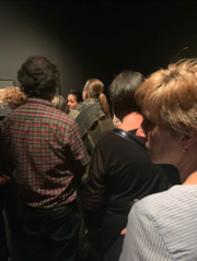
Walking into the first room of the Escher X Nendo: Between Two Worlds exhibition at the National Gallery Of Victoria, I could barley catch a glimpse of the first artwork. There were masses of people filling the entire exhibition space (Figure 1). I joined the long line of viewers that moved parallel with the artworks at a significantly slow pace due to the high level of involvement and appreciation every person adopted as they analysed all of Escher’s pieces.
Figure 1. Photo I took: The Line at the beginning of the exhibition
To my
disadvantage, I had only heard of Escher’s name before but I wouldn’t have been
able to link any of his artwork to his name or have been able to describe the
style of his designs. Thus, I entered the exhibition with no prior knowledge,
attitude or expectations and I left with a new appreciation for him and his
ability to showcase his passion for illusion artwork through these unusual and
attention grabbing pieces.
The overall experience of walking through the exhibition was strengthened by the background music of Bach, filling the space, expressing a sense of calmness and focus. I was fascinated by the fact that Escher loved the music of Bach and that it inspired him to make images (National Gallery Of Victoria, Escher X Nendo, Between Two Worlds Exhibition: NGV Australia). Escher believed that symmetry, rhythm and repetition were shared qualities that both Bach and his art expressed (National Gallery Of Victoria, Escher X Nendo, Between Two Worlds Exhibition: NGV Australia).
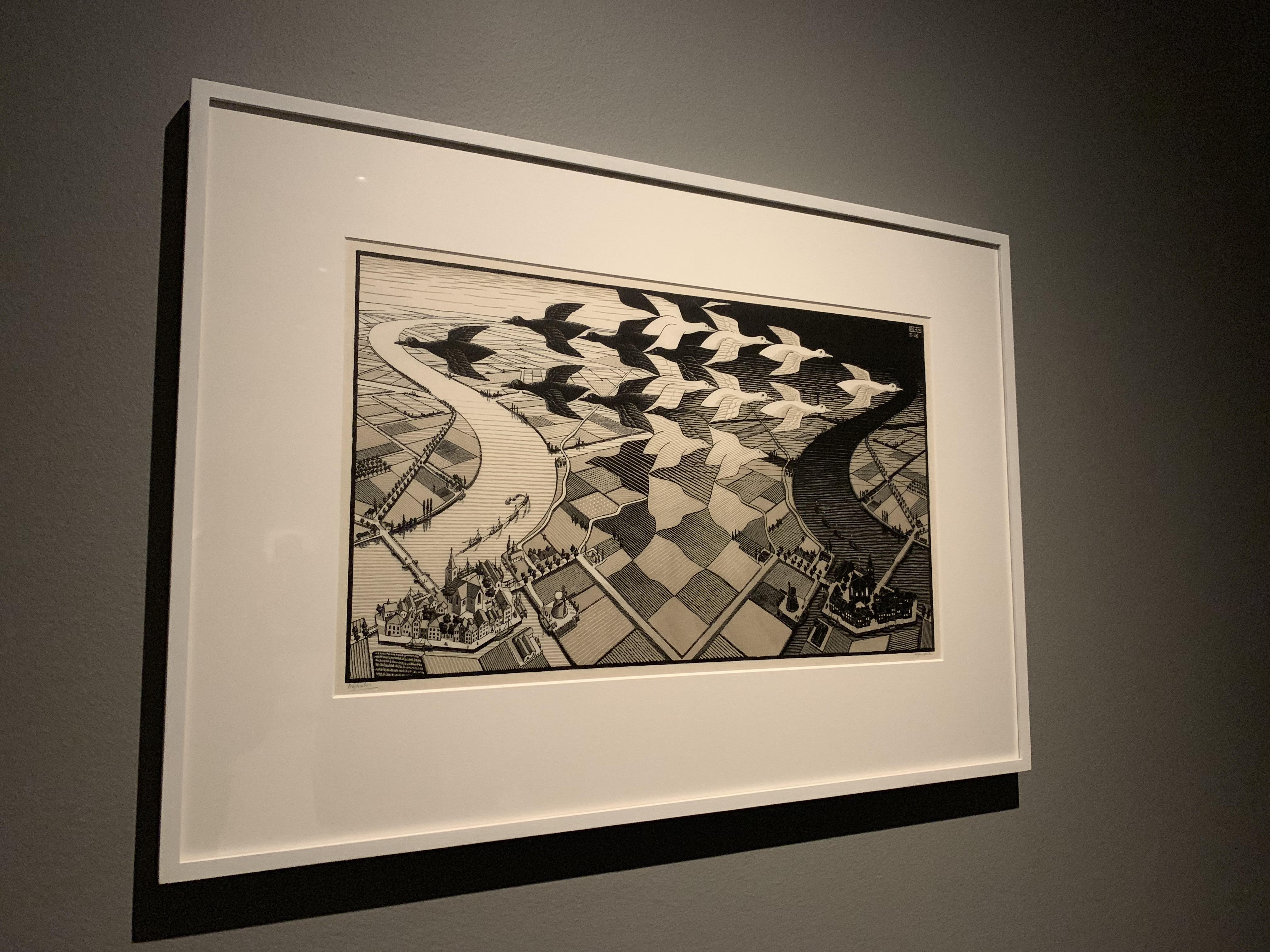
Figure 2. Photo I took: Escher, Day and Night, 1983, National Gallery of Victoria, Australia.
Throughout his
works, Escher withdrew from the idea of drawing his surroundings in realistic
and observational ways, instead, adopting an approach where he drew his “inner
visions” (Poole, 2015). One of the “most famous and popular artworks” exhibited
at the NGV by Escher is titled ‘Day and Night’, shown in Figure 2, which was created
in 1938 (National Gallery Of Victoria, Day and Night, 1938. Escher X Nendo,
Between Two Worlds Exhibition: NGV Australia: NGV Australia). This piece is a
woodcut and is printed in grey and black inks. This artwork captures Escher’s
passion towards the world of form and illusion. Day and Night consists of black and white birds emerging from both
each other and from a chequered field, as they cross paths. This is occurring
above a mirrored town with one side being night and the other day. The unusual
aspect of this artwork is that viewers have to choose whether to see the
foreground or the background as the division between these two aspects are
intentionally blurred. Overall, this image along with many of his other works,
plays with symmetry, optical illusion and dualities. Escher’s imagination
strengthens the impossibility of the invented scenario.
According to the
reading, “Good Taste vs. Good Design”, Good Design is initially considered as
“something aesthetically pleasing or fashionable” stated Crozier (Christoforidou,
Olander & Warell 2012, 185-202). This relates to Escher’s art journey as he
was scorned and dismissed by the art world in the initial phases of his creations,
but was instead, deeply appreciated by mathematicians. Thus, based on Croziers
definition from the reading, the art world would not have viewed Escher’s
designs as “good” due to them not coinciding with the popular designs and
themes of the time. As the reading goes on, it is highlighted by Pye that “good
design is meaningless” (Christoforidou, Olander & Warell 2012, 185-202).
Pye further mentions that the level of success of a design can only be measured
in relation to the intention of the designer. Within the exhibition, it was
repetitively mentioned that Escher’s unique graphic expression and design
themes were majorly based on portraying ideas of reflection, symmetry, cyclic
repetition, transformations of shapes, optical illusions, spatial ambiguities
and perspective distortions. Characteristics like these would have been Escher’s
criteria for success. So therefore as the level of ‘good design’ is based upon
“self evident elements of professional skill” while eradicating the opinions of
practitioners, Escher would have to compare his professional skill against his
own criteria to decide whether he believed his designs were ‘good’
(Christoforidou, Olander & Warell 2012, 185-202).
The way Escher
was first rejected by the popular views and opinions of the art world in his
initial phases of his creations is similar to the journey of the Earthworks
poster collective, discussed in the reading “Earthworks and Beyond” written by
Jess Berry (Berry, 182-187). Both Escher and the Earthworks collective opposed
the traditional concepts within art and society. However, the topics the poster
collective referenced were primarily focused on political images and ideas,
differing from Escher and his focus on illusion. Jess Berry states that the
poster collective presented a rare and innovative approach to arts education
and that the revolutionary work they crafted influenced numerous individuals,
collectives and institutions to come (Berry, 182-187). Similarly, Escher’s work
has impacted and caught the attention of many individuals and the evidence of
this statement is shown through the significant amount of people wanting to,
including myself, pay entrance fees into this Escher exhibition to view his
revolutionary work.
REFEERENCES
Berry, Jess.
Chapter Eleven: Earthworks and Beyond. 182-187.
Christoforidou,
Despina & Olander, Elin & Warell, Anders. 2012. Good Taste vs. Good
Design: A Tug of War in the Light of Bling. The Design Journal Vol 15, no. 2,
185-202.
National Gallery
Of Victoria. “M.C Escher and J.S Bach” Wall Text. Escher X Nendo, Between Two
Worlds Exhibition: NGV Australia, 2 Dec 2018- 7 Apr 2019. Visited on 2 April
2019.
National Gallery
Of Victoria, Day and Night, 1938. Didactic panel to accompany “Day and Night
1983 at the Escher X Nendo, Between Two Worlds Exhibition: NGV Australia, 2 Dec
2018- 7 Apr 2019. Visited on 2 April 2019)
To respond to this blog topic, I adopted an approach where I
researched design practitioners whom have seemingly made a significant impact
on the world of design in the past. Based off of this research, I subsequently chose
a designer in which I had never heard the name of before. I took on this
approach, as I was intrigued to gain an understanding of the journey this
designer faced throughout their work life and to comprehend why I may not have
heard of this person before.
Mimi Vandermolen is an example of an individual whom is considered
a superhero in regards to industrial design and in particular the automotive
industry (Denita, 2018). Vandermolen was the first woman to graduate with an
industrial design degree in 1965 (Carini, 2018). In 1970, Vandermolen joined
Ford’s Design Studio as an addition to the incredibly small quantity of female automotive
designers worldwide and in 1979; she was promoted to the Design Specialist of
this company. Her efforts and ideas were admired as she altered the designs of both
the car interior and exterior spaces, leading her to the promotion of Design
Executive for Small Cars in North America in 1987 (Veit, 2015).
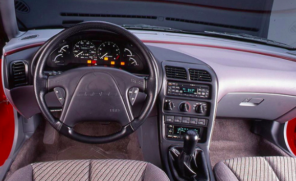
Figure 1. Vandermolen redesigned the 1993 Ford Probe. “Mimi Vandermolen, The Ergonomics Genius behind Ford’s “Rounded Edge Revolution”, 2015. Figure 2. Interior of the redesigned Probe. “Mimi Vandermolen, The Ergonomics Genius behind Ford’s “Rounded Edge Revolution”, 2015.
Figure 1 and 2 provide images of the 1993 Ford Probe, which
was the first design that Vandermolen directed from the start to finish and a
design that focused on and improved the driving experience for females. I found
it strange that she had made such a significant impact for this industry around
the 1980s, but in today’s present period I have never heard of her name or her
accomplishments before.
The idea of female presence and success in the industrial
design workforce forms the basis of discussion in the reading “Women designers-is
there a gender trap?” written by Margaret Bruce and Jenny Lewis. The workforce
progression, development and succession Mimi Vandermolen encountered was quite
rare for that time period as female designers had to face and attempt to
overcome three main ‘hurdles’ which resulted in slowing the pace of or
haltering the succession in this industrial design industry (Bruce & Lewis
1990, 114-120). Lewis and Bruce present the first hurdle, ‘Gaining
Qualifications’ by underlining the effect of having male-dominated college courses,
making females feel a minority and disconnected to the cohort. Therefore,
females feel discouraged to continue. The second hurdle, ‘Getting the First
Job’ discusses the stereotypical bias regarding what is appropriate and fitting
work for each gender; with males jobs being described as “industrial” and
“technical” and females being based on “secretarial stuff” and “dress making” (Connory
2017, 1-2). Once again, discouraging females to succeed in this career path.
The final hurdle, ‘Promotion and Awards’ examines the issue that majority of
senior positions in design companies are given to male workers, emphasising
that the further up the hierarchy one goes, the number of women present
decrease. Consequently, giving females another reason to withdraw from
competition and the industry. Comparing these central ideas from the reading titled
“Women designers-is there a gender trap?” to the success of Mimi Vandemolen in
the industrial design workforce, contrasting and opposing results are formed.
This emphasises that Vandermolen’s design journey was unusual for that time
period.
The issue of male dominance within senior levels of companies
and the slight discouragement of females in this industrial design industry are
still present in today’s society. Therefore, I believe it is required that the
accomplishments of inspirational and impactful female designers such as Mimi
Vandermolen need to be brought into the spotlight again. Hence, this may
encourage and persuade other female designers to oppose the traditional gender stereotype
bias in the workplace and to advance and succeed in the industry where their
passion lies.
Comment on my work with another designer (Rationalism and romanticism)
1.1 Introduction
This blog analyzed my work about another designer, which are all graphic design. Rationalism and romanticism as the main aspects are discussed in this blog and refer to the reading Design thinking between rationalism and romanticism written by Ida Engholm & Karen Lisa Salamon.
1.2 The relationship between Rationalism and Romanticism After the Crafts and Arts Movement, which was initiated by William Morris, two primary schools of the Western design field emerged in the 20th century: modernism and postmodernism. The basis of modernist design is rationalism and functionalism, claiming Forms Follow Function. Postmodernism first appeared in the field of architecture, and it was a counteraction that originated within modernism, especially the rebellion of modernist rationality. Its design style emphasizes that it should have historical continuity, but it is not limited to traditional logical thinking. At the same time, it should explore innovative styling techniques, pay attention to human touch, and pursue individuality. In the design, exaggerated and deformed, or classical elements and modern symbols are often combined in a new way. Romanticism is a decorative development of rationalism and internationalism.
1.3 Combination with Rationalism and Romanticism
Ida Engholm and Karen Lisa Salamon (2017) represent that for today’s design, letting go of romanticism, so ingrained in the deep of design thinking, can be the most challenging thing. It is free-expressed about itself and has a significant impact on the public understanding of design. The graphic composition is an optical element which according to the aesthetic visual effect and the principle of mechanics to arrange and combined. It is a way of creating characters and studying the arrangement between different images by rational and logical reasoning. It is the product of the combination of reason and sensibility.
The logo design (2019, Figure 1) is from this semester’s workshop of identity. The logo was designed for an education camping which was inspirited by my food memory about dragon fruit. Geometric figures were primary parts of my logo design, at the same time, it arranged with different colors, typography, and location and represented the form of dragon fruit and my memory so that it combined with rationalism and romanticism.
Figure 1: This is a logo from my identity design for an education camping which is inspirited by my food memory about dragon fruit this semester’s workshop.
There is a Blog from Nazareno Scibilia (2017, para.8) said: “Romanticism always shows this story even if there is no humanly figure or animal in the image it can show some movement especially when the color and the light are both going in the same direction with the same brush stroke.” For identity, the logo of every branding is the first thing that is showing the background story of a brand. The significant point of designing identity is letting the works communicate with audiences.
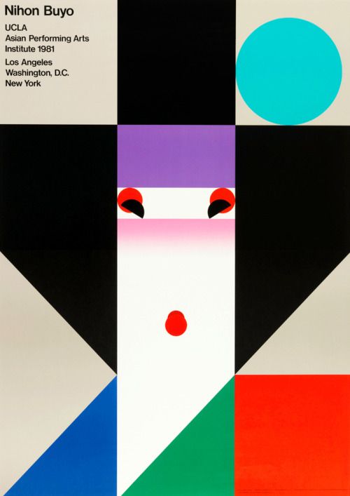
Japanese designers Ikko Tanaka pays attention to the ideographic function of visual elements. The poster of ” Nihon Buyo “(1981, Figure 2 ) with the face as the expression object. The work is consisting of squares and other geometrically equal shapes which is logically mechanical and rational. Tanaka tilted the two semicircles representing the eyes inboard. The processing produces an expression and forms a moving figure with a smile on his face. Looking through Tanaka’s work, the strongest feeling is his bold imagination and performance by vivid colors and images and some exaggerated expression to represent his strong emotion directly.
Figure 2: A poster called Nihon Buyo designed by Japanese designer Ikko Tanaka.
1.4 Conclusion For the understanding of romanticism, we should profoundly understand and grasp their spiritual essence and cultural connotation, rather than blind worship and external use. The coexistence of rationalism and romanticism has its rationality. While criticizing the inheritance of history, we should combine it with the characteristics of the modern era. Any design style and genre should be good at “taking the essence and going to the dross” to achieve the best of the world and keep pace with the times.
A Forgotten designer (Hannah Höch)
1.1 Introduction
This blog is to analyze the work designed by Hannah Höch who was a “forgotten” Dada designers refers to reading Plotting the Historical Pipeline of Women in Graphic Design written by Jane Connory.
1.2 Dada with Gender
Dadaism has profoundly influenced the society of the early 20th century. This wave of power from the imaginary is as a way of thinking art rather than an art form. It eases the split human soul in the context of World War I by all things with “anti-,” even the art itself and deconstructing everything.
Dada has played an important role in history from the perspective of art, politics, and society. However, what was ignored by the public is it is a force consolidating by the white male system, while the contemporary female artists, who had same ideological form and creative context, was seen by the public in the first decade of their death, and regained the right to speak at the end of the 20th century.
1.3 Hannah Höch as an originator of photomontage
National Gallery of Art (2006) concludes that during the Weimar period, Hannah is best known for her work. When she was one of the originators of photomontage. It is a type of collage in which the pasted items are actual photographs or photographic reproductions pulled from the press and other widely produced media.
She chose this form to express some split in mind, including the presentation of women, gay images and ridicule of the beauty industry, and the issue of racial discrimination. Hannah Hoch, born in Germany, is not easy to create and design. Jane (2017) represented that “While they all start from an assumption of gender equality; their voices reveal that a woman’s freedom to pursue a graphic design career has been a struggle against the established social order and its gendered expectations.” Because of Hannah’s creative theme and the time, she was not only suppressed by the Weimar regime but also called “degenerates” by the art circles at that time. However, Hannah Hooch’s later works broke away from the veins of Berlin’s Dadaism and moved to a graphic design that only used different elements to create collages, until the work on the afternoon of her life continued to pay attention to social issues.
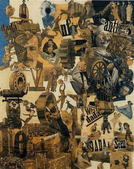
Cut with the Kitchen Knife Dada through the Last Weimar Beer-Belly Cultural Epoch in Germany (1919, Figure 3) is one of her essential pieces. Hawke’s photo collages intelligently reflect Weimar’s diverse social cross-section in Germany by splitting and disintegrating to show her face as a feminist Dada pioneer.
Figure 3: A collage work designed by Hannah Höch, which is Dadaism.
The genre of Dadaism likes its name ( a group of people casually flipped the word out in the dictionary), pursues accidental and meaningless. Collage is a manifestation of Dadaism. Collages are often fragments of magazine photos, often deliberately combined into anti-logic works. One of the Berlin Dadaists who made this integrated photo technique perfect was Hannah Hoch (1889-1978), and Hawke’s combined photo was extremely sensitive because her work brought together many of the things that were discussed at the time. The topic, through the manifestation of hasty chaos, contradictions, and irony, her work not only promotes Dada’s absurdity and illogical, but also redefines the two most exciting developments in the German Weimar Republic, namely the role of women’s society. The explosive growth of the mass media has made a sharp and insightful comment.
1.4 Conclusion
In Hannah Hoch’s work, she showed an integrated theme and mixed the selective cut photos in a seemingly accidental way. Hannah showed her picture in the lower right corner together with a European map pie showing the progress of women’s liberation. She realized that both women and Dada must incite the society that was she created a powerful visual manifesto of this belief.
As the most outstanding female artist in the Dada art circle of male hegemony, there are countless reasons for Hooch to fight for women’s rights, but he has never preached in his works. Even with a clear political theme, Hoch can introduce the subject without hurting its sharpness. She widely accepts various forms of aesthetics. Whether it is an absurd parody of social issues, almost abstract graphics experiments, or bizarre dreams, she is treated with equal calmness.
Reference List
Hannah, H 1919, Cut with the Kitchen Knife Dada through the Last Weimar Beer-Belly Cultural Epoch in Germany, New York, viewed 8 April 2019.
On Curator: The Museum Journal, an article written by Kathleen McLean titled “Do Museum Exhibitions have a future?” sparked interest in me. In this article, she questioned whether or not exhibitions can keep pace with the interactions available elsewhere. She concluded this article by saying that exhibitions will have place on the playing field only if they allow for “multiple forms of — the sharing of knowledge and work — in real time.”
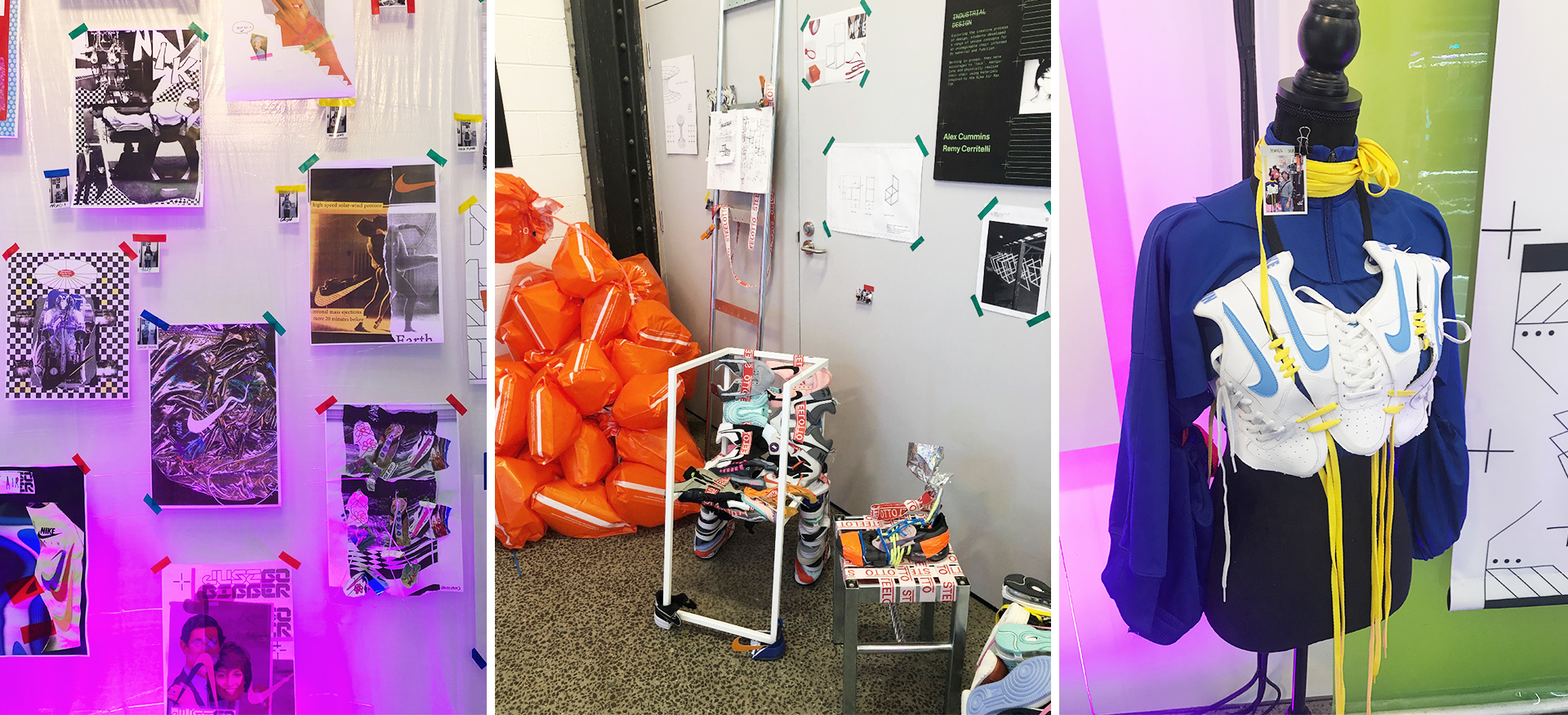
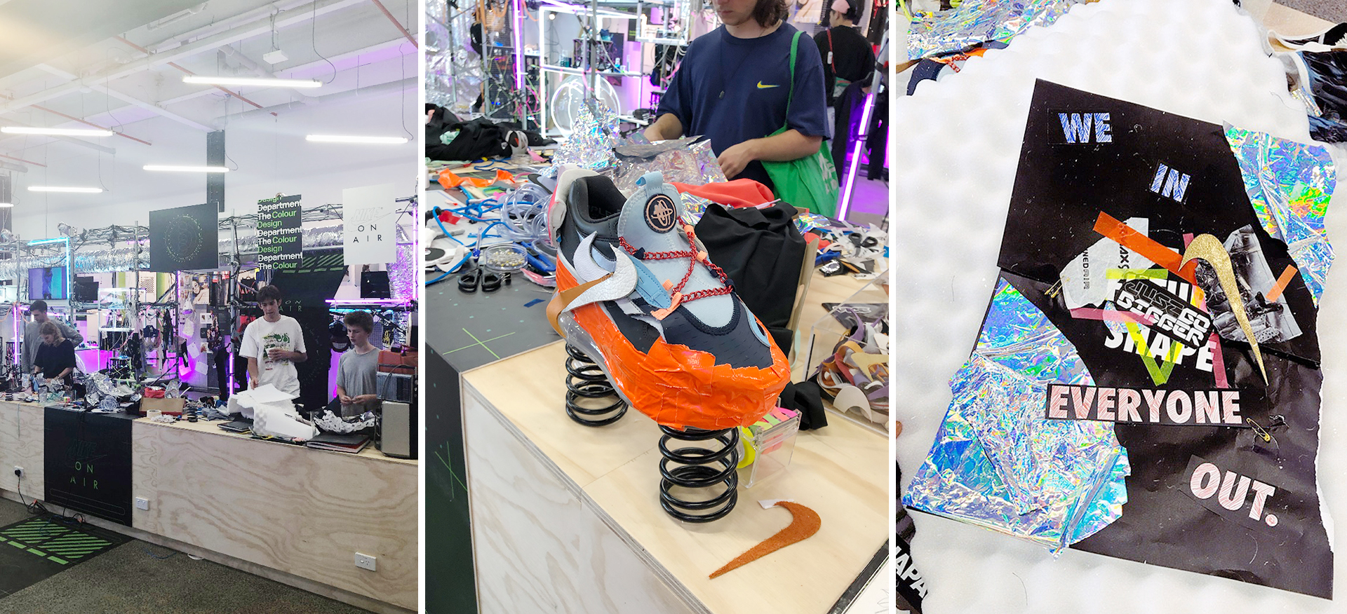
If that is the case, Nike has done it again with its live exhibition: The Melbourne Department. This exhibition was held in FAB9, a creative space in Footscray, for two days only; 23rd & 24th of March 2019. The Melbourne Department was a series of global events celebrating Nike Air, Design, Creativity and Learning. Nike has always come up with new, innovative products and equally innovative way to sell them. Nike’s President, Mark Parker, said, in order to stay relevant, Nike turns its design eye toward modern culture, pushing way beyond its roots as a performance running-shoe company.
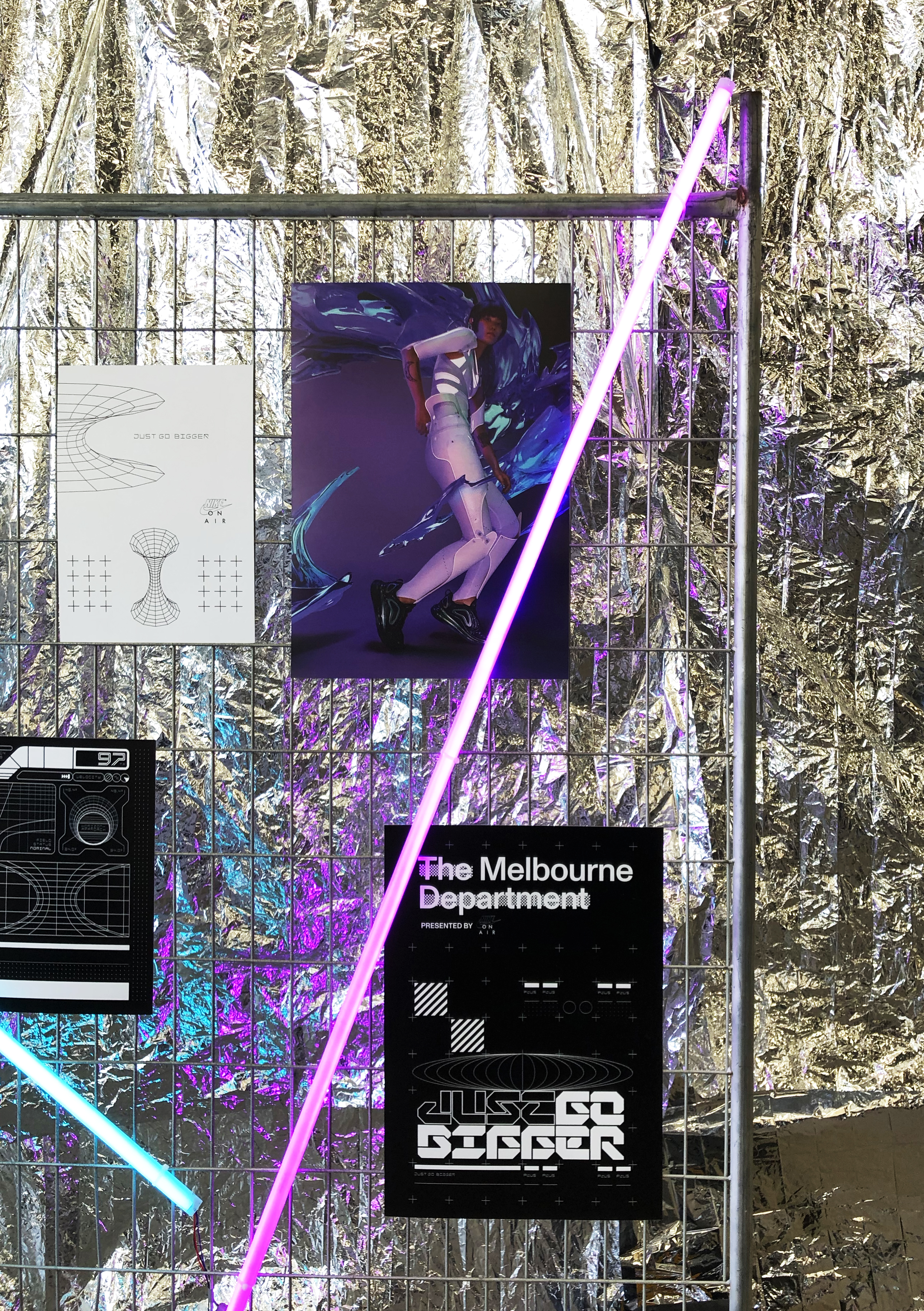
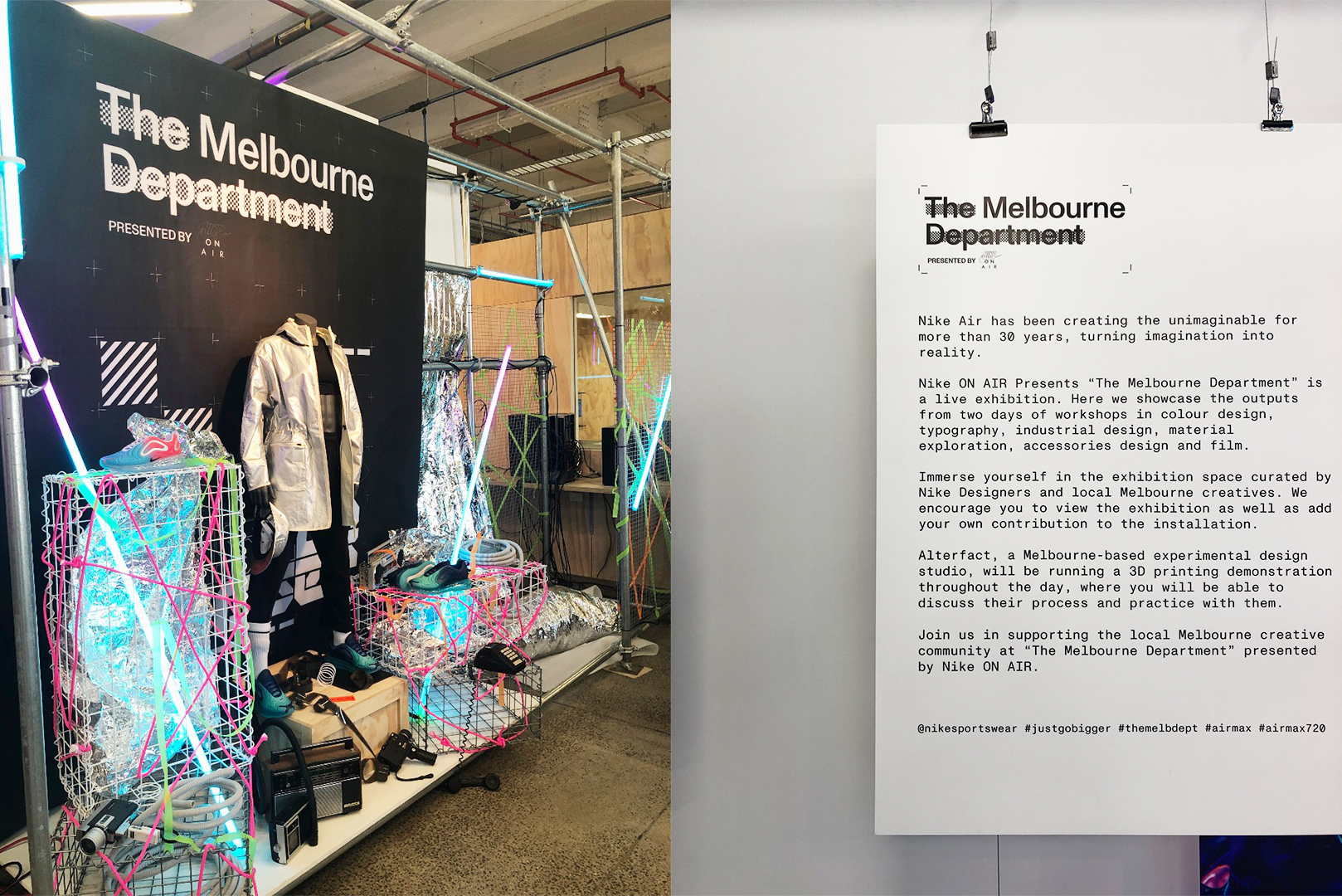
Left to right: Figure 1, The Melbourne Department installation. Figure 2, The Melbourne Department Exhibition label.
I can totally feel Nike’s energy and vision as I walked into the exhibition. Near the entrance, there was an installation with the sign that says, ‘The Melbourne Department,’ accompanied with a mannequin that showcased Nike outfit and a couple of Nike Air Max 720. “Nike Air has been creating the unimaginable for more than 30 years, turning imagination into reality,” was written on the label.
Even though the live exhibition was to celebrate Nike Air (the shoes), they showcased creative outputs across workshops in colour design, typography, industrial design, and material exploration. They also had workshops in accessories design and filmmaking that was running on the day.
Left to right: Figure 3, Participants’ work, typography. Figure 4, Participants’ work, industrial design. Figure 5, Participants’ work, material exploration.
I find it really interesting how Nike, a brand that is well known for its shoes and athletic wear, come up with this idea to bring together creatives from different industries to create something completely different from what is usually showcased on the shopfront. However, this all makes sense since Nike is a brand that is “dedicated to innovation” in the word of Phil Knight, Nike’s co-founder and current chairman.
The highlight of this exhibition was the fact that attendees could contribute to the exhibition. On this space, scattered there were old magazines, some Nike shoes that people had cut into pieces, a box filled with the famous swoosh patches, and other materials attendees could use to create whatever their heart desires, all works have to be inspired by Nike Air of course.
Left to right: Figure 6, The Melbourne Department collab space. Figure 7, attendees’ work. Figure 8, my contribution to the exhibition.
The whole ambience of the exhibition was firing one’s imagination. The displayed works had made me realise that you can do so much with creativity, especially when you are being surrounded by other creatives. I found the whole concept of this live exhibition and the pieces that were showcased, fascinating, as there were no limitations in what the participants could achieve during the workshops. This live exhibition is a great example of what Participatory Design is (later referred to as PD). Matthew Holt, on Transformation of the Aesthetic: Art as Participatory Design, stated that PD is “more concerned with ‘up-skilling’ its participants than being commercially focused on the production of objects.”
Previous statement by Holt confirmed that design is now interactive and participatory. I think the concept of live exhibition is more appealing to the masses because we like to feel as if we are a part of something, especially in today’s world where almost everything is made ready for us. This has something to do with ‘co-creation,’ as Holt, reciting Muller, stated that it is the increased awareness of audience participation in the co-creation of meaning, and the realisation that exhibitions are not so much overviews but exercises or laboratories in speculative modes of interaction. Will live exhibition take over the conventional museum exhibition in this creative industry? Do we desire collaboration or co-creation that much?
References:
Frisch, Aaron. The Story of Nike. North Mankato, Minn.: Smart Apple Media, 2004.
Greene, Jay. Design Is How It Works: How the Smartest Companies Turn Products into
Icons. New York: Portfolio, 2010.
Holt, Matthew. “Transformation of the
Aesthetic: Art as Participatory Design.” Design
and Culture, Volume 7:2 (September 2015): 143-165.
Entering the National Gallery of Victoria (NGV), the line for Escher X Nendo was consistently prolonged. The exhibition featured many extraordinary arts of the Dutch Artist M.C Escher. Consisting of many iconic images during the twentieth century, there was an overall of 160 prints and design. Nendo comes from the name of the Japanese Design studio where the work was commended.
Walking
around the exhibition there were many designs big and small which captured the
eyes of many around. Putting into perspective of the eye, it involved movement
to capture the image of the artworks by the designer. Including animations, it
was very lively and intriguing, making it playful to the viewers.
This isn’t the first time the NGV has innovated past the standard “white cube” exhibition model. The world has accepted and legitimized new forms of art and the situation where new forms of design are appearing as rapidly as art movement. [4]
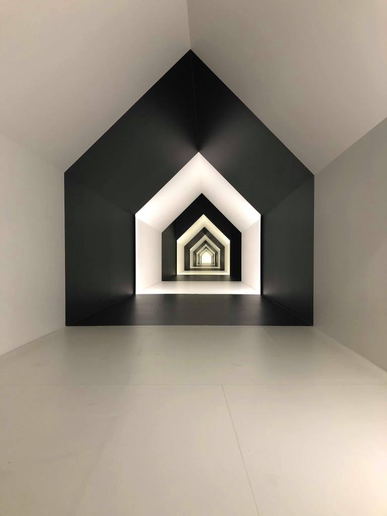
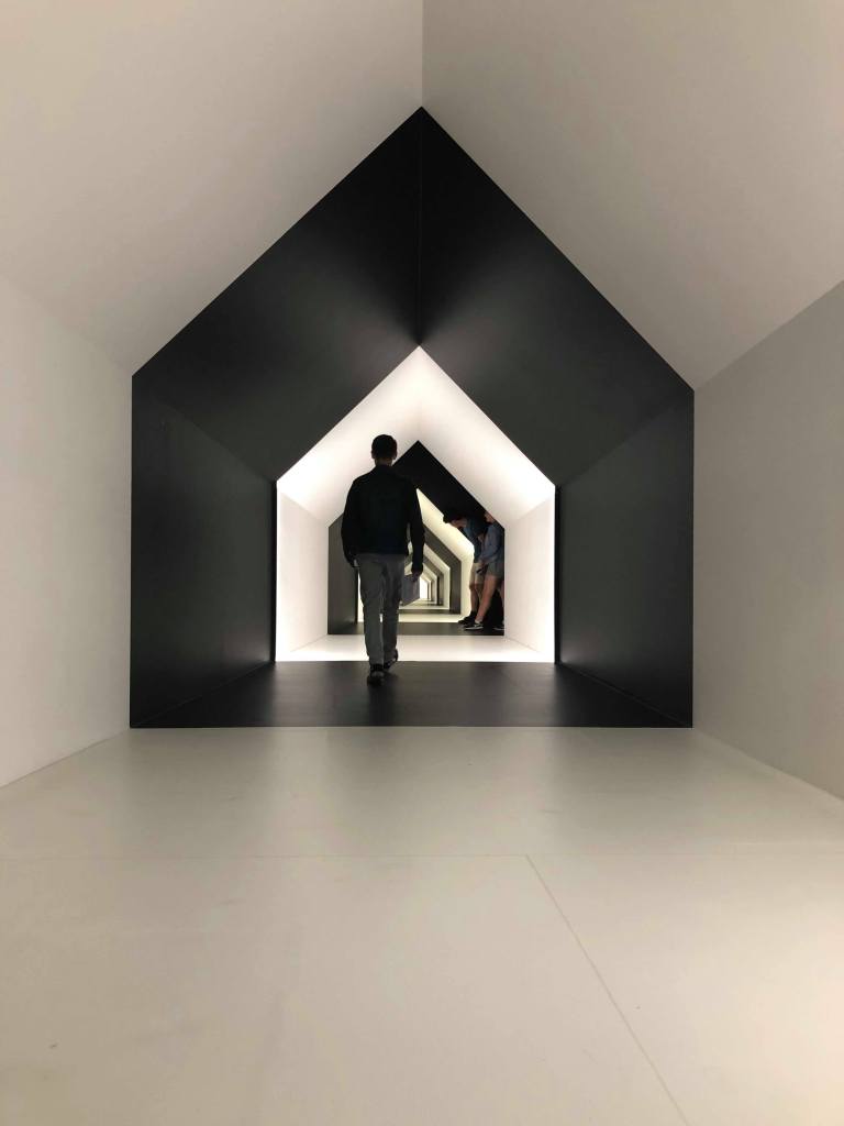
Figure 2, Image of House of Perspective Metal Rods Long-Shot
Figure 1, Image of House of Perspective Metal Rods Up-Close
Two rooms that stood out for me was the “House in Perspective”. Walking around the first room to see black metal rods, I was quite confused on what I was supposed to see. (Figure 1) Placed in a clutter; it took me awhile to realize that I had to look from a specific angle which then formed a house. (Figure 2) The rods enabled the works to be displayed in a new spatial arrangement rather than simply being mounted on the walls. [1] The way the house motif is developed shows this amazing capacity for subtle change, creating a kind of theater of the object. [3]
Figure 3, Photograph of the House of Perspective
Figure 4, Photograph of the House of Perspective
Still a part of the House of Perspective, there was a house-shaped corridor which was a catalyst work for their whole design.(Figure 3 & 4) It was one of the main attractions for everyone. Watching people take photos for memories as well as for their social medias, I can say I was also one of them. Walking through, it felt like I was travelling down a rabbit hole like the movie, Alice in Wonderland. Gradually becoming smaller and lower, it became an optical illusion as it was alternating with black and white patterns whilst decreasing in size.
The information provided with the artworks, the exploration of shapes and space were brought along into the design concept. I noticed it was related to maths and psychology which brought me back to my high schools where I learnt those subjects. To the socially recognized hierarchy of the arts, and within each of them, of genres, schools or periods. [2]
The aesthetics all around whilst walking, not many you can fault with just the simple colours of black and white. As the work was about engagement and movement with the audience, Escher and Nendo without a doubt ticked those boxes.
For
choosing a favourite between Escher and Nendo, I’d prefer the works of Nendo as
his work was more hands on and allowed everyone to have a feel of the design.
His work was more engaging towards everyone around which gave me a sense of
playfulness.
I would recommend this exhibition to everyone, not only towards the design lovers. Receiving inspiration from the designs, it gives a sense of freedom in what we do alongside creativity.