Forgotten Designers // Adrian Adolph Greenberg

By Jenny Lam

Do you remember “The Wizard of Oz”?  Back in 1939 when images weren’t in color but black and white. I guess you didn’t know who designed the costumes for the characters either, don’t worry I didn’t either.
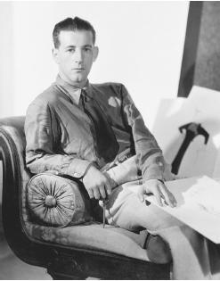
Figure 1. Image of Adrian Adolph Greensburg

Adrian Adolph Greensburg was an American costume designer who designed the costumes for The Wizard of Oz as well as hundreds of Metro-Goldwyn-Mayer films between 1928 to 1941.(Figure 1) His contributions to the world of fashion went beyond the silver screen. [1]

Designing all the costumes for The Wizard of Oz, “….Adrian was not afraid to test surprising new styles or have a bit of fun with a design. He maintained it would either be fashionable by the time the movie was reviewed or be so unusual that it was exempt from fashion.” [3] (Figure 2)
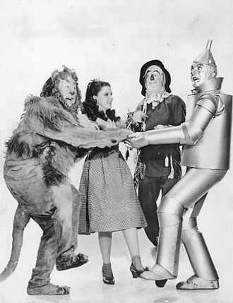
Figure 2, Image of The Wizard of Oz Costumes

One design of Adrian’s stood out the most, was the ruby slippers for Dorothy (Judy Garland) in The Wizard of Oz (Figure 3). There were two variations for the shoe design. The first pair was an “Arabian Test Pair” with the curling toes and heels. This didn’t quite suit Dorothy’s farm girl image, so he had to recreate the design which is now worth over $666,000. [2] The details on the shoes consisted of 2,300 sequins. Thinking that Adrian only created one shoe, there was as many as 10 pairs each varying half a size larger.
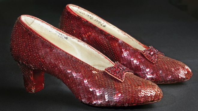
Figure 3, Image of Dorothy’s Red Slippers

Dresses he designed was to prove that women didn’t need to have a perfect figure to look good in what they wear. Drawing the attention to the garment itself, it was to assist hiding the body’s imperfections. [6] The designs of the clothing he did was more reflected on his personal interpretation of the skill rather than the historical time. It was appealing to the eye of many as he designed for more than 250 different films.

Being a costume designer, may seem like an easy task to many until you are placed into their shoes. Adrian’s overlooked many of his designs to make sure the dresses seem more dynamic onscreen as he insisted on using the finest materials and workmanship for the final execution. In the world of aesthetic taste, a number of variations and mutually contradictory taste preferences prevail. [4]

Adrian’s influence was noticed by every showroom and store in the company. If trying to figure out who Adrian was, I would say it would be from the classic movie, The Wizard of Oz. The pure intention of the artist is that of a producer who aims to autonomous, this is, entirely the master of his product. [5]

[4] Despina Christoforidou, Elin Olander And Anders Warell (2012) The Design Journal: Good Taste vs. Good Design: A Tug of War in the Light of Bling (WK5 Reading)

[3] Hollis Jenkins Evans,”Adrian” Vintage Fashion Guild, Accessed 11th April, 2019
https://vintagefashionguild.org/fashion-history/adrian/

[2] New England Historical Society, “Adrian, The Hatmaker’s Son Who Dressed America” Accessed 11th April 2019 http://www.newenglandhistoricalsociety.com/adrian-hatmakers-son-dressed-america/

[5] Pierre Bourdieu (1984) Distinction: A Social Critique of the Judgement of Taste (WK 5 Reading)

[6] Ruby Lane Social. Adrian Adolph Greenberg – The Man Behind the Curtain – Glamorous Fashion Gown, 2011. Accessed 11th April 2019 https://www.rubylane.com/blog/categories/vintage-collectibles/adrian-adolph-greenberg-the-man-behind-the-curtain-glamorous-fashion-gowns/ .

[1] Savour Flair “10 Influential Fashion Designers That Time Forgot” Grace Gordon, 2016, Accessed 11th April 2019https://www.savoirflair.com/fashion/212028/forgotten-influential-fashion-designers
A Forgotten Movement – Redback Graphix and the Forgotten Art of Screen Printing

By Maksis Darzins

Australian design history is regularly omitted from formal design theory classes around the world but, more alarmingly, within Australia itself. After two years of formal design theory classes I have only just been exposed to the rich subculture of print making in Australia between the 1970’s and 1980’s.

This period was filled with underground poster collectives working to support minority political movements and marginalised societies through low cost printing methods, such as stencilling, lino cutting and, most importantly, screen printing.

Screen printing provided the production process for a raft of poster collectives that, because of this process, where able to produce vast quantities of brightly coloured and easily duplicated poster designs.

One of the most influential poster collectives was Redback Graphix, a poster company founded by Michael Callaghan in Sydney’s Griffith University in 1979.

Gregor Cullen became a key member of Redback Graphix when it moved from Sydney to Wollongong in 1980. Throughout Cullen’s time at Redback Graphix he used his talent to create posters about a range of serious social issues, which have almost all since been forgotten.

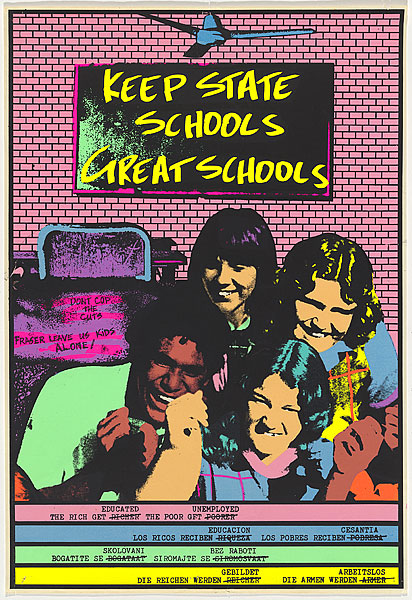
In 1983, Cullen designed a poster titled “Keep State Schools Great School” (Figure 1). This poster addressed the cost cuts that where being made by the Fraser Government to state schools at the time. The poster uses the typical bright colours and screen-printing techniques characterised by Redback Graphix to depict a group of students enjoying their state school education. The poster gets its message across using dark humour in the caption where Cullen has written “The rich get educated and the poor get unemployed”. This caption is designed to resonate with the audience, to alarm them about the seriousness of the cost cuts. This illustrates the positive impact Cullen has had on our society through the creation of his posters, and why we should remember him and his designs in contemporary visual culture.

Figure 1: Keep State Schools Great Schools, by Gregor Cullen, 1983

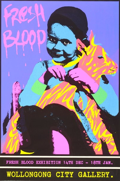
Cullen also used his posters to address other serious issues such as racism in the work place (Figure 2) as well as to support local art shows and similar exhibitions (Figure 3). These posters were created in a familiar Redback Graphix style, while communicating completely different messages.

Figure 2: The Workplace Is No Place for Racism, by Gregor Cullen, 1985

Figure 3: Fresh Blood, by Gregor Cullen, 1983

As digital technologies advanced, the artistry in poster making and silk screen printing was forgotten. The digital age lead to easy mass production of posters through new printing technologies. We see this nowadays as it is possible for anyone to print an infinite amount of full colour posters at the press of a button with minimal effort. This ease of manufacturing leads to an over-saturation of posters that pushes traditional poster designers out of their field.

The digital age has also allowed the greater population the ability to become poster designers. This means that anyone can jump on their computers, open a Microsoft Word document or an Adobe Illustrator artboard, and create a poster to push their message.

This is in stark contrast to the Redback Graphix process where the skills must be learned before a poster can be produced. To create a screen-printed poster the designer would have been taught in a more formal “master to student” way how to create designs, cut out stencils, lay ink and all of the tips and tricks in between. So, not just anyone could walk off the street, operate a screen printer and start creating posters. This extra element of artistry in poster making, supported by Redback Graphix, has since been forgotten and hidden from the wider population.

It is important that we understand and remember the art of print making that was so rich in Australia in the 1970’s and 1980’s, as promoted by artists such as Gregor Cullen at Redback Graphix, especially for its role in the formation of the current political and social construction of Australia.

References

Redback Graphix 1989, Redback Graphix: Now We Are 10 A Retrospective 1979 – 1989, The Impressionists, Camperdown NSW

Gregor Cullen, Gregor Cullen: About, viewed 11 April 2019 http://www.gregorcullen.com/gregor

National Gallery of Australia (NGA), Keep State Schools Great Schools, viewed 11 April 2019 https://artsearch.nga.gov.au/detail.cfm?irn=162786

National Gallery of Australia (NGA), The Workplace Is No Place for Racism, viewed 11 April 2019 https://artsearch.nga.gov.au/detail.cfm?irn=70772

Art Gallery NSW, Fresh Blood, viewed 11 April 2019 https://www.artgallery.nsw.gov.au/collection/works/103.1983/

Escher x Nendo | Between Two Worlds

Written by Carla Romana

Escher x Nendo Between Two Worlds held at the National Gallery of Victoria is an exhibition which started from December 2, 2018 until April 7 2019. This exhibition features two magnificent creators – M. C. Escher and Oki Sato/Nendo. The overall idea of the exhibition was to create a space where balance and harmony works between two forces – art and design. Nendo wanted to re-create Escher’s idea of making two dimensional things that are inspired by three-dimensional things, by doing the opposite in the gallery space [1].

After looking around the exhibition, it became clear that there was a connection between the Escher’s work and Nendo’s design space. Nendo created the space around Escher’s work. It gave individuals the chance to see two dimensional work but transformed into three dimensional forms through the gallery space. Each room was different, and conveyed a different mood. Although it was intentionally black and white just like Escher’s magnificent work, it created solitary but also harmony.

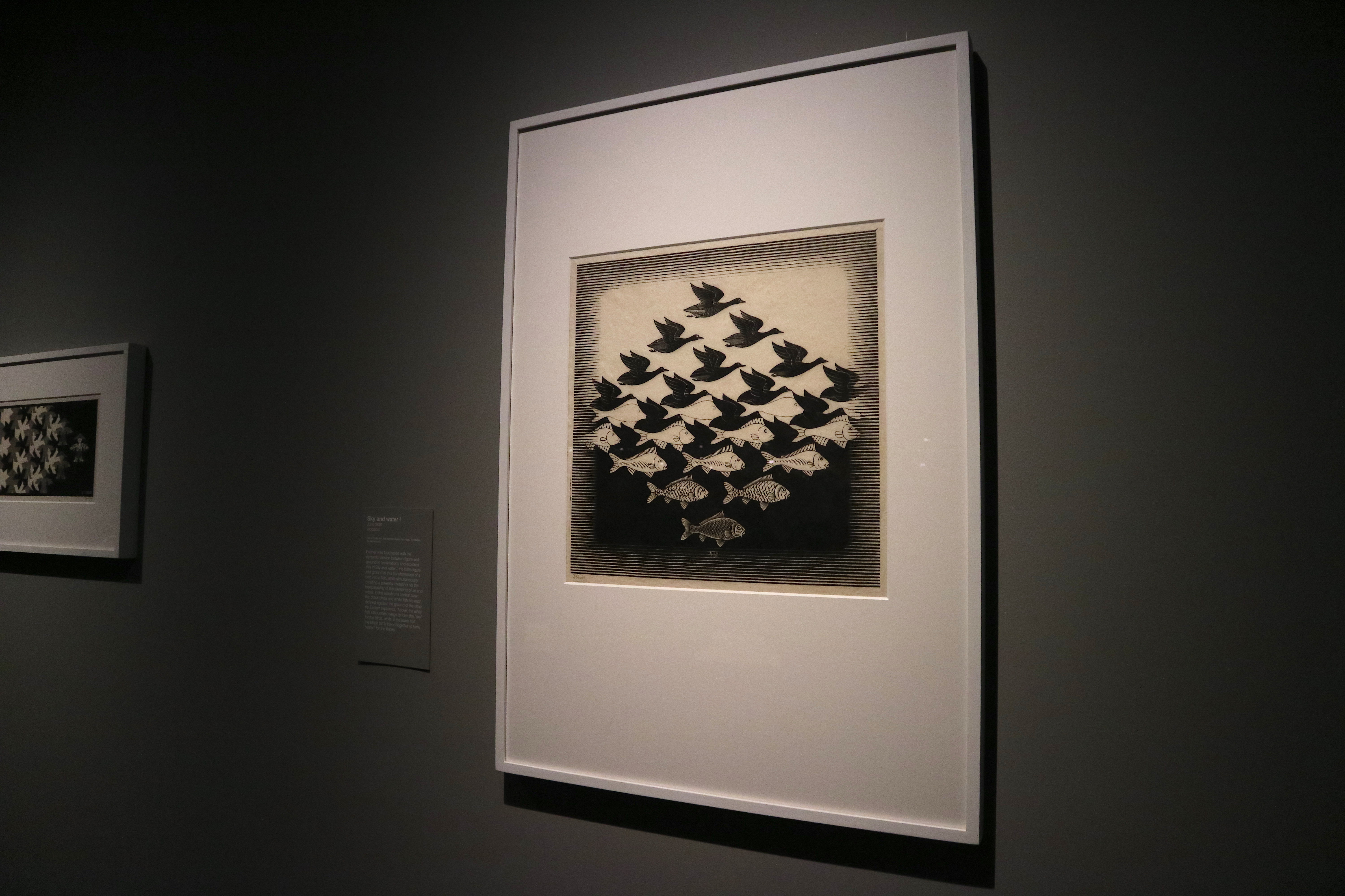
Figure 1, Photo I took in the NGV, M. C. Escher, Sky and Water, June 1938

Escher explored the Regular Division of the Plane and was particular obsessed with the idea of patterns interlocking shapes to create a bigger picture. Escher was able to ‘achieve a seamless metamorphosis of form in his images, creating an expression to his imaginary world of ‘inner visions’ [2].

Escher’s ‘Sky and Water’ (Figure 1) woodcut artwork shows the idea of his theory – the creation of tessellations morphing from one state to another. Escher connects the bird and the fish as well as the sky and the water. I found it interesting that both are opposites however they both relate to one another. Escher was fascinated by the idea of the figure and ground in this transformation whilst simultaneously creating a powerful metaphor of the elements of the air and water [3].

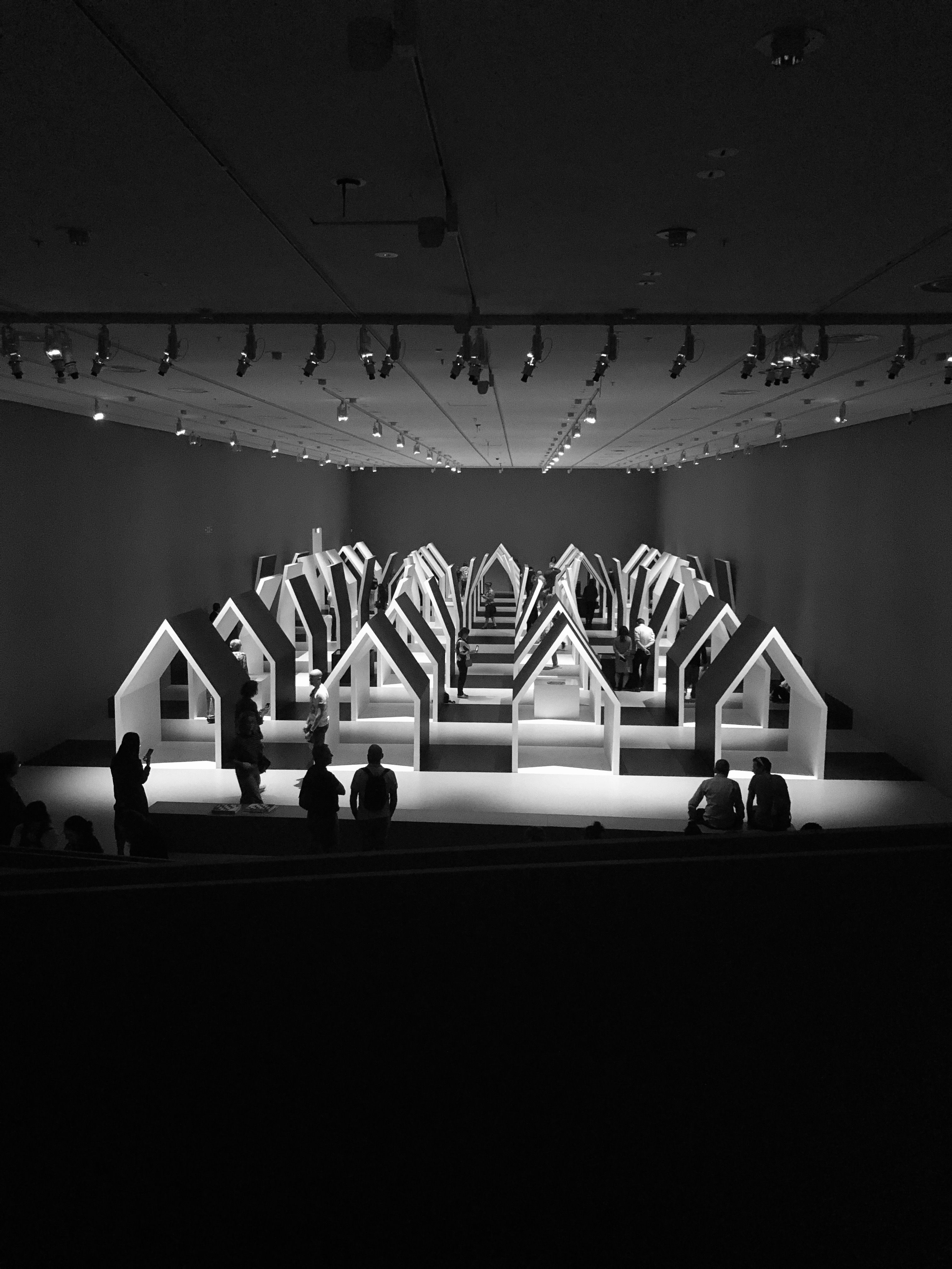
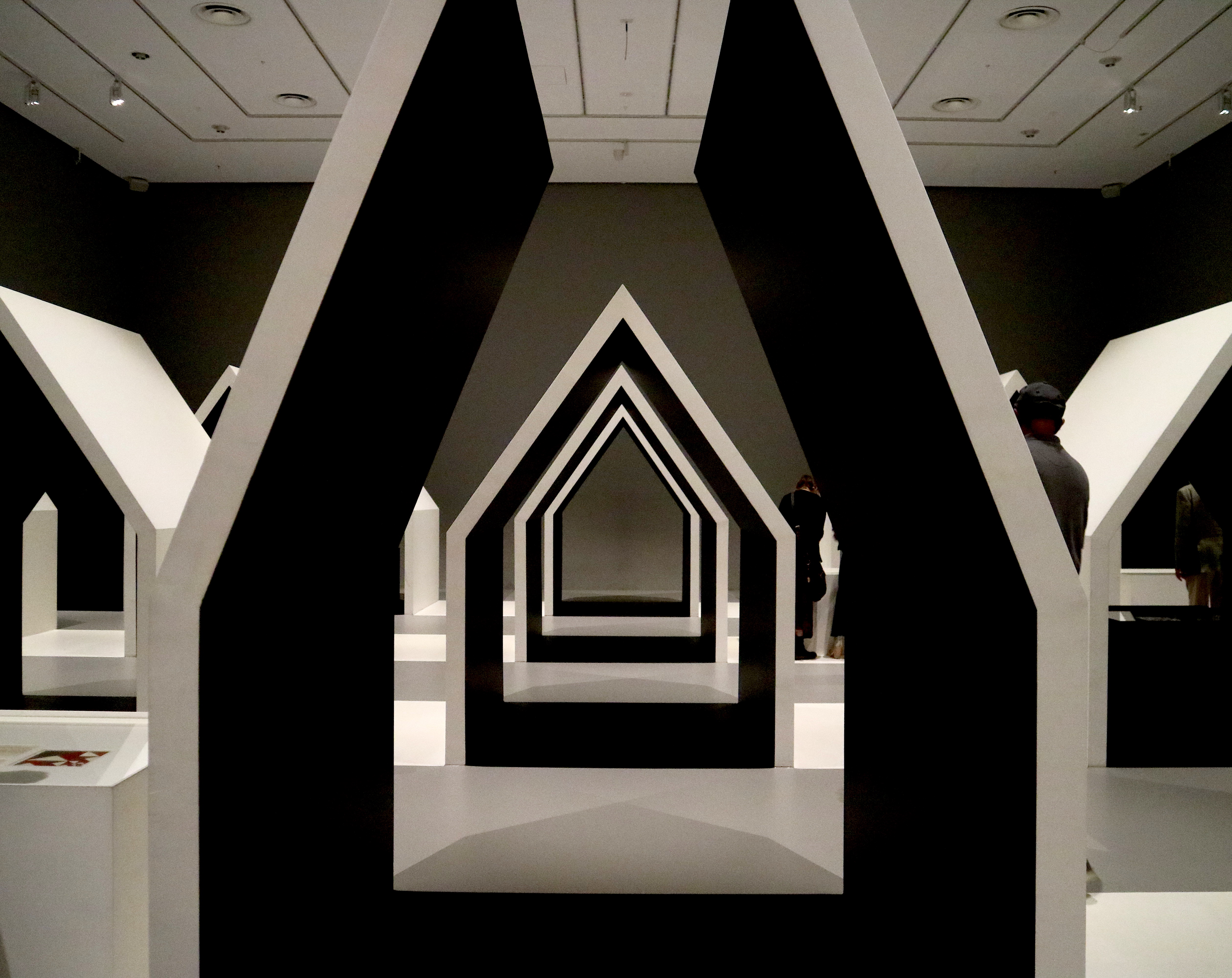
Nendo’s ‘Transforming House’ (Figure 2 & 3) installation design [4] was the space that was surreal compared to the photos that I’ve seen on Instagram. The installation gives individuals a chance to be within the space and be a part of artwork. The roofs of the house gradually open up and out, as if turned inside out [2]. From the centre of the installation, you are able to experience the roof unfold and turn into another form of a house towards the end. Nendo’s design gives an illusion of being able to step into a two dimensional picture. Viewers are able to wander around the space and discover Escher’s works as they immerse themselves within the installation.

Being within the space, and walking into the room and seeing the installation from a higher perspective, hearing the people in awe gave me the thought that this exhibition was a success. Not only were you able to just see the artworks but you’re able to interact with it. Comparing both ‘Sky and Water’ to ‘Transforming House’ people are able to see the relation between two and three dimensional things. The split gallery space present two different viewing experiences, allowing individuals to become immersed with the atmosphere.

[1] Escher x Nendo | Between Two Worlds, Audio Transcript, accessed April 11, 2019, https://www.ngv.vic.gov.au/wp-content/uploads/2019/03/NGV_EXN_AUDIOTRANSCRIPT.pdf

[2] “Escher x Nendo | Between Two Worlds, National Gallery of Victoria (NGV), accessed April 10, 2019, https://www.ngv.vic.gov.au/exhibition/escher-x-nendo-between-two-worlds/

[3] Escher’s ‘Sky and Water’ (June 1938) woodcut artwork

[4] Nendo’s ‘Transforming House’ (2018) installation design

[5] Escher x Nendo | Between Two Worlds, NGV Gallery Book, 105-109

[4] Oki Sato Interview, Escher NGV, accessed April 10, 2019, https://www.dezeen.com/2019/01/17/video-interview-oki-sato-nendo-mc-escher-national-gallery-victoria-movie/

Layer Drawings, Hand-in-Hand

Written by Carla Romana

As a designer myself, I have always been inspired by multiple artists and designers through my years of study and have experimented with various mediums and materials. I’ve always been curious about the creation of installations and by movement of water. It has always been something I’ve been wanting to explore and trace back to, with the memory of when I first had a fear of the deep blue.

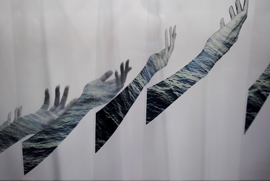
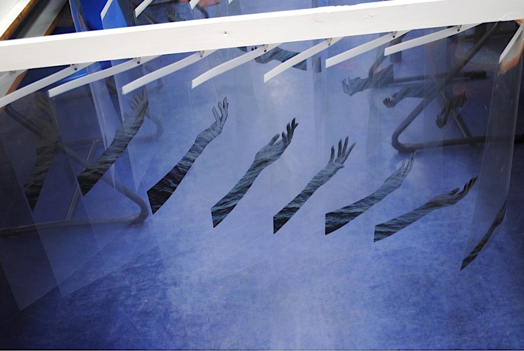
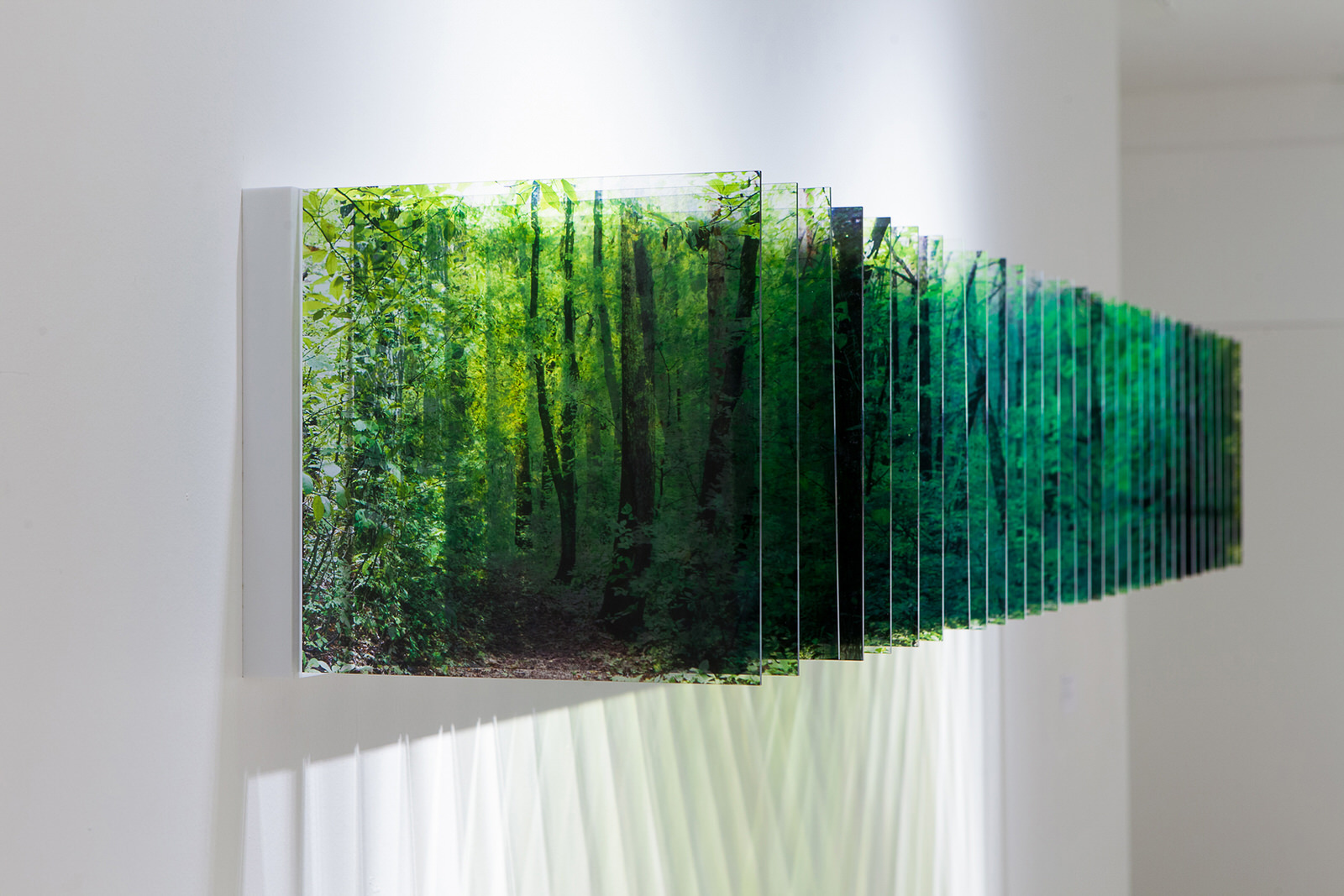
A few years ago, I worked on a contemporary mini installation piece Hand-in-Hand (Figure 1 & 2). This installation piece was inspired by an Japanese artist, Nobuhiro Nakanishi and his work Layer Drawings (Figure 3). He creatively used photography to explore time, space and art installation [1]. I found it interesting that his series of photos was a big gradual image through multiple acrylic sheets which gave the view of a panoramic image.

Figure 3. Nobuhiro Nakanishi, Layer Drawings, 2004-2016

The overall meaning of this installation is to ‘overcome the loneliness and hardship’ and escaping from a cramped confinement – being trapped in a space. The main interest of the installation are the hands that form an illusion of one side grabbing ahold of the hand on the other side of the installation. Coming together, both ends of the installation forms an arch, a pathway that creates a way for the individual to escape and to move forward. Sadly I don’t have an image that shows this arch/pathway. The tonal shift in the waves (from light to dark) as well as the desaturated arm is interpreted as an individual trying to reach out and escape from the confinement.

The hands are also an important part as its associated with the “pleasure of proximate senses” – the sense of touch [2]. The hands reaching out are a sign of hope. Even though it may be blue, black and white and could illustrate sadness and negativity, it could also depict a sign of hope and a better tomorrow. Even in our society today, we are starting to perceive ideas and going beyond the social norms. Escaping the boundaries and being influenced by those around us to move forward. When looking at the spaces between each individual sheet, it’s as if you want to attempt to fill the gaps in between. We want to fill in missing time and space. I wanted to create an installation where you’re also able to experience space, time and emotions as sensations experienced by both the viewer and the artist.

In a way, I wanted to explore two different realms – ’reality and fiction’ through the creation of the work (fiction) as well as the meaning behind the piece (reality) [3]. As seen through Nakanishi’s work, we are all subject to the passing of time, yet each of us feels and perceives it in our own way [4]. We experience the ephemerality of time through memorable objects and that serves as a purpose when we revisit those memories [1]. Despite being trapped in a cramped confinement, there will always be a way to escape whether you are bound by boundaries or not. Time will tell, that there will be someone willing to help you escape, from the depths of the deep blue.

[1] Nakanishi, Nobuhiro, About Layer Drawings, accessed April 10, 2019, http://nobuhironakanishi.com/essay/layer-drawings-en/

[2] Mack, Adam, The Politics of Good Taste, 2012, The Senses and Society, 7:1, 87-94

[3] Bourdieu, Pierre, Introduction from Distinction: A Social Critique of the Judgement of Taste, 1984, 1-7

[4] Zhang, Michael, Layers of Time, accessed April 11, 2019, https://petapixel.com/2017/06/19/layers-time-created-arranging-photos-acrylic/

The red flower room

by Kaybe Wong

When talking about Japanese artists, you must have heard this name, Yayoi Kusama, “who was a self-described “obsessional artist.”[1] She is well known by “her immersive installations that explore ideas of infinity and obliteration.” [2] She obsessed with using polka dots and nets in her artworks.

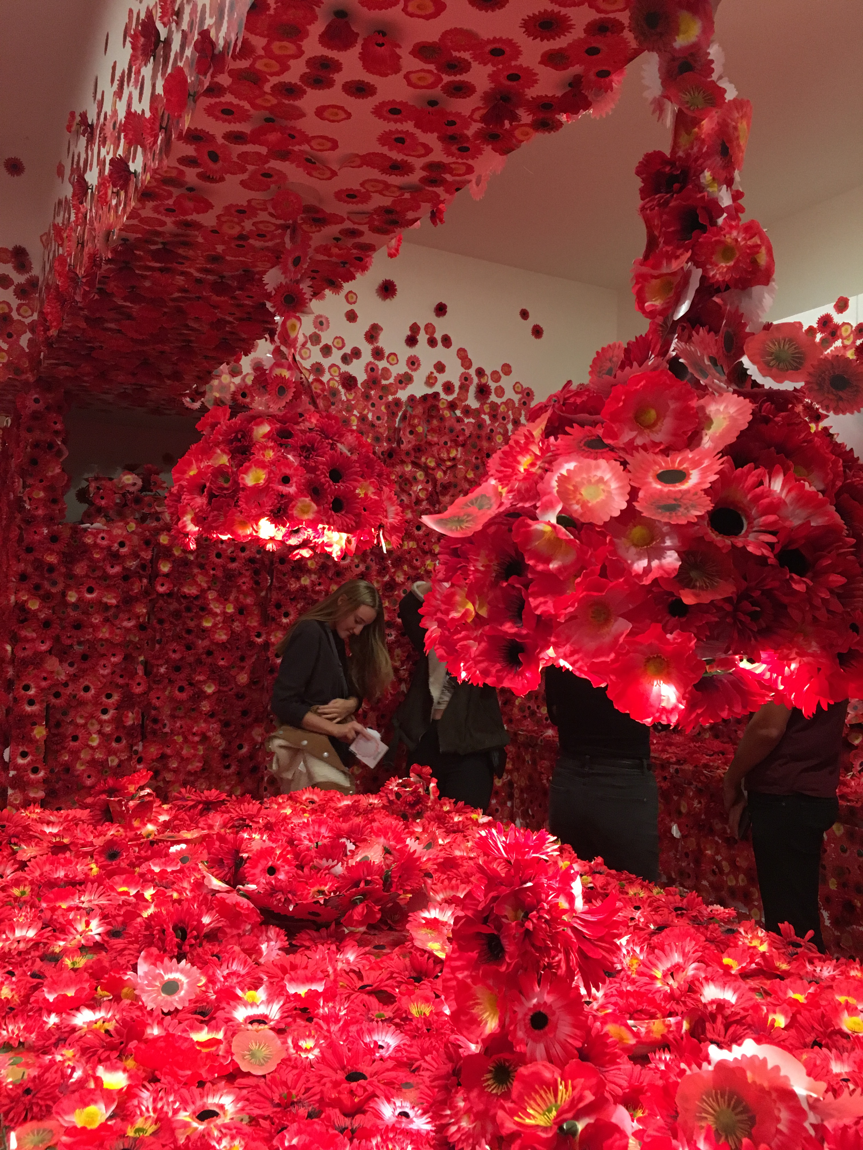
Figure 1 & 2. Photos I took in the NGV

During 15th December in 2017 to 15th April in 2018, there was an exhibition done by her was held at the National Gallery of Victoria (NGV) in Melbourne, which is the Flower Obsession. The concept of this exhibition is similar to her other exhibition, The Obliteration Room, which is to invite the audience to engage and complete the artwork. Kusama has been experiencing vivid hallucination since ten years old, and this idea is inspired by one of her childhood experience. One day she was gazing at a table towel with red flower pattern, and suddenly the entire room was filled with red flowers, even her body as well.[3] In the Flower Obsession, Kusama created a furnished space in the NGV, the audience will be given a red flower sticker to stick anywhere in that space, in order to make the space filled with red flowers and transform the space into a spectacular and unique environment. This kind of art is called Participatory Art, “it is a term that describes a form of art that directly engages the audience in the creative process so that they become participants in the event.”[4] The aim is to “increase awareness of audience participation in the co-creation of meaning”[5], and the exhibition is more emphasis on the interaction with the audience but not the overviews.

I went to the exhibition in February, and I was excited about it because I always like Kusama’s works such as the dotty yellow pumpkin and The Obliteration Room , however I had never got a chance to see her artworks in person. Therefore, I was really excited when I knew that she was holding an exhibition in Melbourne.
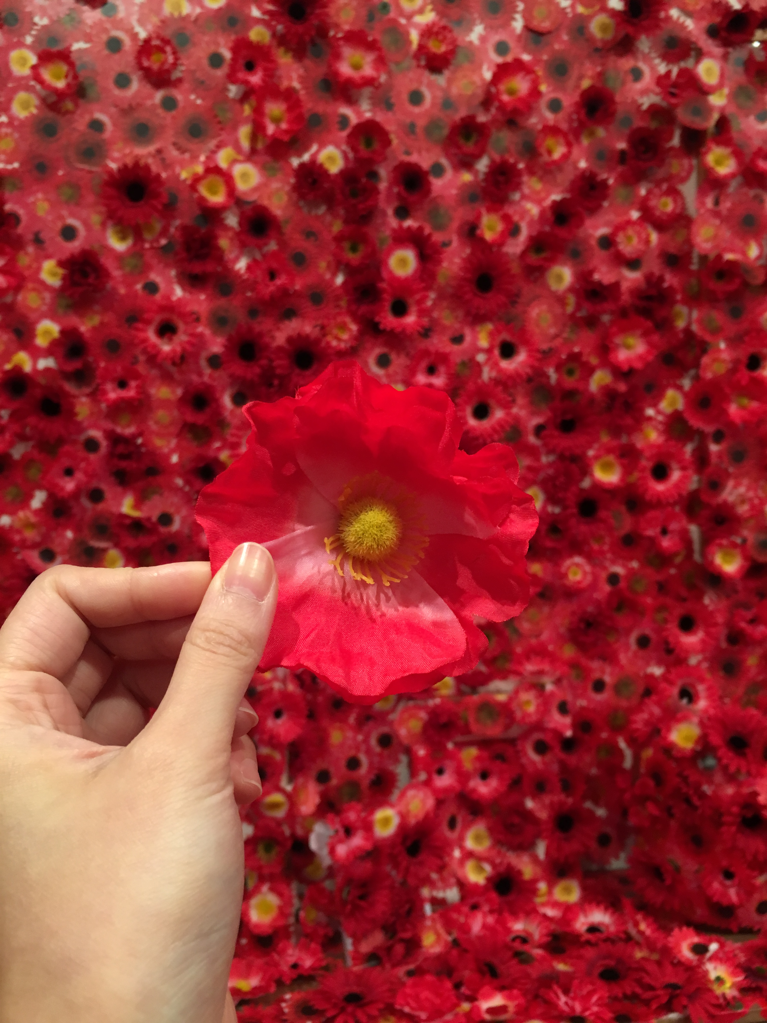
Before everyone got in, we got a red flower sticker, which let visitors stick in the space. When I first stepped in the space, I think it is amazing and spectacular, which you cannot feel it by just looking at the photos on Instagram. The space was actually like a house, there was a table, chairs, sofa and even a toilet etc. The entire space was filled with red colour, and when you look closer, you can see they are all red flowers, the plastic one and the sticker one. And of course, I sticked my red flower sticker on the wall as well! However, a friendly reminder that you may get a bit scared if you have Trypophobia. Moreover, I think the space of the exhibition can be larger because it was crowded that my friend and I could not walk into some popular photographing spots, for example, the bathtub.

Flower Obsession was very successful, there were “more than 550,000 stickers were affixed to the surfaces of an ordinary apartment.”[6] Besides the popularity of Kusama, I think the reason why Flower Obsession is remarkable because of the concept of the exhibition. It is a participatory art, which let the audience engage in the artwork, participate in the process of creating it. This kind of interaction is more impressive than just looking at an amazing painting or art piece, as the audience create the artwork as well, it is their artwork too. Therefore, that’s why I still remember how the exhibition looks like after a year because I participated in creating the Flower Obsession too!

[1] Rachel Cole, “Yayoi Kusama | Biography, Art, & Facts”, Encyclopedia Britannica, Last modified 2019, https://www.britannica.com/biography/Yayoi-Kusama.

[2] “Artists | NGV”, Ngv.Vic.Gov.Au, Last modified 2019, https://www.ngv.vic.gov.au/triennial-voices/artists/?a=58.

[3] Kate Sierzputowski, “Yayoi Kusama’s ‘Flower Obsession’ Invites Guests To Cover A Domestic Interior With Faux Blossoms”, Colossal, Last modified 2018, https://www.thisiscolossal.com/2018/04/yayoi-kusamas-flower-obsession/.

[4] “Participatory Art – Art Term | Tate”, Tate, Last modified 2019, https://www.tate.org.uk/art/art-terms/p/participatory-art.

[5] Matthew Holt, “Transformation of the Aesthetic: Art as Participatory Design.” Design and Culture 7, no. 2 (2015): 143-65.

[6] Ben Neutze, “The NGV’s Triennial Is The Gallery’s Most-Visited Exhibition Ever”, Time Out Melbourne, Last modified 2018, https://www.timeout.com/melbourne/news/the-ngvs-triennial-is-the-gallerys-most-visited-exhibition-ever-041918.

A designer, not just a lover

by Kaybe Wong

When we talk about the female fashion designer, you may think about some well-known designers, such as CoCo Chanel, Vivienne Tam and Vivienne Westwood. However, there was also a talented fashion designer whom we have forgotten about, and she is Emilie Flöge.

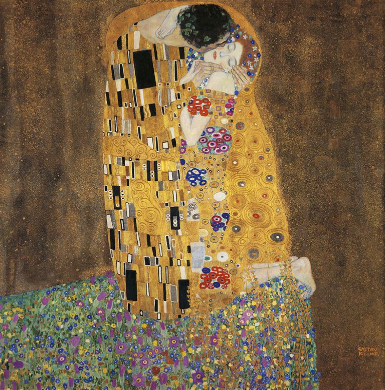
You may not have heard her name before, but you may see Gustav Klimt’s painting The Kiss (Figure 1.) and many people believe that the kissing couples in the painting are Klimt and Emilie Flöge.

Figure 1. Gustav Klimt, The Kiss, 1907 [1]

Flöge was a dress designer, she started up the Schwestern Flöge fashion house with her two sisters in Vienna in 1904.[2] However, “this partnership was unusual at a time when Austrian women did not often venture into business.”[3] From here, it shows that women were not active in the workplace or have their own business. And I believe that it was because sexual stereotyping occurred at that period of time, which means “all domestic and caring work within the family is denoted as ‘women’s work’, whilst waged work in the public domain is classified as ‘men’s work’.”[4] People thought that women should stay at home and do housework while men should go to work and earn money to raise the family and that’s why it was polarised when three women had their own business.

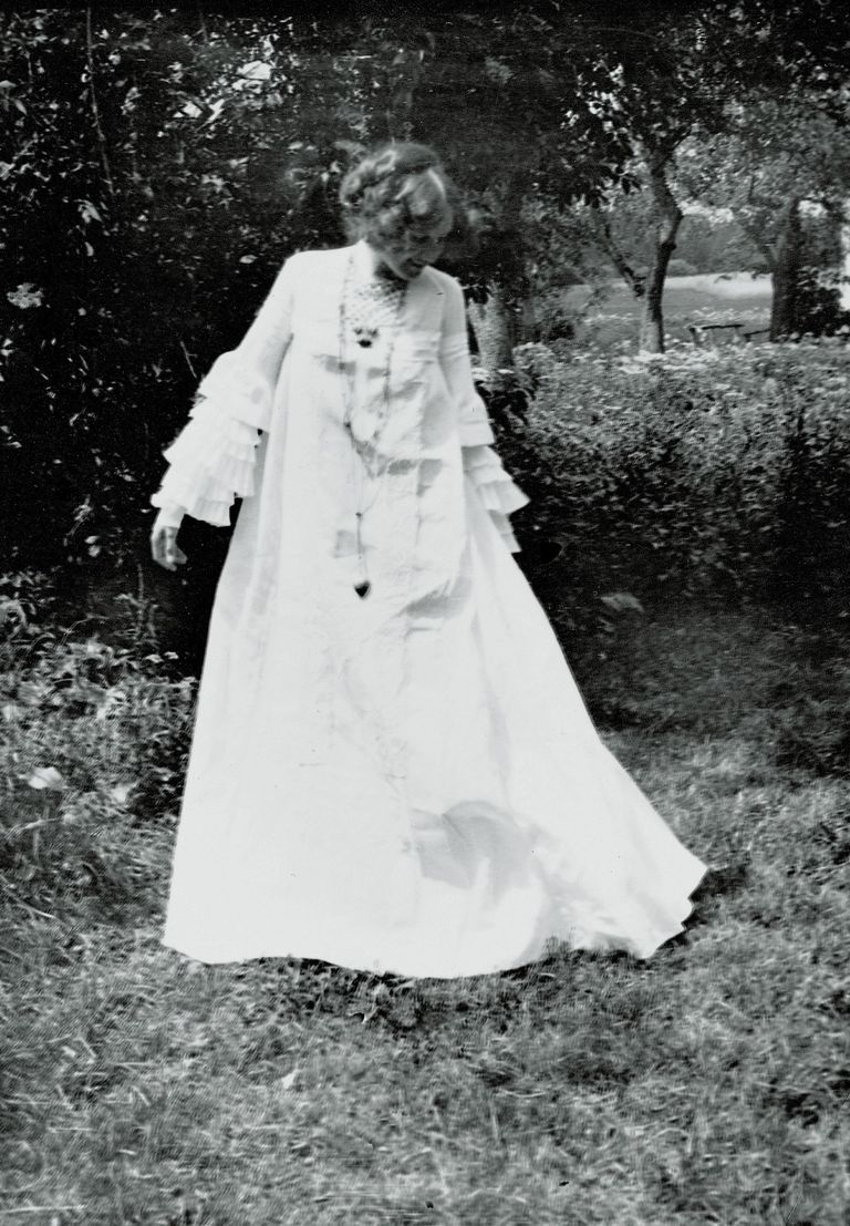
Although Flöge was a talented fashion designer, her works were not accepted by the public. It was because her works were influenced by the feminist movement, her designs were more focus on functional and comfortable. For instance, in the Figure 2., it is a dress designed by her, she avoided the constraining bodices but used a long, loosely design cutting, which was easy and comfortable to wear.

Figure 2. A dress deigned by Emilie Flöge [5]

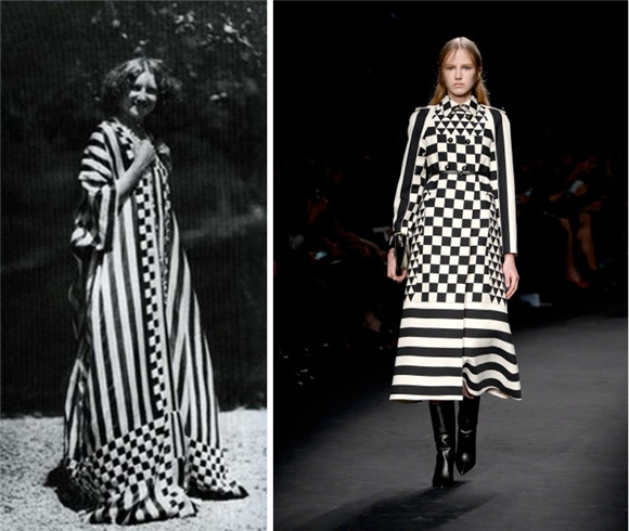
Flöge’s design might be identified as “bad taste” at that time, but after nearly a century, her designs do influence a famous fashion brand in 2015 (Figure 3.), which is Valentino, and her design is identified as “good taste” now. From here, it shows that “what is considered good taste is socially constructed,” [6] people in the past thought Flöge’s design was bad taste, but it does not mean her design is a bad design. It was just because the fashion trend at that time was tight dress and constraining bodices but Flöge’s design was different and opposite, which is loosely dress without constraining bodices.

Figure 3. Valentino inspired by Flöge’s design [7]

I think Emilie Flöge is an amazing female fashion designer, because of her unique thinking and bold design. However, she is forgotten by the world. When I was doing research on her, I found out that there are many articles and information about the relationship between Klimt and her, and more focus on Klimt’s paintings but not much about Flöge’s designs. And I feel sad about that because while Klimt’s paintings were so popular, but Flöge’s talent and designs was unknown and unrecognised in the fashion history, and she surely deserves attention just like CoCo Chanel.


[1] “The Kiss Painting – Google Search”, Google.Com, Last modified 2019, https://www.google.com/search?q=the+kiss+painting&source=lnms&tbm=isch&sa=X&ved=0ahUKEwi9hP_spMfhAhWXMt4KH

[2] Fischer, Wolfgang G. “GUSTAV KLIMT & EMILIE FLÖGE.” Art Book 1, no. 2 (1994): 38.

[3] Powell, Nicolas. “Emilie Floge and Her Lover Gustav Klimt.” Apollo (Archive : 1925-2005) 116, no. 246 (1982): 112-14.

[4] Bruce, and Lewis. “Women Designers — Is There a Gender Trap?” Design Studies 11, no. 2 (1990): 114-20.

[5] “Emilie Flöge Dresses – Google Search”, Google.Com, Last modified 2019, https://www.google.com/search?tbm=isch&sa=1&ei=9M6uXJrJGoevmAWk5blo&q=emilie+fl%C3%B6ge+dresses&oq=Emilie+Fl%C3%B6ge+&gs_l=img.1.0.0i19j0i30i19j0i8i30i19j0i30i19l6j0i5i30i19.910411.910411..911697…0.0..0.189.189.0j1……1….2j1..gws-wiz-img.0WF13bDxBBE#imgrc=cMDbmORVL85hwM:.

[6] Christoforidou, Despina, Elin Olander, Anders Warell, and Lisbeth Svengren Holm. “Good Taste vs. Good Design: A Tug of War in the Light of Bling.” The Design Journal 15, no. 2 (2012): 185-202.

[7] “Emilie Flöge”, Jiemian.Com, Last modified 2015, https://www.jiemian.com/article/330056.html.

Welcome to Wasteland: The Future of Design

By Maksis Darzins

As sustainability becomes more of a concern in our day to day lives, designers will be responsible for creating change that pushes away from the ideas of consumerism and mass production. Designers will have to use their skills to develop creative solutions for everyday activities with an ever-larger emphasis on sustainable and ethical design practices.

The Welcome to Wasteland exhibition shows positive steps to a cleaner future. The exhibition highlights the positive change being made by many architects, industrial designers, furniture designers and design researchers across Australia to achieve a cleaner future through transforming waste to functional products.

The Welcome to Wasteland exhibition was displayed at Compound Interest, which is a single room gallery hidden between Collingwood’s heritage town houses and ever-changing vibrant graffiti.

This single room was presented with all the exhibits positioned around the outer wall with a pile of materials used by the selected designers arranged in the centre. This material pile looked like a hard waste collection at first glace due to its porcelain shards, metallic tubes and industrial plastic off-cuts arranged in a haphazard construction.

After looking around the exhibition the first time it became clear that this collection of waste was a selection of materials that the designers had repurposed and reimagined into one of a kind products and furniture pieces.

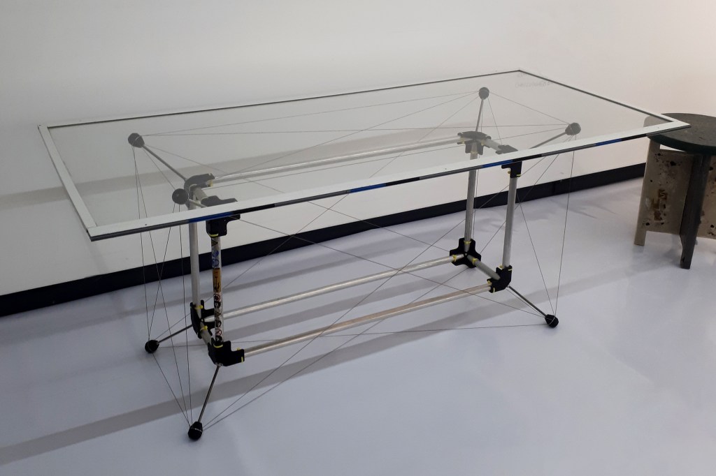
One example of this is TeMo (Figure 1),a tensegrity table designed by Mark Richardson out of aluminium tubing with a plate glass top. The materials could have all been bought brand new from the local hardware store but instead Richardson repurposed the handles from old whipper-snippers that he found in hard rubbish collections or at waste transfer centres. These tubes where then held together with simple 3D printed brackets which could be made in house without any outsourcing which adds to the philosophy of sustainable design practices.

Figure 1: TeMo by Mark Richardson

This ingenuity was seen throughout the whole exhibition as these talented, progressive designers had turned materials such as marine plastic debris and spent coffee grounds into door knobs and functional stools.

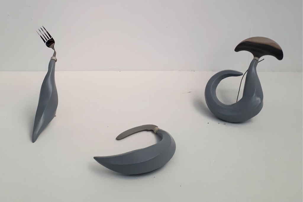
From the whole exhibition the product that interested me the most was a cutlery set titled Grip (Figure 2). This product caught my eye through its use of organic curves and unusual shapes. Grip was designed by Sarah Ceravolo who is a Melbourne based designer who works mainly with the development of dynamic forms and generative technologies.

Ceravolo designed this cutlery set with the dynamic forms in mind as well as the overarching theme, from Welcome to Wasteland, of sustainability. This cutlery set was made out of HDPE plastic syringes that would have normally been thrown out as hospital waste. Ceravolo states on her Instagram that “Australian hospitals produce 260 million kilograms of solid waste each year”. This waste is currently disposed of after its short usage life, ending up in landfill across the country. Ceravolo’s work shows clearly that this hospital waste could easily be melted down and recycled into a vast variety of useful products, giving this saved landfill a second life.

Grip has an extra level of positive impact as the items have been designed specifically in their interesting forms to help individuals who have difficulty gripping traditional cutlery due to a lack of fine motor skills. This is what has dictated the thicker handle and unconventional geometry. This can be seen particularly well with the knife where the blade is located directly below the handle rather than, conventionally, at the end of a thin lever. The blade location means that the cutting force is not applied directly from the wrist but from further up the users arm, making it easier to apply the required force.

Figure 2: Grip by Sarah Ceravolo

The idea of designing for a specific purpose also resonated with the Welcome to Wasteland exhibition, as it means the product will have a longer life. The Grip, for example, will always serve their stated purpose and will not simply be disposed of after one use like plastic cutlery would, or be replaced once they go out of fashion, as homeware and fast fashion items tend to do.

This exhibition has made me think more about how I work in my own design process. I have started to think twice before buying new materials, seeing if I can possibly use recycled materials, upcycling waste, or whether the product is even worth making, that is, will the product’s positive impact out weigh its negative environmental impact.

This was a great exhibition for any design student to see as it promoted cleaner design practices and stimulated design ideas through the adaption of unusual materials, while clearly showing the direction in which design is heading today.

Written by Maksis Darzins

References

Pieces of Eight, Sarah Ceravolo, viewed 7 April 2019, https://www.piecesofeight.com.au/collections/sarah-ceravolo

Convolo Design, About Concolo Design, viewed 7 April 2019, https://www.convolodesign.com/studio/

Ceravolo, S 2019, Instagram update, 25 March, viewed 7 April 2019, https://www.instagram.com/convolo_design/?hl=en

National Gallery of Victoria (NGV), Welcome to Wasteland, viewed 17 March 2019, https://www.ngv.vic.gov.au/program/welcome-to-wasteland/

Friends and Associates, Mark Richardson: TeMo, viewed 10 April 2019, http://solar.friendsand.associates/glass-aluminium-plastic-stainless-steel

Friends and Associates, Sarah Ceravolo: Grip, viewed 10 April 2019, http://solar.friendsand.associates/hdpe-polyethelene-stainless-steel

Example Blog

“Maybe The People”

National Gallery of Victoria Triennial is a free exhibition which started from 15th of December 2017 till 15th of April 2018 celebrating the contemporary art and design practice that traverses all four levels of NGV international[1], as well as offering a rich array of programs. There is a large range of aspects been exhibited covering the art and design practices including animation, drawing, sculpture, film, architecture, painting and tapestry. The visitors would have the opportunity to look at the most creative minds in the world because the exhibition is featuring the work of over 100 artists and designers from 31 countries.
One of the artworks been exhibited is for a New Zealand based artist Kushana Bush. The work is combination of few pieces which is known as “Maybe The People” [2].

The artwork shows the highly attention to details in the characters and the elements involve, which is a very common practice in most of Bush’s works.  The artwork has been rendered painstakingly in gouache on paper, using a combination of Eastern and Westerns styles.  The work contains shadows, wind-blown fields grass, wispy clouds and waves.

The main interest point of this artwork that draws every single eye to it is the subject or the object that those people are worshipping, which on other hand is unclear and not always obvious. But what is clear, is the gathering of these many people around where  the artists personally thinks that the modern world  we live in lacks the joint activities  and ceremonies, Bush says “We are all looking for reasons to come together”.
There is a combination of natural elements appearing in the background of the artwork. This is often suffering at the hands of human being. The centre of the attention here is the hero who has many of them around his chest with one draped around his torso hanging down ready to behead. Next to that, five woman sitting inline next each other making the birds ready to go next.
The next artwork presents the hanging deer from its leg and dividing the crowd into two groups, one playing wooden flutes, the other jutting their tongues out in a hungry apprehension.

One of the aims of the NGV Triennial exhibition is to present the contemporary art practice. And Kushanna Bush considers herself a contemporary storyteller [3], which is often obvious through the highly detailed paintings that presents multiple-figure compositions often follows a narrative approach. She usually bases her art on different historical and stylistic origins.

According to the article “Transformation of the Aesthetic: Art as Participatory Design” there is a strong connection between art and design [4]. And the most significant metonym happens at the level of participatory of projects. It also argues that art in the context of participatory design offers political alternative to avant-garde tactic and the notion of voice or opinion; instead it offers the modification aspect of it [5].

Participatory systems are unique as it allows the audience to be involved in the process and completion of the work. Taking in consideration the artwork “Maybe the people”, it is work that’s open to the viewer’s interpretation. Every person would translate the artwork in their own way and link it to their desired characters in real life. Starting by the hero of the artwork and imagining the actions happening and continuing with the rest that follows to makes up a story out of it. Several works were exhibited at the NGV Triennial that prepared the atmosphere of participatory art and design. And was done by offering the facilities for the audience to get involve and shape themselves in it.

In conclusion, Kushanna Bush is trying to involve the participatory design through her contemporary storyteller artworks, by engaging the audience within the artwork and letting them dive into their imagination to create a live versions of her drawn characters and elements while looking at it. And making the title of the work questionable by saying “Maybe the people” referring that anybody’s interpretation could be true in regards of what’s happening in the story.


[1] “NGV Triennial | NGV”, Ngv.Vic.Gov.Au, last modified 2018, accessed April 13, 2018,
https://www.ngv.vic.gov.au/exhibition/ngv-triennial/

[2] kushanna Bush, Maybe the people, NGV, Melbourne

https://www.ngv.vic.gov.au/exhibition/ngv-triennial/

[3] NGV | View Work”, Ngv.Vic.Gov.Au, last modified 2018, accessed April 13, 2018,
https://www.ngv.vic.gov.au/explore/collection/work/117223/

[4] Mathew Holt, ‘Transformation of the Aesthetic: Art as Participatory Design‘, Design and Culture, Vol. 7 No.2. 144.

[5] Ibid, 143